## Bar Chart: Overall Accuracy Comparison
### Overview
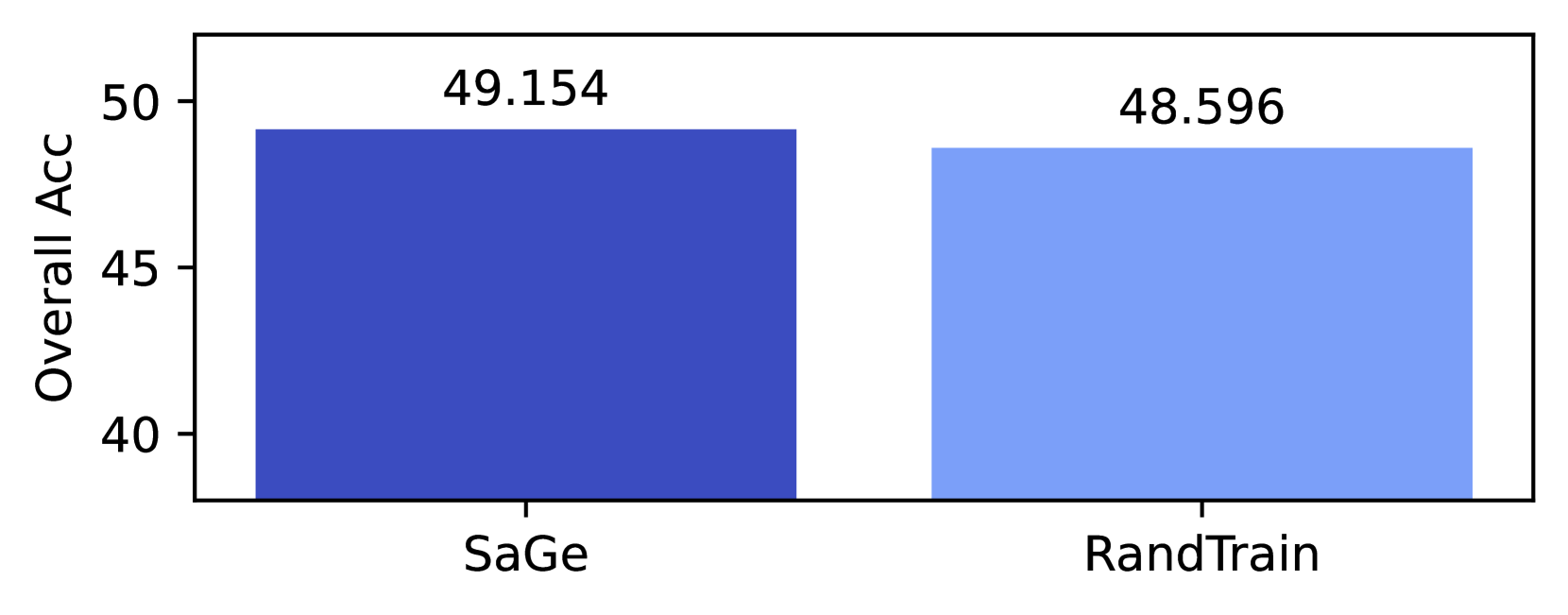
The image displays a simple vertical bar chart comparing the "Overall Acc" (Overall Accuracy) of two distinct methods or models: "SaGe" and "RandTrain". The chart presents a direct, side-by-side comparison of a single performance metric.
### Components/Axes
* **Y-Axis (Vertical):**
* **Label:** "Overall Acc"
* **Scale:** Linear scale ranging from 40 to 50.
* **Tick Marks:** Major ticks are present at 40, 45, and 50.
* **X-Axis (Horizontal):**
* **Categories:** Two categorical bars are present.
* **Labels (from left to right):** "SaGe" and "RandTrain".
* **Data Series & Legend:**
* There is no separate legend box. The categories are identified by the labels directly beneath each bar.
* **Bar 1 (Left):** Labeled "SaGe". Colored in a dark, saturated blue.
* **Bar 2 (Right):** Labeled "RandTrain". Colored in a lighter, less saturated blue.
* **Data Labels:**
* Numerical values are displayed directly above each bar.
* Value above "SaGe" bar: **49.154**
* Value above "RandTrain" bar: **48.596**
### Detailed Analysis
* **SaGe Performance:** The bar representing "SaGe" reaches a height corresponding to an Overall Accuracy of **49.154**. This is the higher of the two values presented.
* **RandTrain Performance:** The bar representing "RandTrain" reaches a height corresponding to an Overall Accuracy of **48.596**.
* **Comparison:** The difference in Overall Accuracy between the two methods is **0.558** (49.154 - 48.596). Visually, the bars are very close in height, indicating a small performance gap.
### Key Observations
1. **Close Performance:** The primary observation is the proximity of the two accuracy scores. The visual difference in bar height is minimal, reflecting the small numerical difference of approximately 0.56 percentage points.
2. **Metric Focus:** The chart isolates and compares a single, high-level metric ("Overall Acc"), providing no insight into other potential performance dimensions like precision, recall, or computational cost.
3. **Visual Encoding:** The chart uses color (dark blue vs. light blue) and spatial separation (left vs. right) to distinguish the two categories. The direct labeling below each bar and the value labels above them make the chart self-explanatory without a separate legend.
### Interpretation
This chart presents a performance benchmark between two entities, likely machine learning models or training methodologies named "SaGe" and "RandTrain". The data suggests that **SaGe achieves a marginally higher Overall Accuracy than RandTrain**.
The key takeaway is not a dramatic superiority but a slight edge. In a technical context, this small difference could be significant depending on the application's sensitivity to accuracy improvements. It prompts further investigation:
* Is this difference statistically significant?
* What are the trade-offs? Does SaGe require more data, computation, or time to achieve this gain?
* How does this "Overall Acc" break down across different classes or subsets of the data?
The chart effectively communicates that, on this specific aggregate metric, SaGe is the top performer, but the margin is narrow enough that other factors (efficiency, robustness, fairness) would be critical in deciding which method to employ.