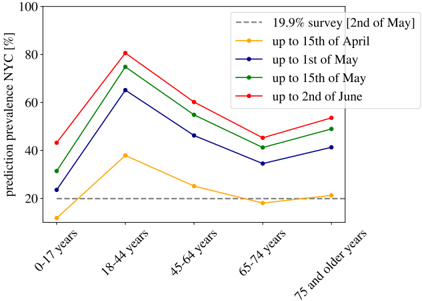
## Line Graph: Prediction Prevalence in NYC by Age Group and Date
### Overview
The image is a line graph depicting the predicted prevalence of an unspecified condition in New York City (NYC) across five age groups (0-17 years, 18-44 years, 45-64 years, 65-74 years, 75+ years) over time. The y-axis represents prediction prevalence as a percentage, while the x-axis categorizes age groups. Five data series are plotted, each corresponding to a specific date range or survey, with distinct colors and markers.
### Components/Axes
- **X-Axis (Categories)**: Age groups labeled as "0-17 years," "18-44 years," "45-64 years," "65-74 years," and "75 and older years."
- **Y-Axis (Scale)**: Prediction prevalence in NYC (%) ranging from 0% to 100% in 20% increments.
- **Legend**: Located in the top-right corner, with the following entries:
- Gray dashed line: "19.9% survey [2nd of May]"
- Yellow line with circles: "up to 15th of April"
- Blue line with circles: "up to 1st of May"
- Green line with circles: "up to 15th of May"
- Red line with circles: "up to 2nd of June"
### Detailed Analysis
#### Age Group: 0-17 years
- **Yellow line ("up to 15th of April")**: Starts at ~10% and rises sharply to ~35% by 18-44 years.
- **Blue line ("up to 1st of May")**: Begins at ~25% and peaks at ~65% for 18-44 years.
- **Green line ("up to 15th of May")**: Starts at ~30% and reaches ~75% for 18-44 years.
- **Red line ("up to 2nd of June")**: Begins at ~40% and peaks at ~80% for 18-44 years.
#### Age Group: 18-44 years
- **Yellow line**: Peaks at ~35% (15th of April).
- **Blue line**: Peaks at ~65% (1st of May).
- **Green line**: Peaks at ~75% (15th of May).
- **Red line**: Peaks at ~80% (2nd of June).
#### Age Group: 45-64 years
- **Yellow line**: Drops to ~25% (15th of April).
- **Blue line**: Declines to ~45% (1st of May).
- **Green line**: Falls to ~55% (15th of May).
- **Red line**: Reduces to ~60% (2nd of June).
#### Age Group: 65-74 years
- **Yellow line**: Lowest at ~20% (15th of April).
- **Blue line**: Slightly increases to ~35% (1st of May).
- **Green line**: Rises to ~40% (15th of May).
- **Red line**: Increases to ~45% (2nd of June).
#### Age Group: 75+ years
- **Yellow line**: Remains flat at ~20% (15th of April).
- **Blue line**: Slightly increases to ~25% (1st of May).
- **Green line**: Rises to ~30% (15th of May).
- **Red line**: Increases to ~35% (2nd of June).
### Key Observations
1. **Peak Prevalence**: The 18-44 age group consistently shows the highest prevalence across all dates, peaking at ~80% by June 2nd.
2. **Temporal Trends**: Prevalence increases over time for most age groups, with the steepest rise observed between April 15th and June 2nd.
3. **Survey Baseline**: The gray dashed line (19.9% survey on May 2nd) acts as a reference point, remaining constant across all age groups.
4. **Lowest Prevalence**: The 75+ age group has the lowest values, ranging from ~20% to ~35% across dates.
### Interpretation
The data suggests a significant increase in predicted prevalence in NYC, particularly among younger adults (18-44 years), with the highest values observed by June 2nd. The temporal progression (April to June) indicates a possible seasonal or event-driven trend, such as a public health crisis or policy change. The 19.9% survey line may represent a baseline or target threshold, as it remains constant despite fluctuations in other data series. The 0-17 age group shows a steady rise, potentially linked to factors like school reopenings or seasonal exposure. Conversely, older age groups (65+ years) exhibit lower prevalence, which could reflect differences in susceptibility, healthcare access, or reporting practices. The sharp decline after June 2nd in some lines might indicate interventions or data collection adjustments.