## Log-Log Plot: Correlation Function vs. Distance
### Overview
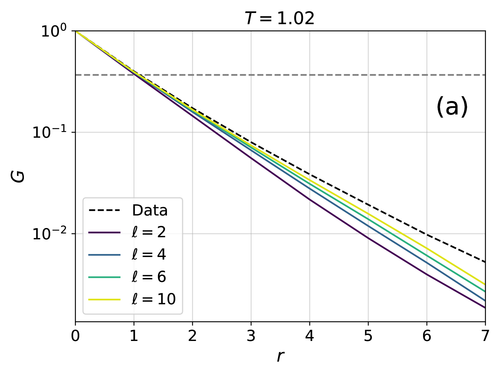
The image presents a log-log plot illustrating the correlation function (G) as a function of distance (r) for different values of 'l'. A dashed black line represents "Data", while solid lines represent theoretical curves for l = 2, 4, 6, and 10. The plot is labeled with 'T = 1.02' at the top-right and '(a)' at the top-right corner. The y-axis is logarithmic, ranging from 10⁰ to 10⁻². The x-axis, also representing distance, ranges from 0 to 7.
### Components/Axes
* **X-axis:** 'r' (Distance), ranging from 0 to 7, with tick marks at integer values.
* **Y-axis:** 'G' (Correlation Function), on a logarithmic scale from 10⁰ (1) to 10⁻² (0.01), with tick marks at 10⁰, 10⁻¹, and 10⁻².
* **Legend:** Located in the bottom-left corner, listing the following:
* 'Data' - Dashed black line
* 'l = 2' - Dark purple line
* 'l = 4' - Gray line
* 'l = 6' - Green line
* 'l = 10' - Yellow line
* **Title/Label:** 'T = 1.02' positioned at the top-right.
* **Annotation:** '(a)' positioned at the top-right.
### Detailed Analysis
The plot shows the decay of the correlation function 'G' with increasing distance 'r'. The 'Data' line (dashed black) exhibits a relatively steep decay. The solid lines represent theoretical predictions for different values of 'l'.
* **Data (Dashed Black):** The line slopes downward, starting at approximately G = 0.8 at r = 0 and decreasing to approximately G = 0.02 at r = 7.
* **l = 2 (Dark Purple):** This line starts at approximately G = 0.9 at r = 0 and decreases to approximately G = 0.03 at r = 7. It is slightly above the 'Data' line.
* **l = 4 (Gray):** This line starts at approximately G = 0.7 at r = 0 and decreases to approximately G = 0.025 at r = 7. It is close to the 'Data' line.
* **l = 6 (Green):** This line starts at approximately G = 0.6 at r = 0 and decreases to approximately G = 0.02 at r = 7. It is below the 'Data' line.
* **l = 10 (Yellow):** This line starts at approximately G = 0.5 at r = 0 and decreases to approximately G = 0.015 at r = 7. It is the lowest of the theoretical curves.
All lines exhibit a generally linear decay on this log-log scale, indicating a power-law relationship between G and r. The slope of each line varies, corresponding to the different values of 'l'.
### Key Observations
* The 'Data' line falls between the curves for l = 4 and l = 6.
* As 'l' increases, the correlation function decays more rapidly with distance.
* All curves show a similar trend of decreasing correlation with increasing distance.
* The logarithmic scale emphasizes the rate of decay, making it easier to compare the different curves.
### Interpretation
This plot likely represents the spatial correlation of some quantity within a system, possibly a fluid or a material. The correlation function 'G' quantifies how strongly the value of the quantity at one point is related to its value at another point, separated by a distance 'r'. The parameter 'l' likely represents a characteristic length scale within the system.
The fact that the 'Data' line falls between the curves for l = 4 and l = 6 suggests that the characteristic length scale of the system is somewhere between 4 and 6. The value of T = 1.02 could represent a temperature or another relevant parameter of the system. The plot demonstrates how the correlation function decays with distance, and how this decay is influenced by the characteristic length scale 'l'. The use of a log-log plot allows for the identification of power-law behavior, which is common in many physical systems. The annotation '(a)' suggests this is part of a larger figure with multiple panels.