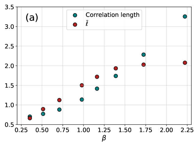
## Scatter Plot: Correlation Length and ℓ̄ vs. β
### Overview
The image is a scatter plot labeled "(a)" in the top-left corner, displaying two data series plotted against a parameter β on the x-axis. The plot compares the values of "Correlation length" and "ℓ̄" (a symbol with a bar over the letter l) as β increases. The data points show a clear positive correlation for both series, with "Correlation length" exhibiting a steeper increase at higher β values.
### Components/Axes
* **Chart Type:** Scatter plot.
* **Panel Label:** "(a)" located in the top-left corner of the plot area.
* **X-Axis:**
* **Title:** β (Greek letter beta).
* **Scale:** Linear, ranging from 0.25 to 2.25.
* **Major Tick Marks:** 0.25, 0.50, 0.75, 1.00, 1.25, 1.50, 1.75, 2.00, 2.25.
* **Y-Axis:**
* **Title:** Not explicitly labeled. The axis represents the numerical value of the plotted quantities.
* **Scale:** Linear, ranging from 0.5 to 3.5.
* **Major Tick Marks:** 0.5, 1.0, 1.5, 2.0, 2.5, 3.0, 3.5.
* **Legend:**
* **Position:** Top-center of the plot area, inside a white box with a light gray border.
* **Entries:**
1. **Teal Circle:** Labeled "Correlation length".
2. **Red Circle:** Labeled "ℓ̄" (the symbol consists of a lowercase 'l' with a horizontal bar above it).
* **Grid:** A light gray grid is present, aligning with the major tick marks on both axes.
### Detailed Analysis
**Data Series 1: Correlation length (Teal Circles)**
* **Trend:** The data points follow a clear upward curve. The slope is moderate for β < 1.0 and becomes significantly steeper for β > 1.0.
* **Approximate Data Points (β, Value):**
* (0.35, 0.70)
* (0.50, 0.75)
* (0.70, 0.90)
* (1.00, 1.10)
* (1.20, 1.40)
* (1.40, 1.75)
* (1.75, 2.30)
* (2.25, 3.25)
**Data Series 2: ℓ̄ (Red Circles)**
* **Trend:** The data points also follow an upward trend, but the increase is more linear and less steep compared to the "Correlation length" series, especially at higher β values. The rate of increase appears to slow slightly after β ≈ 1.4.
* **Approximate Data Points (β, Value):**
* (0.35, 0.65)
* (0.50, 0.90)
* (0.70, 1.10)
* (1.00, 1.50)
* (1.20, 1.70)
* (1.40, 1.95)
* (1.75, 2.05)
* (2.25, 2.10)
### Key Observations
1. **Diverging Trends:** While both quantities increase with β, they diverge significantly. At low β (≈0.35), their values are very close (0.70 vs. 0.65). By β=2.25, "Correlation length" (3.25) is over 50% larger than "ℓ̄" (2.10).
2. **Crossover Point:** The two data series intersect between β=0.5 and β=0.7. At β=0.5, ℓ̄ (0.90) is greater than Correlation length (0.75). By β=0.7, Correlation length (0.90) is slightly less than ℓ̄ (1.10), but the trend lines have crossed.
3. **Non-Linear vs. Near-Linear Growth:** "Correlation length" shows pronounced non-linear (possibly exponential or power-law) growth. "ℓ̄" shows growth that is closer to linear, with a potential saturation effect at the highest β values shown.
4. **Data Density:** The sampling of β is not uniform. There are more data points clustered in the lower range (β < 1.5) than in the higher range.
### Interpretation
This plot likely comes from a physics or statistical mechanics context, where β often represents inverse temperature (1/kT). The data demonstrates a fundamental relationship: as the system's "temperature" decreases (β increases), both the correlation length and the average length scale ℓ̄ increase.
The critical insight is the **diverging behavior**. The correlation length, which measures the distance over which fluctuations in the system are related, grows much more rapidly than the average length ℓ̄. This is a classic signature of approaching a **critical point** or phase transition. Near such a point, correlations become long-ranged, causing the correlation length to diverge (theoretically to infinity at the critical β), while other average quantities (like ℓ̄) may increase more slowly or saturate.
The crossover at low β suggests that in the high-temperature (low β) disordered phase, the two length scales are comparable. As the system cools and becomes more ordered, the correlation length takes over as the dominant scale governing the system's spatial structure. The plot visually captures the onset of this critical scaling behavior.