TECHNICAL ASSET FINGERPRINT
507b45d41978e39677fd01a9
Click to view fullscreen
Press ESC or click to close
FOUND IN PAPERS
EXPERT: healer-alpha-free VERSION 1
RUNTIME: free/openrouter/healer-alpha
INTEL_VERIFIED
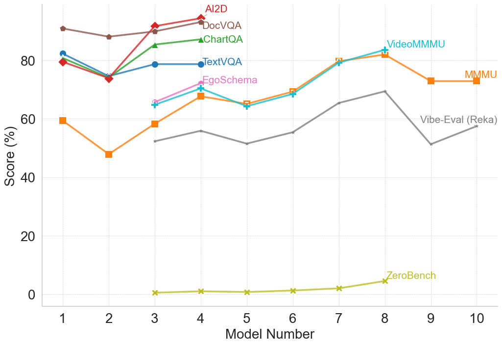
## Multi-Line Chart: Model Performance Comparison Across Multiple Benchmarks
### Overview
The image is a line chart comparing the performance scores (in percentage) of 10 different AI models (numbered 1 through 10) across 8 distinct evaluation benchmarks. Each benchmark is represented by a uniquely colored line with specific markers. The chart illustrates how model performance varies significantly depending on the task or benchmark being evaluated.
### Components/Axes
* **X-Axis:** Labeled "Model Number". It has discrete integer markers from 1 to 10.
* **Y-Axis:** Labeled "Score (%)". It has a linear scale from 0 to approximately 90, with major gridlines at intervals of 20 (0, 20, 40, 60, 80).
* **Legend:** Positioned in the top-right quadrant of the chart area. It lists 8 benchmarks with corresponding line colors and markers:
1. **AI2D** - Red line with diamond markers.
2. **DocVQA** - Brown line with circle markers.
3. **ChartQA** - Green line with triangle markers.
4. **TextVQA** - Blue line with circle markers.
5. **EgoSchema** - Pink line with plus (+) markers.
6. **VideoMMMU** - Cyan line with plus (+) markers.
7. **MMMU** - Orange line with square markers.
8. **Vibe-Eval (Reka)** - Gray line with 'x' markers.
9. **ZeroBench** - Yellow-green line with 'x' markers. (Note: This label appears directly on the chart near its line, not in the top-right legend cluster).
### Detailed Analysis
**Trend Verification & Data Point Extraction (Approximate Values):**
* **AI2D (Red, Diamond):** Shows a generally upward trend. Starts at ~80% (Model 1), dips to ~74% (Model 2), then rises sharply to ~92% (Model 3) and peaks at ~95% (Model 4). Data is only plotted for Models 1-4.
* **DocVQA (Brown, Circle):** High and relatively stable performance. Starts at ~90% (Model 1), dips slightly to ~88% (Model 2), rises to ~90% (Model 3), and peaks at ~93% (Model 4). Data is only plotted for Models 1-4.
* **ChartQA (Green, Triangle):** Shows an upward trend. Starts at ~80% (Model 1), dips to ~75% (Model 2), then rises to ~85% (Model 3) and ~87% (Model 4). Data is only plotted for Models 1-4.
* **TextVQA (Blue, Circle):** Relatively stable with a slight upward trend. Starts at ~82% (Model 1), dips to ~75% (Model 2), then stabilizes around ~79% for Models 3 and 4. Data is only plotted for Models 1-4.
* **EgoSchema (Pink, +):** Shows an upward trend. Starts at ~66% (Model 3), rises to ~72% (Model 4). Data is only plotted for Models 3-4.
* **VideoMMMU (Cyan, +):** Shows a general upward trend with a mid-point dip. Starts at ~65% (Model 3), rises to ~71% (Model 4), dips to ~64% (Model 5), then climbs steadily to ~69% (Model 6), ~80% (Model 7), and peaks at ~83% (Model 8). Data is plotted for Models 3-8.
* **MMMU (Orange, Square):** Shows a volatile but overall upward trend. Starts at ~60% (Model 1), dips sharply to ~48% (Model 2), rises to ~58% (Model 3), ~68% (Model 4), dips to ~65% (Model 5), then climbs to ~70% (Model 6), ~80% (Model 7), peaks at ~82% (Model 8), then declines to ~73% (Model 9) and ~73% (Model 10). Data is plotted for all models.
* **Vibe-Eval (Reka) (Gray, x):** Shows a fluctuating, moderate upward trend. Data starts at Model 3 (~53%), rises to ~56% (Model 4), dips to ~52% (Model 5), rises to ~56% (Model 6), ~65% (Model 7), peaks at ~70% (Model 8), then dips sharply to ~52% (Model 9) and recovers to ~58% (Model 10). Data is plotted for Models 3-10.
* **ZeroBench (Yellow-Green, x):** Consistently very low scores, showing a very slight upward trend. Starts near 0% (Model 3), remains near 0-1% for Models 4, 5, and 6, rises slightly to ~2% (Model 7), and peaks at ~5% (Model 8). Data is only plotted for Models 3-8.
### Key Observations
1. **Benchmark Difficulty Spectrum:** There is a massive performance gap between benchmarks. AI2D, DocVQA, and ChartQA are consistently at the high end (75-95%), while ZeroBench is at the extreme low end (0-5%).
2. **Model Specialization:** No single model (number) is best across all benchmarks. For example, Model 4 excels on AI2D and DocVQA but is mid-range on MMMU. Model 8 achieves the highest scores on VideoMMMU and MMMU but is average on Vibe-Eval.
3. **Data Availability:** Performance data is not available for all models on all benchmarks. The first four models have data on the "classic" VQA benchmarks (AI2D, DocVQA, ChartQA, TextVQA). Later models (3-10) have data on more diverse benchmarks like MMMU, VideoMMMU, and Vibe-Eval.
4. **Volatility:** The MMMU and Vibe-Eval lines show the most volatility, with significant dips and peaks across models, suggesting these benchmarks may be more sensitive to specific model capabilities or training differences.
5. **Convergence Point:** Around Model 7 and 8, the scores for VideoMMMU, MMMU, and Vibe-Eval converge in the 65-83% range, indicating a cluster of models with comparable performance on these more complex, multimodal tasks.
### Interpretation
This chart provides a Peircean insight into the current landscape of multimodal AI evaluation. The **sign** (the plotted lines) indicates that model capability is not monolithic but highly **indexical** of the specific task or benchmark.
* **What the data suggests:** The data demonstrates that progress in AI is uneven. Models have become highly proficient at certain structured tasks (like document and chart understanding, as seen in DocVQA/ChartQA) but struggle profoundly with others (like ZeroBench, which likely tests fundamental reasoning or knowledge outside typical training distributions).
* **Relationship between elements:** The benchmarks themselves form a hierarchy of difficulty. The clustering of AI2D/DocVQA/ChartQA/TextVQA at the top suggests they test related skills (text and chart parsing in documents). The middle cluster (MMMU, VideoMMMU, Vibe-Eval) likely tests more integrated, complex reasoning across modalities. ZeroBench's isolation at the bottom marks it as a test of a fundamentally different, and currently unsolved, capability.
* **Notable Anomalies:** The complete absence of data for the first two models on benchmarks like MMMU and Vibe-Eval is a significant gap. The dramatic dip for Model 2 on the MMMU line is an outlier that warrants investigation—was this model specifically weak in the areas tested by MMMU? The near-zero performance on ZeroBench across all models is the most striking anomaly, highlighting a potential ceiling or blind spot in current model architectures or training paradigms.
In essence, the chart argues that "model performance" is a meaningless metric without the context of the benchmark. It visually advocates for a multi-benchmark evaluation approach to capture the true, multifaceted nature of AI capability.
DECODING INTELLIGENCE...