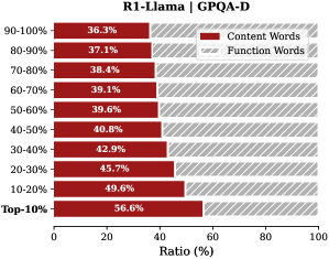
## Horizontal Stacked Bar Chart: R1-Llama | GPQA-D
### Overview
This image is a horizontal stacked bar chart comparing the ratio of "Content Words" to "Function Words" across different percentile ranges for a model or dataset labeled "R1-Llama" on the "GPQA-D" benchmark. The chart visualizes how the composition of word types changes across performance or confidence tiers.
### Components/Axes
* **Chart Title:** "R1-Llama | GPQA-D" (centered at the top).
* **Vertical Axis (Y-axis):** Represents percentile ranges, ordered from highest to lowest. The categories are:
* 90-100%
* 80-90%
* 70-80%
* 60-70%
* 50-60%
* 40-50%
* 30-40%
* 20-30%
* 10-20%
* Top-10%
* **Horizontal Axis (X-axis):** Labeled "Ratio (%)" with a scale from 0 to 100, marked at intervals of 20 (0, 20, 40, 60, 80, 100).
* **Legend:** Located in the top-right corner of the chart area.
* A dark red square is labeled "Content Words".
* A light red (pinkish) square is labeled "Function Words".
* **Data Bars:** Each horizontal bar is stacked with two segments corresponding to the legend. The dark red segment (Content Words) is on the left, and the light red segment (Function Words) is on the right. The percentage value for the "Content Words" segment is printed inside each dark red bar.
### Detailed Analysis
The chart displays the following data points for each percentile range. The "Function Words" ratio is calculated as the complement to 100% of the given "Content Words" ratio.
| Percentile Range | Content Words Ratio (%) | Function Words Ratio (%) (Calculated) |
| :--- | :--- | :--- |
| Top-10% | 56.6% | 43.4% |
| 90-100% | 36.3% | 63.7% |
| 80-90% | 37.1% | 62.9% |
| 70-80% | 38.4% | 61.6% |
| 60-70% | 39.1% | 60.9% |
| 50-60% | 39.6% | 60.4% |
| 40-50% | 40.8% | 59.2% |
| 30-40% | 42.9% | 57.1% |
| 20-30% | 45.7% | 54.3% |
| 10-20% | 49.6% | 50.4% |
**Trend Verification:** Moving from the top of the chart (90-100% range) to the bottom (Top-10% range), the dark red "Content Words" segment consistently increases in length. Conversely, the light red "Function Words" segment consistently decreases. This indicates a clear inverse relationship between the two word types across the percentile tiers.
### Key Observations
1. **Dominance of Function Words:** In the highest percentile ranges (90-100% down to 50-60%), "Function Words" constitute the majority, ranging from approximately 64% to 60%.
2. **Crossover Point:** The ratio of "Content Words" to "Function Words" becomes roughly equal (near 50/50) in the 10-20% percentile range (49.6% vs. 50.4%).
3. **Content Word Dominance in Top Tier:** In the "Top-10%" category, "Content Words" become the dominant type, comprising 56.6% of the ratio.
4. **Monotonic Trend:** The increase in the "Content Words" ratio is monotonic and nearly linear as one moves from the highest to the lowest percentile ranges shown.
### Interpretation
This chart likely analyzes the linguistic composition of text generated by or associated with the "R1-Llama" model on the "GPQA-D" task, segmented by some measure of confidence, quality, or performance percentile.
* **What the data suggests:** The data demonstrates a strong correlation between the percentile tier and the type of words used. Higher-confidence or higher-performance outputs (90-100%) are characterized by a higher proportion of "Function Words" (e.g., articles, prepositions, conjunctions). Lower-confidence or lower-performance outputs (Top-10%) shift towards a higher proportion of "Content Words" (e.g., nouns, verbs, adjectives).
* **How elements relate:** The inverse relationship between the two word types is the core finding. The chart implies that as the model's output moves into lower percentile brackets (which may correspond to more challenging questions or less confident answers), its language becomes more "content-heavy" and less reliant on structural, grammatical function words.
* **Notable patterns/anomalies:** The most striking pattern is the smooth, consistent gradient. There are no sudden jumps or outliers, suggesting a fundamental and predictable shift in linguistic strategy across the performance spectrum. The "Top-10%" being the only category where content words outnumber function words is a critical threshold. This could indicate that for the most difficult or poorly-performing instances, the model's output becomes more focused on substantive terms, potentially at the expense of grammatical fluency or connective phrasing.