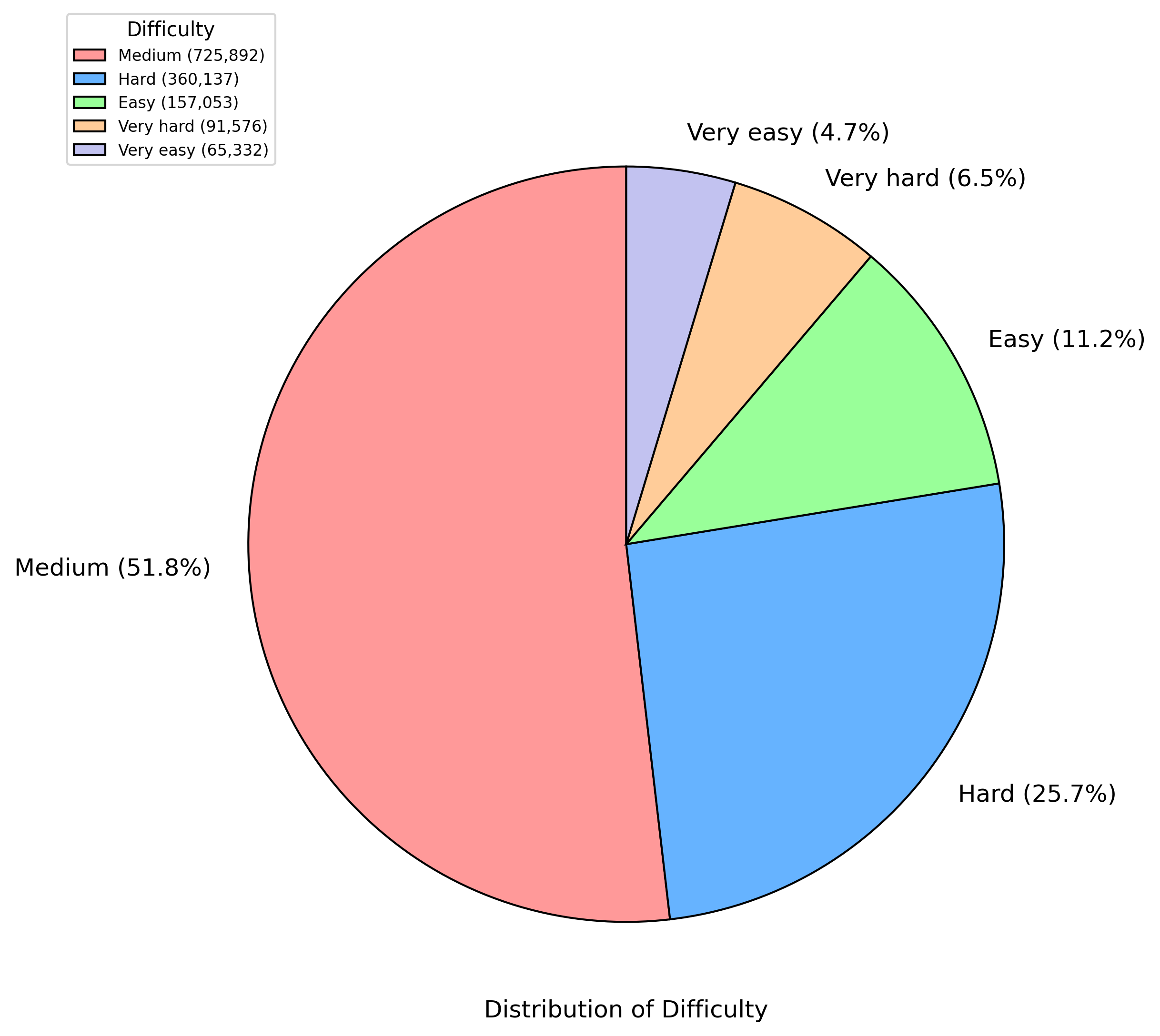
## Pie Chart: Distribution of Difficulty
### Overview
The image depicts a pie chart illustrating the distribution of difficulty levels across five categories: Medium, Hard, Easy, Very Hard, and Very Easy. The chart uses distinct colors for each category, with numerical values and percentages provided for both the total counts and proportional distribution.
### Components/Axes
- **Legend**: Positioned on the left side of the chart, the legend maps colors to difficulty categories:
- **Medium**: Red (725,892, 51.8%)
- **Hard**: Blue (360,137, 25.7%)
- **Easy**: Green (157,053, 11.2%)
- **Very Hard**: Orange (91,576, 6.5%)
- **Very Easy**: Purple (65,332, 4.7%)
- **Chart Title**: "Distribution of Difficulty" (centered above the pie chart).
- **Slices**: Each difficulty category is represented as a wedge in the pie chart, with labels and percentages placed adjacent to their respective sections.
### Detailed Analysis
1. **Medium (Red)**: Dominates the chart at 51.8% (725,892 instances), occupying slightly more than half the pie.
2. **Hard (Blue)**: Second-largest segment at 25.7% (360,137 instances), positioned to the right of the Medium slice.
3. **Easy (Green)**: Occupies 11.2% (157,053 instances), located below the Hard segment.
4. **Very Hard (Orange)**: Smallest non-trivial segment at 6.5% (91,576 instances), situated below the Easy slice.
5. **Very Easy (Purple)**: Smallest segment at 4.7% (65,332 instances), placed at the bottom-right of the chart.
### Key Observations
- **Dominance of Medium Difficulty**: The Medium category accounts for over half of the total, indicating it is the most prevalent difficulty level.
- **Significant Hard Difficulty**: The Hard category represents a quarter of the data, suggesting a notable but secondary prevalence.
- **Minor Extremes**: Easy, Very Hard, and Very Easy categories collectively account for only 22.4% of the data, with Very Easy being the smallest.
### Interpretation
The data suggests a bimodal distribution skewed toward Medium and Hard difficulties, with the extremes (Very Easy and Very Hard) being relatively rare. This could imply:
- A balanced dataset designed to test intermediate and challenging scenarios.
- Potential outliers in the Very Easy and Very Hard categories, which may require further investigation for data quality or contextual relevance.
- The distribution might reflect user performance trends, where most tasks fall into moderate difficulty, while a subset is either overly simplistic or excessively complex.
The percentages sum to 99.9% (due to rounding), confirming the data's internal consistency. The spatial arrangement of slices and legend ensures clarity, with colors and labels directly correlating to their respective segments.