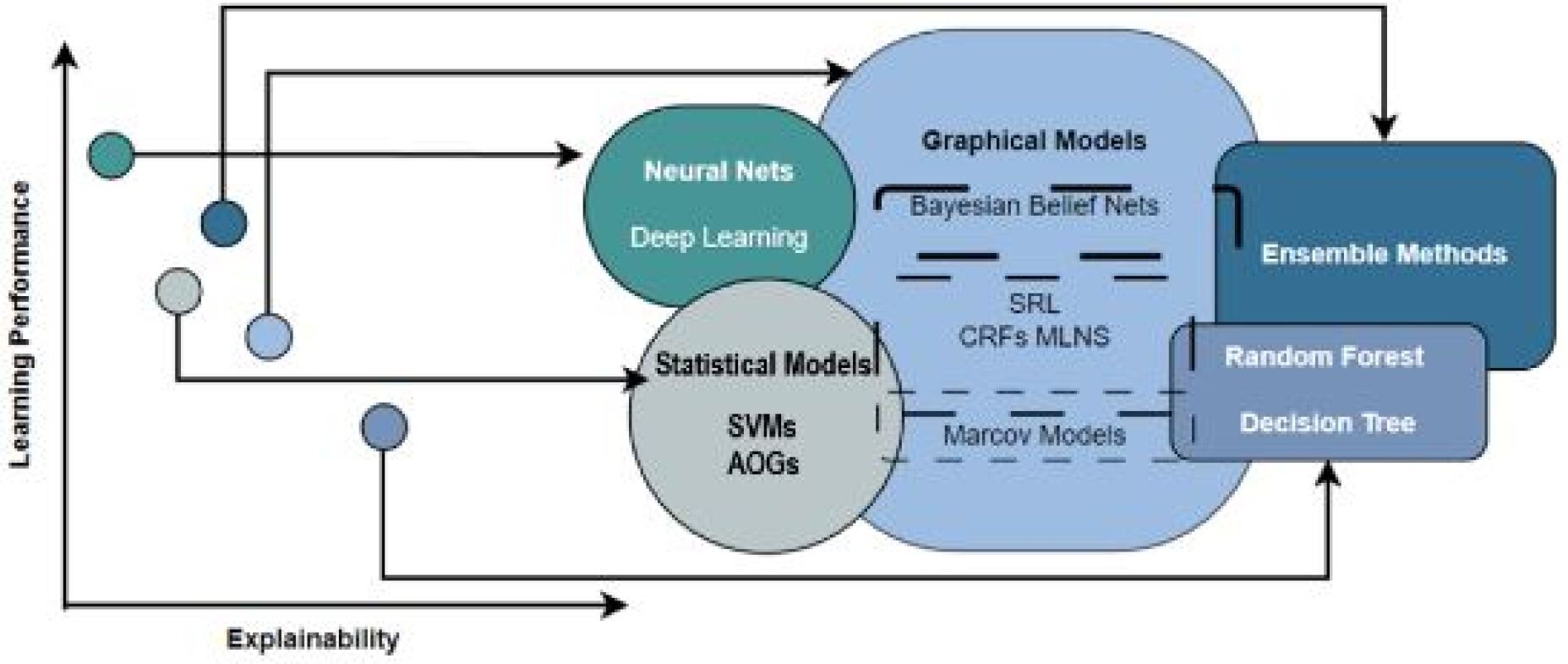
## Diagram: Machine Learning Model Comparison
### Overview
The image is a diagram comparing different machine learning models based on their learning performance and explainability. The diagram uses a 2D space with "Learning Performance" on the y-axis and "Explainability" on the x-axis. Different types of models are grouped into clusters, and their relative positions indicate their performance and explainability trade-offs.
### Components/Axes
* **X-axis:** Explainability (horizontal axis)
* **Y-axis:** Learning Performance (vertical axis)
* **Clusters:**
* Neural Nets (includes Deep Learning) - Teal color
* Statistical Models (includes SVMs, AOGs) - Light gray color
* Graphical Models (includes Bayesian Belief Nets, SRL, CRFs MLNS, Markov Models) - Light blue color
* Ensemble Methods (includes Random Forest, Decision Tree) - Dark blue color
### Detailed Analysis
The diagram plots machine learning models in a 2D space defined by "Learning Performance" and "Explainability".
* **Neural Nets (Teal):** Positioned towards the top-left, indicating high learning performance but relatively low explainability. Includes "Deep Learning".
* **Statistical Models (Light Gray):** Positioned towards the bottom-left, indicating lower learning performance but relatively low explainability. Includes "SVMs" and "AOGs".
* **Graphical Models (Light Blue):** Positioned towards the center, suggesting a balance between learning performance and explainability. Includes "Bayesian Belief Nets", "SRL", "CRFs MLNS", and "Markov Models".
* **Ensemble Methods (Dark Blue):** Positioned towards the top-right, indicating high learning performance and relatively high explainability. Includes "Random Forest" and "Decision Tree".
The diagram also includes several data points (circles) connected to the clusters with lines. The positions of these data points on the axes are as follows:
* **Teal Data Point:** High Learning Performance, Low Explainability (connected to Neural Nets)
* **Dark Blue Data Point:** Medium Learning Performance, High Explainability (connected to Ensemble Methods)
* **Light Gray Data Point:** Low Learning Performance, Low Explainability (connected to Statistical Models)
* **Light Blue Data Point:** Medium Learning Performance, Medium Explainability (connected to Graphical Models)
* **Darker Blue Data Point:** High Learning Performance, Low Explainability
### Key Observations
* There is a trade-off between learning performance and explainability.
* Neural Nets offer high learning performance but low explainability.
* Ensemble Methods offer a good balance of both.
* Statistical Models have lower performance and explainability.
* Graphical Models offer a middle ground.
### Interpretation
The diagram illustrates the trade-offs between learning performance and explainability for different machine learning models. It suggests that models like Neural Nets are suitable for tasks where performance is paramount, even at the cost of interpretability. Ensemble Methods offer a good compromise, while Statistical Models might be preferred when explainability is more important than performance. Graphical Models provide a balance between the two. The diagram is useful for selecting the appropriate model based on the specific requirements of a given task.