\n
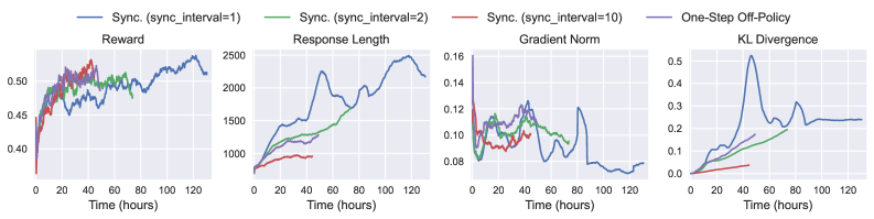
## Multi-Panel Line Chart: Training Metrics Over Time
### Overview
The image displays a set of four line charts arranged horizontally, comparing the performance of different reinforcement learning training configurations over time. The charts track four distinct metrics: Reward, Response Length, Gradient Norm, and KL Divergence. The x-axis for all charts is "Time (hours)", ranging from 0 to approximately 130 hours. A shared legend at the top identifies four data series.
### Components/Axes
* **Legend (Top Center):** Positioned above the charts, it defines four lines:
* **Blue Line:** `Sync. (sync_interval=1)`
* **Green Line:** `Sync. (sync_interval=2)`
* **Red Line:** `Sync. (sync_interval=10)`
* **Purple Line:** `One-Step Off-Policy`
* **Chart 1 (Left): Reward**
* **Title:** "Reward"
* **Y-axis:** Unlabeled, but numerical scale from 0.40 to 0.50.
* **X-axis:** "Time (hours)" with markers at 0, 20, 40, 60, 80, 100, 120.
* **Chart 2 (Center-Left): Response Length**
* **Title:** "Response Length"
* **Y-axis:** Unlabeled, but numerical scale from 0 to 2500.
* **X-axis:** "Time (hours)" with markers at 0, 20, 40, 60, 80, 100, 120.
* **Chart 3 (Center-Right): Gradient Norm**
* **Title:** "Gradient Norm"
* **Y-axis:** Unlabeled, but numerical scale from 0.08 to 0.16.
* **X-axis:** "Time (hours)" with markers at 0, 20, 40, 60, 80, 100, 120.
* **Chart 4 (Right): KL Divergence**
* **Title:** "KL Divergence"
* **Y-axis:** Unlabeled, but numerical scale from 0.0 to 0.5.
* **X-axis:** "Time (hours)" with markers at 0, 20, 40, 60, 80, 100, 120.
### Detailed Analysis
**1. Reward Chart:**
* **Trend Verification:** The blue line (`sync_interval=1`) shows a strong, consistent upward trend. The green (`sync_interval=2`) and red (`sync_interval=10`) lines rise initially but then plateau with high variance. The purple line (`One-Step Off-Policy`) is not visible in this chart.
* **Data Points (Approximate):**
* Blue: Starts ~0.40, ends ~0.50 at 120h.
* Green: Peaks ~0.48 around 40h, ends ~0.47 at 120h.
* Red: Peaks ~0.48 around 30h, ends ~0.46 at 120h.
**2. Response Length Chart:**
* **Trend Verification:** The blue line shows a dramatic, near-linear increase. The green line increases steadily but at a lower rate. The red line increases very slowly and remains low.
* **Data Points (Approximate):**
* Blue: Starts ~500, ends ~2500 at 120h.
* Green: Starts ~500, ends ~1800 at 120h.
* Red: Starts ~500, ends ~1000 at 120h.
**3. Gradient Norm Chart:**
* **Trend Verification:** All lines show high volatility. The blue line exhibits the most extreme swings, with a notable dip below 0.08 around 90h. The green and red lines are more stable within the 0.08-0.14 range.
* **Data Points (Approximate):**
* Blue: Fluctuates between ~0.07 and ~0.16.
* Green: Fluctuates between ~0.09 and ~0.13.
* Red: Fluctuates between ~0.09 and ~0.12.
**4. KL Divergence Chart:**
* **Trend Verification:** The blue line shows a sharp, significant spike. The green line increases gradually. The red line remains very low and flat.
* **Data Points (Approximate):**
* Blue: Spikes to ~0.5 at ~40h, then settles to ~0.25 by 120h.
* Green: Increases steadily to ~0.2 by 120h.
* Red: Remains below ~0.05 throughout.
### Key Observations
1. **Performance Hierarchy:** The `Sync. (sync_interval=1)` configuration (blue) achieves the highest Reward and Response Length but at the cost of the highest Gradient Norm volatility and a massive spike in KL Divergence.
2. **Stability vs. Performance Trade-off:** Increasing the sync interval (green, red) leads to more stable training (lower KL Divergence, less Gradient Norm variance) but results in lower final Reward and much shorter Response Lengths.
3. **One-Step Off-Policy:** This series (purple) is only visible in the legend. Its lines are either perfectly overlapping another series (unlikely) or, more plausibly, are not plotted in these specific charts, suggesting this figure may be part of a larger set where that series is shown elsewhere.
4. **Critical Event:** The blue line's KL Divergence spike at ~40 hours coincides with its steepest increase in Response Length, suggesting a potential policy shift or instability event at that point in training.
### Interpretation
This data demonstrates a clear trade-off in distributed reinforcement learning between synchronization frequency and training stability/performance. A very frequent sync (`interval=1`) drives aggressive policy improvement (high reward, long responses) but introduces significant instability, as evidenced by exploding gradients and a large divergence from the prior policy. Less frequent syncing (`interval=2, 10`) acts as a regularizer, producing more stable but less performant policies. The charts suggest that the optimal sync interval is a balance point, not simply the most frequent option. The absence of the `One-Step Off-Policy` data in the plots is a notable gap, preventing a full comparison of synchronous vs. asynchronous update strategies.