\n
## Line Chart: Correctness vs. Number of Retries
### Overview
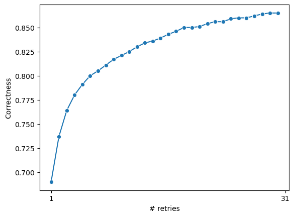
The image displays a 2D line chart plotting a metric called "Correctness" against the "# retries". The chart shows a single data series represented by a blue line with circular markers at each data point. The relationship is non-linear, demonstrating a rapid initial increase in correctness that gradually plateaus as the number of retries increases.
### Components/Axes
* **Chart Type:** Line chart with data point markers.
* **X-Axis (Horizontal):**
* **Label:** "# retries"
* **Scale:** Linear scale.
* **Visible Tick Markers:** The axis is explicitly labeled at the start (`1`) and the end (`31`). The intermediate tick marks are present but not numerically labeled.
* **Y-Axis (Vertical):**
* **Label:** "Correctness"
* **Scale:** Linear scale.
* **Visible Tick Markers:** Labeled at intervals of 0.025, starting from `0.700` at the bottom to `0.850` at the top. The specific labeled values are: `0.700`, `0.725`, `0.750`, `0.775`, `0.800`, `0.825`, `0.850`.
* **Data Series:**
* **Color:** Medium blue (approximately hex #1f77b4).
* **Marker Style:** Solid circular dots.
* **Line Style:** Solid line connecting the markers.
* **Legend:** No legend is present, as there is only one data series.
* **Title:** No chart title is visible within the image frame.
### Detailed Analysis
**Trend Verification:** The blue line exhibits a clear logarithmic or asymptotic growth trend. It starts with a very steep positive slope at low retry counts, which progressively flattens as the number of retries increases, indicating diminishing returns.
**Data Point Extraction (Approximate Values):**
The following table reconstructs the approximate data points by reading the chart. Values are estimated based on the position of the blue markers relative to the axis scales. Uncertainty is inherent in visual estimation from a static image.
| # Retries (X) | Correctness (Y) | Approximate Coordinates (X, Y) |
| :--- | :--- | :--- |
| 1 | ~0.690 | (1, 0.690) |
| 2 | ~0.738 | (2, 0.738) |
| 3 | ~0.765 | (3, 0.765) |
| 4 | ~0.782 | (4, 0.782) |
| 5 | ~0.792 | (5, 0.792) |
| 6 | ~0.800 | (6, 0.800) |
| 7 | ~0.805 | (7, 0.805) |
| 8 | ~0.810 | (8, 0.810) |
| 9 | ~0.815 | (9, 0.815) |
| 10 | ~0.820 | (10, 0.820) |
| 11 | ~0.825 | (11, 0.825) |
| 12 | ~0.828 | (12, 0.828) |
| 13 | ~0.832 | (13, 0.832) |
| 14 | ~0.835 | (14, 0.835) |
| 15 | ~0.838 | (15, 0.838) |
| 16 | ~0.840 | (16, 0.840) |
| 17 | ~0.842 | (17, 0.842) |
| 18 | ~0.845 | (18, 0.845) |
| 19 | ~0.847 | (19, 0.847) |
| 20 | ~0.849 | (20, 0.849) |
| 21 | ~0.850 | (21, 0.850) |
| 22 | ~0.852 | (22, 0.852) |
| 23 | ~0.854 | (23, 0.854) |
| 24 | ~0.856 | (24, 0.856) |
| 25 | ~0.857 | (25, 0.857) |
| 26 | ~0.858 | (26, 0.858) |
| 27 | ~0.859 | (27, 0.859) |
| 28 | ~0.860 | (28, 0.860) |
| 29 | ~0.861 | (29, 0.861) |
| 30 | ~0.862 | (30, 0.862) |
| 31 | ~0.863 | (31, 0.863) |
### Key Observations
1. **Diminishing Returns:** The most significant gains in correctness occur within the first 5-7 retries. After approximately 10 retries, the curve's slope becomes very shallow.
2. **Asymptotic Behavior:** The correctness value appears to approach an asymptote just above 0.860. The increase from retry 20 to 31 is minimal (~0.014) compared to the increase from retry 1 to 12 (~0.138).
3. **No Plateau within Range:** While the curve flattens, it does not become perfectly horizontal within the displayed range (1 to 31 retries). There is still a very slight positive slope at the end of the chart.
4. **Consistent Monotonic Increase:** The correctness metric never decreases with additional retries; it is a monotonically increasing function.
### Interpretation
This chart demonstrates a classic pattern of **convergent improvement with diminishing marginal returns**. In a technical context, this likely models a process where repeated attempts ("retries") improve the probability or quality of a successful outcome ("Correctness").
* **What it suggests:** The system or algorithm being measured benefits greatly from a small number of retries, quickly reaching a high level of correctness (e.g., ~0.800 by 6 retries). However, achieving near-maximum performance requires a substantially larger number of attempts.
* **Relationship between elements:** The independent variable (# retries) directly drives the dependent variable (Correctness), but the relationship is non-linear. The "cost" (in time, computation, or resources) of each additional retry yields progressively less "benefit" in correctness.
* **Practical Implication:** This data is crucial for optimization. It helps answer: "How many retries are enough?" The "knee" of the curve (around 5-10 retries) represents a potential sweet spot balancing performance and efficiency. Pushing beyond 20-25 retries may be computationally expensive for negligible gain, unless the application demands absolute maximum correctness regardless of cost.
* **Underlying Mechanism:** The shape suggests the process may be overcoming initial, easily-solvable errors quickly, while later retries tackle rarer, more stubborn failure modes. It could model scenarios like: a machine learning model's accuracy improving with more training epochs, a network packet successfully transmitting after multiple attempts, or a heuristic algorithm refining its solution over iterations.