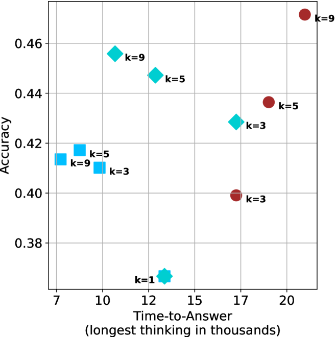
## Scatter Plot: Accuracy vs. Time-to-Answer
### Overview
The image is a scatter plot comparing the accuracy of a model against the time it takes to answer, with different markers representing different values of 'k'. The x-axis represents "Time-to-Answer (longest thinking in thousands)" and the y-axis represents "Accuracy". There are three distinct marker types: squares, diamonds, and circles, each associated with different 'k' values.
### Components/Axes
* **X-axis:** "Time-to-Answer (longest thinking in thousands)". The scale ranges from approximately 7 to 20, with gridlines at intervals of 1.
* **Y-axis:** "Accuracy". The scale ranges from 0.38 to 0.46, with gridlines at intervals of 0.02.
* **Markers:**
* Squares (light blue): k=3, k=5, k=9
* Diamonds (light blue): k=3, k=5, k=9
* Circles (brown): k=3, k=5, k=9
* Star (light blue): k=1
### Detailed Analysis
* **Squares (light blue):**
* k=3: Time-to-Answer ≈ 9.8, Accuracy ≈ 0.41
* k=5: Time-to-Answer ≈ 8.5, Accuracy ≈ 0.42
* k=9: Time-to-Answer ≈ 7.5, Accuracy ≈ 0.415
* **Diamonds (light blue):**
* k=3: Time-to-Answer ≈ 16.5, Accuracy ≈ 0.43
* k=5: Time-to-Answer ≈ 13.5, Accuracy ≈ 0.445
* k=9: Time-to-Answer ≈ 11.5, Accuracy ≈ 0.455
* **Circles (brown):**
* k=3: Time-to-Answer ≈ 17, Accuracy ≈ 0.40
* k=5: Time-to-Answer ≈ 18.5, Accuracy ≈ 0.435
* k=9: Time-to-Answer ≈ 20.5, Accuracy ≈ 0.47
* **Star (light blue):**
* k=1: Time-to-Answer ≈ 13.5, Accuracy ≈ 0.37
### Key Observations
* For the same 'k' value, the different marker types (squares, diamonds, circles) show a trend of increasing Time-to-Answer and Accuracy from squares to diamonds to circles.
* The 'k=1' data point (star) has the lowest accuracy and a moderate Time-to-Answer.
* The 'k=9' data point (circle) has the highest accuracy and the highest Time-to-Answer.
### Interpretation
The scatter plot suggests a relationship between the 'k' value, Time-to-Answer, and Accuracy. The different marker types (squares, diamonds, circles) likely represent different model configurations or algorithms. The trend indicates that as 'k' increases, both the Time-to-Answer and Accuracy tend to increase, especially when comparing the same marker type. The 'k=1' data point is an outlier, suggesting that this configuration is less effective in terms of accuracy. The plot highlights a trade-off between accuracy and time, with higher accuracy generally requiring more time to answer. The different marker types could represent different models, and the plot suggests that the circular model performs the best, but takes the longest time.