## Line Chart: Model Performance Scores
### Overview
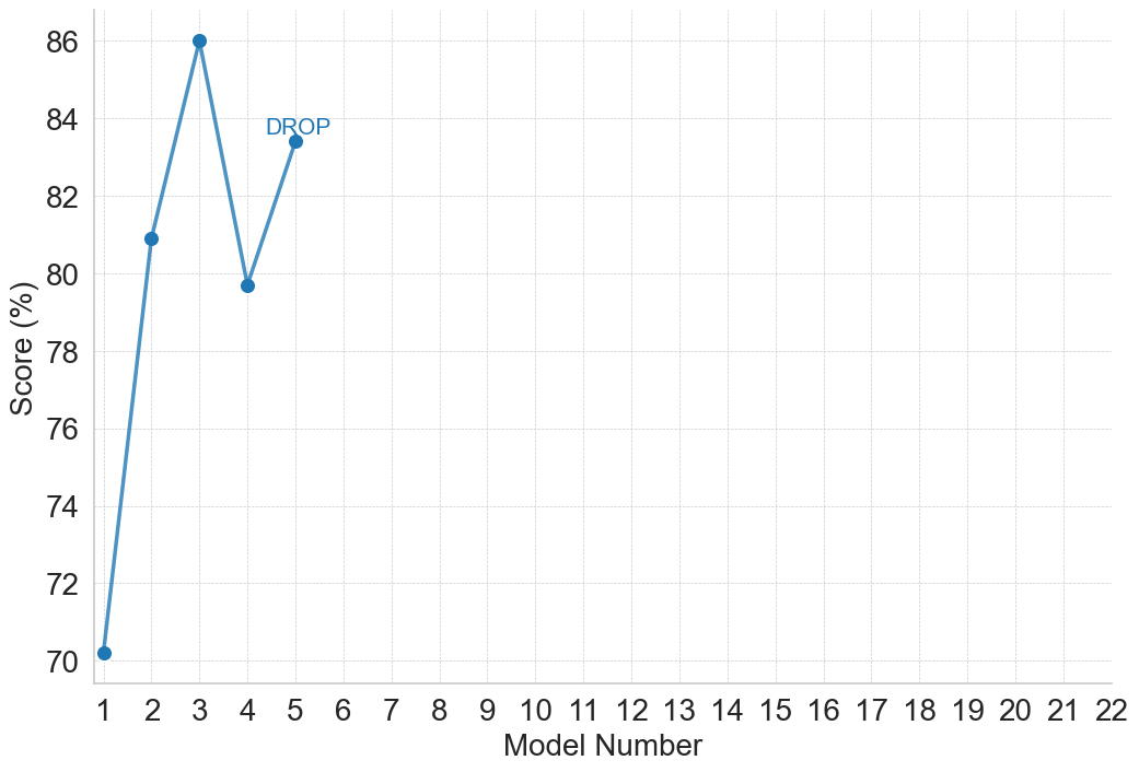
The image displays a line chart plotting the performance scores of five sequential models. The chart features a single data series represented by a blue line with circular markers at each data point. A text annotation "DROP" is placed near the fourth data point, highlighting a specific event in the trend. The chart area is dominated by empty space to the right, as data is only provided for models 1 through 5, while the x-axis extends to model 22.
### Components/Axes
* **Chart Type:** Line chart with data point markers.
* **X-Axis (Horizontal):**
* **Label:** "Model Number"
* **Scale:** Linear, integer values from 1 to 22.
* **Markers:** Major tick marks and labels for every integer from 1 to 22.
* **Y-Axis (Vertical):**
* **Label:** "Score (%)"
* **Scale:** Linear, ranging from 70 to 86.
* **Markers:** Major tick marks and labels at intervals of 2 (70, 72, 74, 76, 78, 80, 82, 84, 86).
* **Data Series:**
* **Color:** Blue (approximately #4a86c8).
* **Representation:** A solid blue line connecting circular blue markers at each data point.
* **Legend:** None present, as there is only one data series.
* **Annotations:**
* The text "DROP" in blue is positioned above and slightly to the right of the data point for Model 4.
* **Grid:** A light gray, dashed grid is present for both major x and y axis intervals.
### Detailed Analysis
**Data Points (Approximate Values):**
The chart contains five distinct data points. Values are estimated based on their position relative to the y-axis grid lines.
1. **Model 1:** Score ≈ 70.0% (The point sits exactly on the 70 grid line).
2. **Model 2:** Score ≈ 81.0% (The point is halfway between the 80 and 82 grid lines).
3. **Model 3:** Score ≈ 86.0% (The point sits exactly on the 86 grid line, the highest value on the chart).
4. **Model 4:** Score ≈ 79.7% (The point is slightly below the 80 grid line. The "DROP" annotation is associated with this point).
5. **Model 5:** Score ≈ 83.5% (The point is between the 82 and 84 grid lines, closer to 84).
**Trend Description:**
The line begins at its lowest point (Model 1, 70%), rises sharply to a peak at Model 3 (86%), then experiences a significant decline to Model 4 (≈79.7%), before recovering partially at Model 5 (≈83.5%). The visual trend is: **Sharp Increase → Peak → Sharp Decrease ("DROP") → Moderate Recovery.**
### Key Observations
1. **Peak Performance:** Model 3 achieves the highest score of 86%.
2. **Significant Drop:** The most notable feature is the performance drop between Model 3 and Model 4, explicitly labeled "DROP". This represents a decrease of approximately 6.3 percentage points.
3. **Partial Recovery:** Model 5 shows a rebound from the drop, but does not return to the peak performance of Model 3.
4. **Data Range:** The provided data only occupies the first quarter of the available x-axis (Models 1-5 of 1-22). The vast empty space from Model 6 to 22 suggests either incomplete data, a focused experiment on early models, or that subsequent models were not evaluated.
5. **Initial Improvement:** There is a substantial 11-percentage-point improvement from Model 1 to Model 2.
### Interpretation
This chart likely tracks the iterative development or testing of a series of models (e.g., machine learning models, algorithm versions). The data suggests a non-linear development path:
* **Early Iterative Gains:** The jump from Model 1 to 2 and then to 3 indicates successful iterations leading to peak performance.
* **Setback or Overfitting:** The annotated "DROP" at Model 4 is critical. It could signify a failed experiment, a change in evaluation criteria, overfitting to a specific test set in Model 3, or the introduction of a new variable that negatively impacted performance. The annotation marks this as a point of interest for investigation.
* **Recovery and Stabilization:** The rise at Model 5 suggests the developers identified and partially corrected the issue from Model 4, though they did not fully regain the previous peak. This pattern is common in optimization processes where a step backward is followed by a more stable advance.
* **Scope of Experiment:** The empty axis from Model 6 onward implies the story is incomplete. It raises questions: Did development stop after Model 5? Are results for later models pending? Was the goal only to test these five specific variants? The chart's narrative is confined to this early, volatile phase of development.
**In summary, the chart documents an initial rapid improvement in model performance, followed by a significant, highlighted setback, and then a partial recovery, all within the first five iterations of a potentially longer sequence.**