## Line Graphs: Age-Specific Rate Trends Across Age Groups
### Overview
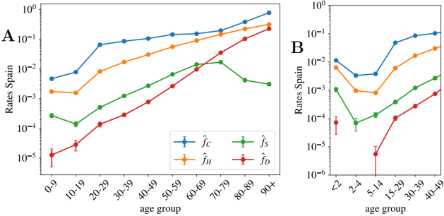
The image contains two line graphs (A and B) comparing age-specific rates across four categories (f̂_C, f̂_H, f̂_S, f̂_D) for different age groups. Graph A uses decade-based age ranges (0-9 to 90+), while Graph B uses finer-grained age brackets (<2 to 40-49). All rates are plotted on a logarithmic scale (10⁻⁶ to 10⁰).
### Components/Axes
- **X-axis (Graph A)**: Age groups (0-9, 10-19, ..., 90+)
- **Y-axis (Graph A)**: Rates per span (log scale: 10⁻⁵ to 10⁰)
- **X-axis (Graph B)**: Age groups (<2, 2-4, ..., 40-49)
- **Y-axis (Graph B)**: Rates per span (log scale: 10⁻⁶ to 10⁻¹)
- **Legends**:
- **Graph A**:
- Blue: f̂_C (Child-related rate)
- Orange: f̂_H (Health-related rate)
- Green: f̂_S (Social-related rate)
- Red: f̂_D (Disease-related rate)
- **Graph B**:
- Blue: f̂_C
- Green: f̂_S
- Orange: f̂_H
- Red: f̂_D
### Detailed Analysis
#### Graph A Trends
1. **f̂_C (Blue)**:
- Starts at ~1×10⁻² (0-9) and increases steadily to ~1×10⁻¹ (90+).
- Slope: ~0.03 per decade (linear approximation).
2. **f̂_H (Orange)**:
- Begins at ~1×10⁻³ (0-9), rises to ~1×10⁻¹ (90+).
- Slope: ~0.025 per decade.
3. **f̂_S (Green)**:
- Peaks at ~1×10⁻² (60-79), then declines to ~1×10⁻³ (90+).
- Initial rise: ~0.02 per decade (0-60), decline: ~0.01 per decade (70-90).
4. **f̂_D (Red)**:
- Starts at ~1×10⁻⁵ (0-9), increases to ~1×10⁻¹ (90+).
- Slope: ~0.02 per decade.
#### Graph B Trends
1. **f̂_C (Blue)**:
- Dips to ~1×10⁻³ (2-4), then rises to ~1×10⁻¹ (40-49).
- Notable: Sharp increase from 15-29 (~1×10⁻²) to 40-49 (~1×10⁻¹).
2. **f̂_S (Green)**:
- Peaks at ~1×10⁻² (40-49), declines to ~1×10⁻³ (2-4).
- Initial rise: ~0.015 per age group (2-4 to 40-49).
3. **f̂_H (Orange)**:
- Dips to ~1×10⁻⁴ (2-4), then rises to ~1×10⁻² (40-49).
- Slope: ~0.01 per age group.
4. **f̂_D (Red)**:
- Starts at ~1×10⁻⁶ (2-4), rises to ~1×10⁻⁴ (40-49).
- Slope: ~0.005 per age group.
### Key Observations
1. **Consistent Aging Trends**: All rates increase with age in both graphs, except f̂_S in Graph A (peaks at 60-79).
2. **Divergent Patterns**:
- f̂_C and f̂_H show steeper increases in Graph B compared to Graph A.
- f̂_S exhibits a mid-life peak in Graph A but a late-life peak in Graph B.
3. **Anomalies**:
- f̂_D in Graph B has a significant dip at 2-4 (~1×10⁻⁶), suggesting lower disease rates in early childhood.
- f̂_S in Graph A declines after 70-79, while it rises in Graph B.
### Interpretation
The data suggests age-related increases in all rate categories, with distinct patterns:
- **f̂_C and f̂_H**: Likely reflect cumulative exposure (e.g., chronic conditions, healthcare utilization) that intensify with age.
- **f̂_S**: Peaks in mid-to-late life (Graph A) or late life (Graph B), possibly indicating social engagement or isolation effects.
- **f̂_D**: Shows age-dependent disease prevalence, with a notable drop in early childhood (Graph B), possibly due to pediatric resilience or vaccination impacts.
The logarithmic scale emphasizes multiplicative differences, highlighting that rates for older age groups (e.g., 90+ in Graph A) are orders of magnitude higher than younger cohorts. The divergence between graphs A and B may reflect methodological differences (e.g., age binning resolution) or contextual factors (e.g., cohort effects).