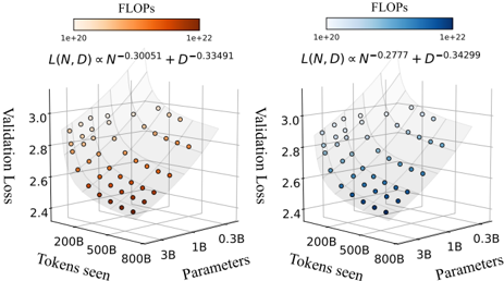
## 3D Scatter Plot: Validation Loss vs. Tokens Seen and Parameters
### Overview
The image contains two side-by-side 3D scatter plots comparing validation loss across different model configurations. Each plot visualizes the relationship between tokens seen (x-axis), parameters (y-axis), and validation loss (z-axis), with computational cost (FLOPs) encoded via color gradients. The left plot uses orange points, while the right uses blue points.
---
### Components/Axes
#### Left Plot (Orange Points)
- **X-axis (Tokens seen)**: 200B → 800B (logarithmic scale)
- **Y-axis (Parameters)**: 0.3B → 3B (logarithmic scale)
- **Z-axis (Validation Loss)**: 2.4 → 3.0
- **Legend**: FLOPs range from 1e+20 (light orange) to 1e+22 (dark orange)
- **Formula**: `L(N, D) ∝ N⁻⁰.³⁰⁰⁵¹ + D⁻⁰.³³⁴⁹¹`
#### Right Plot (Blue Points)
- **X-axis (Tokens seen)**: 200B → 800B (logarithmic scale)
- **Y-axis (Parameters)**: 0.3B → 3B (logarithmic scale)
- **Z-axis (Validation Loss)**: 2.4 → 3.0
- **Legend**: FLOPs range from 1e+20 (light blue) to 1e+22 (dark blue)
- **Formula**: `L(N, D) ∝ N⁻⁰.²⁷⁷⁷ + D⁻⁰.³⁴²⁹⁹`
---
### Detailed Analysis
#### Left Plot (Orange)
- **Data Points**: 25+ points clustered in a descending trend from top-right (high tokens/parameters) to bottom-left (low tokens/parameters).
- **Color Gradient**: Darker orange points (higher FLOPs) correlate with lower validation loss (z-axis).
- **Formula Interpretation**: Validation loss decreases with increasing tokens seen (N) and parameters (D), with stronger sensitivity to D (exponent -0.33491 vs. -0.30051 for N).
#### Right Plot (Blue)
- **Data Points**: 20+ points following a similar descending trend but with tighter clustering.
- **Color Gradient**: Darker blue points (higher FLOPs) also correlate with lower validation loss.
- **Formula Interpretation**: Validation loss decreases with N and D, but with weaker sensitivity to N (exponent -0.2777 vs. -0.34299 for D).
---
### Key Observations
1. **Trend Verification**:
- Both plots show validation loss decreasing as tokens seen and parameters increase.
- Left plot’s trend is steeper (higher exponents), suggesting faster loss reduction per unit increase in N/D.
- Right plot’s data points are more tightly grouped, indicating less variability in loss for similar configurations.
2. **Color-Legend Correlation**:
- Darker colors (higher FLOPs) consistently align with lower validation loss in both plots.
- Example: Left plot’s darkest orange point (1e+22 FLOPs) has validation loss ~2.4, while the lightest (1e+20) has ~2.8.
3. **Axis Scaling**:
- Logarithmic scales for tokens seen and parameters emphasize multiplicative relationships (e.g., 200B → 800B is a 4x increase).
---
### Interpretation
The data demonstrates that **validation loss improves with increased computational resources (FLOPs) and model scale (tokens seen/parameters)**. However, the left plot’s steeper exponents suggest it achieves better optimization efficiency (lower loss per FLOP) compared to the right plot. The right plot’s tighter clustering implies more consistent performance across similar configurations, while the left plot’s broader spread may indicate architectural trade-offs or training instability. The formulas highlight that parameter count (D) has a stronger impact on loss reduction than token count (N) in both cases, aligning with common deep learning scaling laws.