## Bar Chart: Unlabeled Distribution
### Overview
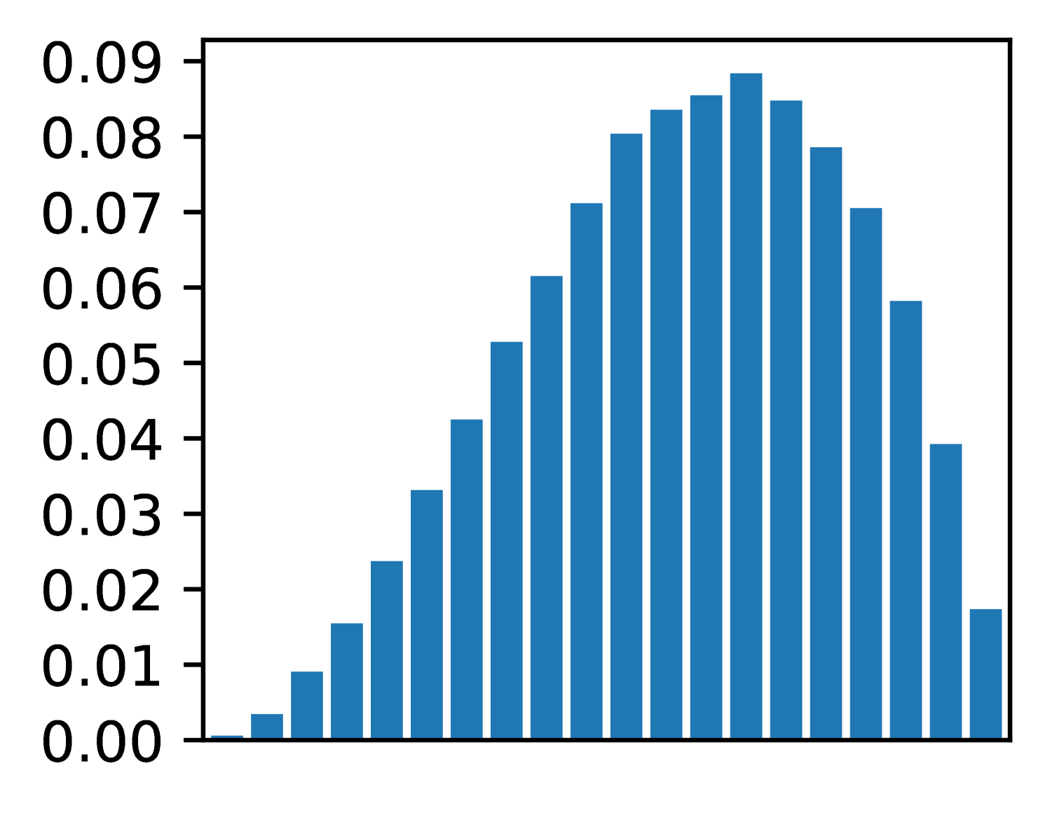
The image displays a vertical bar chart (histogram) showing a unimodal, approximately symmetric distribution of values. The chart consists of 20 blue bars of varying heights plotted against a numerical y-axis. There is no chart title, x-axis label, or legend present.
### Components/Axes
* **Y-Axis:** The vertical axis is labeled with numerical values ranging from `0.00` to `0.09` in increments of `0.01`. The axis line and tick marks are clearly visible on the left side of the chart.
* **X-Axis:** The horizontal axis is present but has **no labels, title, or tick marks**. It serves only as a baseline for the bars.
* **Bars:** There are 20 vertical bars, all of the same solid blue color. They are evenly spaced along the x-axis.
* **Legend:** There is **no legend** in the image.
* **Title:** There is **no title** for the chart.
### Detailed Analysis
The chart depicts a distribution that rises to a central peak and then falls. The trend is as follows:
1. **Ascending Phase:** Starting from the left, the bar heights increase steadily.
2. **Peak:** The distribution reaches its maximum height near the center.
3. **Descending Phase:** After the peak, the bar heights decrease in a roughly mirror-image fashion to the ascent.
**Approximate Bar Heights (from left to right):**
The following table lists the approximate value for each bar, estimated by aligning the top of the bar with the y-axis scale. Uncertainty is ±0.002.
| Bar Position (Left to Right) | Approximate Y-Value |
| :--------------------------- | :------------------ |
| 1 | 0.000 |
| 2 | 0.003 |
| 3 | 0.009 |
| 4 | 0.016 |
| 5 | 0.024 |
| 6 | 0.033 |
| 7 | 0.042 |
| 8 | 0.053 |
| 9 | 0.061 |
| 10 | 0.071 |
| 11 | 0.080 |
| 12 | 0.084 |
| 13 | 0.086 |
| 14 | **0.089 (Peak)** |
| 15 | 0.085 |
| 16 | 0.079 |
| 17 | 0.070 |
| 18 | 0.058 |
| 19 | 0.039 |
| 20 | 0.018 |
### Key Observations
* **Distribution Shape:** The data forms a classic bell-shaped or normal-like distribution.
* **Symmetry:** The distribution is roughly symmetric around the 14th bar (the peak).
* **Peak Location:** The highest frequency (tallest bar) is the 14th bar from the left, with a value of approximately `0.089`.
* **Range:** The values span from near `0.00` to just below `0.09`.
* **Missing Context:** The complete absence of an x-axis label or chart title makes it impossible to determine what variable is being measured or what the categories/bins represent.
### Interpretation
This chart visually demonstrates a dataset where the majority of observations cluster around a central value, with fewer observations at the extremes. The shape is characteristic of many natural and statistical phenomena (e.g., measurement errors, heights of a population).
The **key investigative insight** is the profound lack of context. While the *pattern* of the data is clear, its *meaning* is entirely obscured. The chart shows *that* there is a distribution, but not *what* is distributed. To make this data useful, critical metadata is required: the title of the chart, the label for the x-axis (defining the bins or categories), and the unit of measurement for the y-axis (e.g., probability density, frequency, count). Without this information, the chart is an abstract representation of a distribution pattern only.