## Medical Diagnostic Reasoning Diagram: Diabetes Type II Inference Flow
### Overview
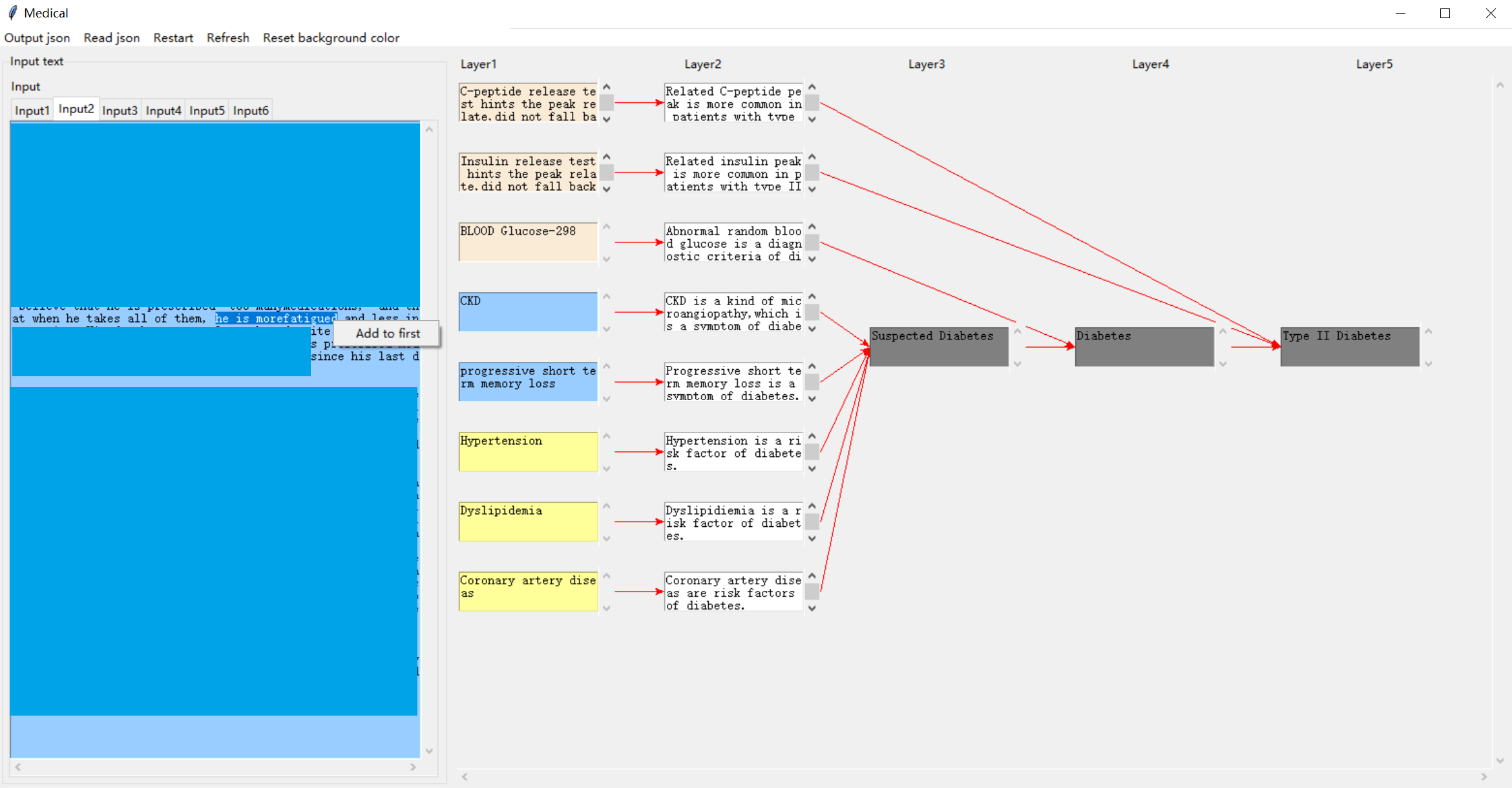
This image is a screenshot of a specialized medical software application titled "Medical." It displays a multi-layered diagnostic reasoning diagram that visually maps clinical evidence (tests, symptoms, risk factors) to a final diagnosis of Type II Diabetes. The interface includes an input text panel on the left and a five-layer flowchart on the right, connected by directional arrows.
### Components/Axes
**Application Interface:**
- **Title Bar:** "Medical"
- **Menu Bar:** Options include "Output json," "Read json," "Restart," "Refresh," "Reset background color."
- **Left Panel ("Input text"):** Contains tabs labeled `Input1` through `Input6`. The active tab (`Input2`) shows a blue text area with partially visible patient notes. A tooltip/context menu labeled "Add to first" is visible.
- **Right Panel (Main Diagram):** Organized into five vertical columns labeled `Layer1`, `Layer2`, `Layer3`, `Layer4`, and `Layer5`.
**Diagram Structure & Color Coding:**
- **Layer1 (Evidence Input):** Contains colored boxes representing clinical data.
- **Beige Boxes (Test Results):**
1. "C-peptide release test hints the peak late did not fall back"
2. "Insulin release test hints the peak late did not fall back"
3. "BLOOD Glucose-298"
- **Blue Boxes (Symptoms/Conditions):**
4. "CKD"
5. "progressive short term memory loss"
- **Yellow Boxes (Risk Factors):**
6. "Hypertension"
7. "Dyslipidemia"
8. "Coronary artery disease"
- **Layer2 (Interpretation):** Each Layer1 box connects via a red arrow to a corresponding white box that interprets the evidence.
- **Layer3 (Intermediate Conclusion):** A single gray box labeled "Suspected Diabetes."
- **Layer4 (Primary Diagnosis):** A single gray box labeled "Diabetes."
- **Layer5 (Specific Diagnosis):** A single gray box labeled "Type II Diabetes."
### Detailed Analysis
**Flow and Connections:**
1. **From Layer1 to Layer2:** Each piece of evidence is interpreted.
- C-peptide test → "Related C-peptide peak is more common in patients with type II"
- Insulin test → "Related insulin peak is more common in patients with type II"
- Blood Glucose-298 → "Abnormal random blood glucose is a diagnostic criteria of diabetes"
- CKD → "CKD is a kind of microangiopathy, which is a symptom of diabetes"
- Memory loss → "Progressive short term memory loss is a symptom of diabetes"
- Hypertension → "Hypertension is a risk factor of diabetes"
- Dyslipidemia → "Dyslipidemia is a risk factor of diabetes"
- Coronary artery disease → "Coronary artery disease are risk factors of diabetes"
2. **From Layer2 to Layer3 (Suspected Diabetes):** All Layer2 interpretations **except the first two** (C-peptide and Insulin) have red arrows converging on the "Suspected Diabetes" box. This indicates that symptoms and risk factors collectively raise suspicion.
3. **From Layer3 to Layer4 to Layer5 (Diagnostic Chain):** A linear path: "Suspected Diabetes" → "Diabetes" → "Type II Diabetes."
4. **Direct Path to Specific Diagnosis:** The first two Layer2 boxes (C-peptide and Insulin interpretations) have red lines that **bypass Layers 3 and 4**, connecting directly to the "Type II Diabetes" box in Layer5. This signifies that these specific test results are strong, direct indicators for Type II Diabetes specifically.
**Input Text Fragment (Left Panel):**
Visible text in the `Input2` tab includes:
- "...believe that he is prescribed too many medications, and..."
- "...at when he takes all of them, he is more fatigued and less in..."
- "...s pl... since his last d..."
This suggests the input is a patient history note describing polypharmacy and fatigue, which are clinically relevant to the diagnostic process.
### Key Observations
1. **Hierarchical Reasoning:** The diagram models a diagnostic thought process, moving from raw data (Layer1) to interpretation (Layer2), to a working hypothesis (Layer3), to a general diagnosis (Layer4), and finally to a specific subtype (Layer5).
2. **Evidence Weighting:** The system visually differentiates the strength of evidence. Symptoms and risk factors (blue/yellow) lead to suspicion, while specific metabolic test results (beige) provide a direct path to the final diagnosis.
3. **Clinical Logic:** The interpretations in Layer2 correctly link the evidence to diabetes pathology (e.g., CKD as a microangiopathy, hypertension as a risk factor).
4. **Data Point:** A specific lab value is noted: "BLOOD Glucose-298" (presumably mg/dL), which is a markedly high random glucose level, a key diagnostic criterion.
### Interpretation
This diagram represents a **clinical decision support system** or a **knowledge graph** for diabetes diagnosis. It demonstrates how disparate clinical data points are synthesized through a logical, layered inference engine.
- **What it suggests:** The patient profile likely includes elevated blood glucose, abnormal C-peptide/insulin response patterns, and comorbid conditions (CKD, hypertension, etc.). The system concludes this constellation of findings is most consistent with **Type II Diabetes**.
- **Relationships:** The flowchart explicitly shows that while many factors contribute to a general suspicion of diabetes, the **C-peptide and insulin release test patterns** are treated as highly specific biomarkers for the Type II subtype, warranting a direct diagnostic link.
- **Notable Anomaly/Insight:** The direct connection from the C-peptide/Insulin tests to the final diagnosis, bypassing intermediate steps, highlights a key diagnostic principle: these tests can differentiate Type II from Type I diabetes (where C-peptide is typically low). The system encodes this medical knowledge directly into its visual logic.
- **Purpose:** The tool likely aids in standardizing diagnostic reasoning, ensuring all relevant evidence is considered, and providing a transparent, auditable trail from data to conclusion. The "Output json" menu option suggests the reasoning process can be exported as structured data.