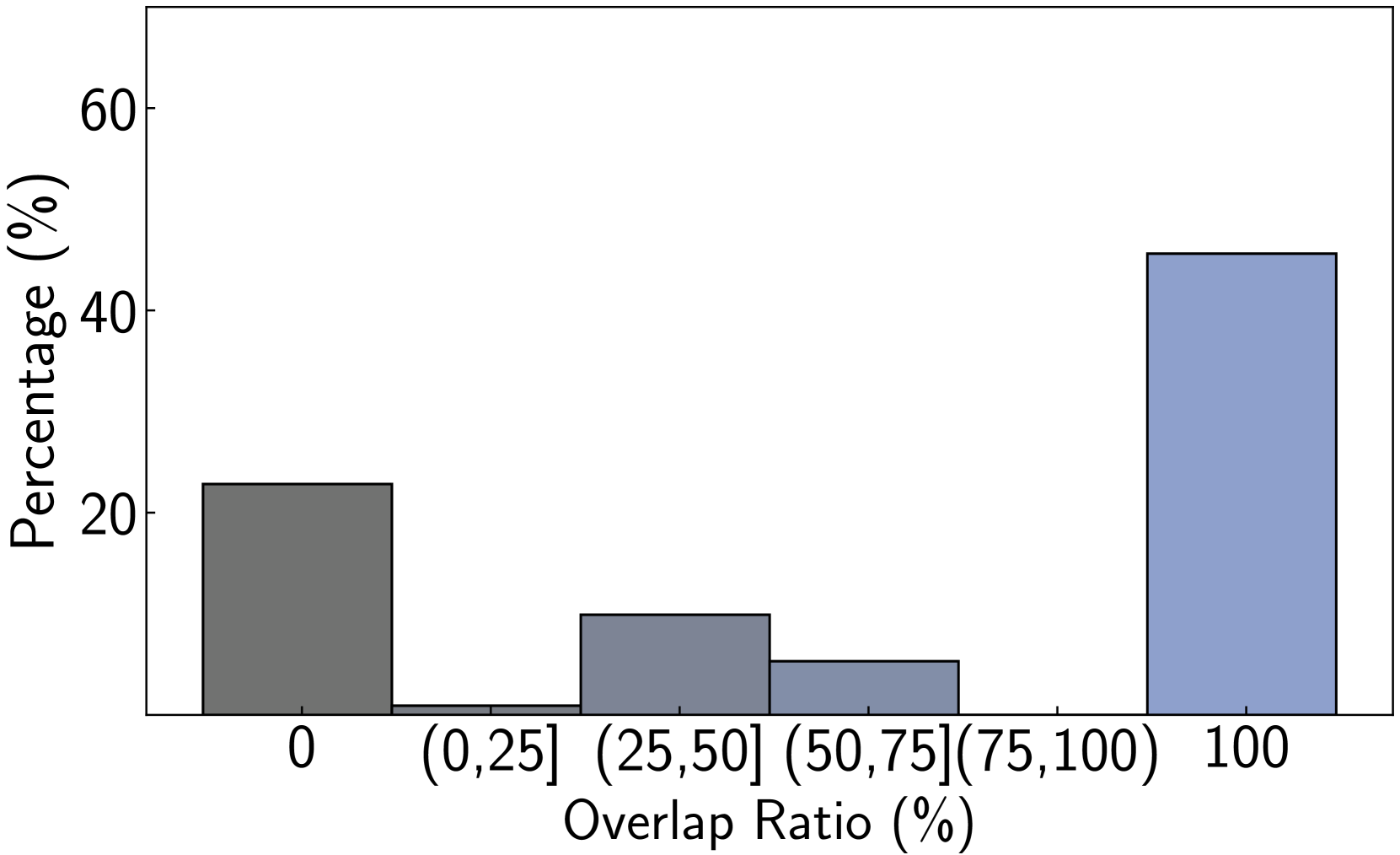
## Bar Chart: Distribution of Overlap Ratio (%)
### Overview
This image is a bar chart displaying the distribution of an "Overlap Ratio (%)" across different categories. The y-axis represents the "Percentage (%)", and the x-axis represents the "Overlap Ratio (%)" categorized into bins.
### Components/Axes
* **Y-axis Title**: "Percentage (%)"
* **Scale**: Increments of 20, with markers at 0, 20, 40, and 60. The scale appears to extend slightly beyond 60.
* **X-axis Title**: "Overlap Ratio (%)"
* **Categories/Bins**:
* `0` (represented by a single bar)
* `(0,25]` (represented by a single bar)
* `(25,50]` (represented by a single bar)
* `(50,75]` (represented by a single bar)
* `(75,100]` (This bin appears to be empty or has a value of 0, as no bar is present)
* `100` (represented by a single bar)
### Detailed Analysis
The chart displays five distinct bars, each representing a specific range or value of the Overlap Ratio.
1. **Overlap Ratio = 0 (%)**:
* **Color**: Dark Grey
* **Trend**: This is the first bar on the left.
* **Value**: The top of the bar aligns with the `20` mark on the y-axis. Therefore, the percentage is approximately **22%** (slightly above 20%).
2. **Overlap Ratio = (0,25] (%)**:
* **Color**: Medium Grey
* **Trend**: This bar is positioned to the right of the first bar.
* **Value**: The top of the bar aligns with a value slightly above the `10` mark on the y-axis, approximately **12%**.
3. **Overlap Ratio = (25,50] (%)**:
* **Color**: Medium Grey
* **Trend**: This bar is positioned to the right of the previous bar.
* **Value**: The top of the bar aligns with a value slightly below the `10` mark on the y-axis, approximately **8%**.
4. **Overlap Ratio = (50,75] (%)**:
* **Color**: Medium Grey
* **Trend**: This bar is positioned to the right of the previous bar.
* **Value**: The top of the bar aligns with a value slightly above the `0` mark and below the `10` mark, approximately **4%**.
5. **Overlap Ratio = 100 (%)**:
* **Color**: Light Blue
* **Trend**: This bar is positioned to the far right, separated from the other bars.
* **Value**: The top of the bar aligns with the `40` mark and extends slightly above it, approximately **45%**.
**Note on Colors**: The bars for overlap ratios `(0,25]`, `(25,50]`, and `(50,75]` share a similar medium grey color. The bar for `0` is a darker grey, and the bar for `100` is a distinct light blue.
### Key Observations
* The highest percentage of overlap ratio is observed at **100%**, accounting for approximately **45%**.
* The second highest percentage is for an overlap ratio of **0%**, accounting for approximately **22%**.
* The overlap ratios between **0% and 75%** (excluding 0% and 100%) show a decreasing trend in percentage as the ratio increases. Specifically:
* `(0,25]` has ~12%
* `(25,50]` has ~8%
* `(50,75]` has ~4%
* There is a significant gap in the data between the `(50,75]` bin and the `100` bin, with no data represented for the `(75,100]` range.
### Interpretation
This bar chart suggests a bimodal distribution of the "Overlap Ratio (%)". There are two prominent peaks: one at an overlap ratio of **0%** (approximately 22%) and another at an overlap ratio of **100%** (approximately 45%). The intermediate overlap ratios between 0% and 75% show a declining frequency.
The data implies that the observed phenomena or entities tend to either have no overlap or a complete overlap. The low percentages in the intermediate ranges suggest that partial overlaps are less common. The distinct separation of the dark grey bar (0%) and the light blue bar (100%) from the medium grey bars (intermediate ranges) might indicate different underlying mechanisms or categories contributing to these specific overlap ratios. The absence of data for the `(75,100]` range is notable and could be an artifact of the data collection or represent a genuine lack of occurrences in that specific interval.