## Bar Chart: Distribution of Overlap Ratios
### Overview
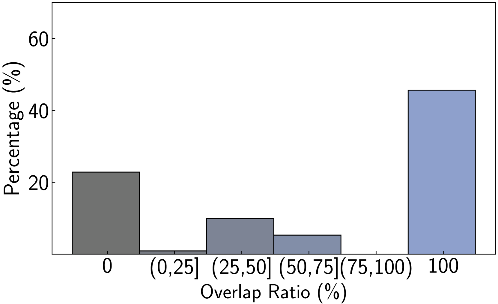
The image is a bar chart displaying the percentage distribution of items across different categories of "Overlap Ratio." The chart shows a bimodal distribution with the highest percentages at the extreme ends of the scale (0% and 100% overlap) and significantly lower percentages in the intermediate ranges.
### Components/Axes
* **Chart Type:** Vertical Bar Chart (Histogram-like bins).
* **Y-Axis:**
* **Label:** "Percentage (%)"
* **Scale:** Linear scale from 0 to 60, with major tick marks at 0, 20, 40, and 60.
* **X-Axis:**
* **Label:** "Overlap Ratio (%)"
* **Categories/Bins:** Six distinct categories are labeled:
1. `0`
2. `(0,25]` (greater than 0%, up to and including 25%)
3. `(25,50]` (greater than 25%, up to and including 50%)
4. `(50,75]` (greater than 50%, up to and including 75%)
5. `(75,100)` (greater than 75%, up to but not including 100%)
6. `100`
* **Legend:** No separate legend is present. The bars are differentiated by position and a subtle color gradient from dark gray (left) to light blue-gray (right).
### Detailed Analysis
The chart presents the following approximate percentage values for each overlap ratio category. Values are estimated based on the bar heights relative to the y-axis scale.
1. **Category `0` (Leftmost bar, dark gray):** The bar height is slightly above the 20% mark. **Approximate Value: 22%**.
2. **Category `(0,25]` (Second bar from left, medium gray):** This is the shortest bar, barely visible above the baseline. **Approximate Value: ~1%**.
3. **Category `(25,50]` (Third bar, medium gray):** The bar height is halfway between 0 and 20%. **Approximate Value: 10%**.
4. **Category `(50,75]` (Fourth bar, medium-light gray):** The bar height is about a quarter of the way to 20%. **Approximate Value: 5%**.
5. **Category `(75,100)` (Fifth bar, light gray):** This bar is extremely short, similar to the `(0,25]` category. **Approximate Value: ~0.5%**.
6. **Category `100` (Rightmost bar, light blue-gray):** This is the tallest bar, extending above the 40% mark. **Approximate Value: 45%**.
**Trend Verification:** The visual trend is not linear. It starts high at 0%, drops dramatically for the next bin, rises slightly for the middle bins, drops again, and then spikes to its maximum at 100%. This creates a clear "U-shaped" or bimodal pattern.
### Key Observations
* **Bimodal Dominance:** The distribution is heavily polarized. The two extreme categories (`0` and `100`) together account for approximately **67%** of the total (22% + 45%).
* **Sparse Middle:** The intermediate overlap ranges contain very few items. The combined percentage for all bins from `(0,25]` through `(75,100)` is only about **16.5%**.
* **Notable Gap:** The `(75,100)` category is nearly empty, suggesting that cases with very high but not complete overlap are exceptionally rare in this dataset.
* **Color Coding:** The bars use a grayscale-to-blue gradient, with the leftmost (`0`) being the darkest and the rightmost (`100`) being the lightest and most distinct in hue (blue-gray).
### Interpretation
This chart demonstrates a strong **polarization effect** in the measured overlap. The data suggests that the entities being compared tend to either have **no overlap at all** or **complete, perfect overlap**, with very few instances falling in between.
This pattern is significant and could imply several scenarios depending on the context (which is not provided in the image):
1. **Binary Nature of the Phenomenon:** The process generating this data may have a natural tendency toward all-or-nothing outcomes. For example, in document comparison, this could indicate that documents are either identical copies or completely unrelated.
2. **Threshold Effect:** There might be a system or mechanism that pushes outcomes toward the extremes, preventing partial overlaps from being stable or common.
3. **Data Artifact:** If this represents matching or alignment data, it could suggest that the matching algorithm is highly confident in either a perfect match or no match, but struggles with ambiguous, partial cases.
The near-absence of data in the `(75,100)` range is a critical anomaly. It indicates that achieving a very high degree of overlap without reaching 100% is an unlikely or unstable state in this system. The overall message is one of dichotomy, not gradation.