\n
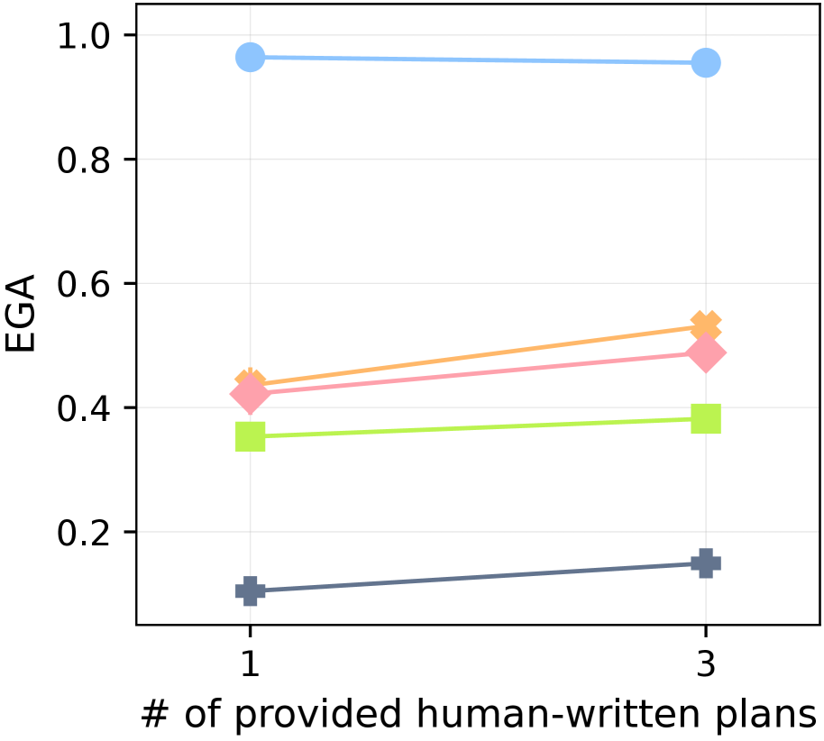
## Line Chart: EGA vs. Number of Provided Human-Written Plans
### Overview
This is a line chart plotting the performance metric "EGA" against the number of provided human-written plans. The chart compares five distinct data series, each represented by a unique color and marker shape, across two data points on the x-axis (1 and 3 plans). The overall trend shows that for most series, EGA increases as the number of provided plans increases from 1 to 3.
### Components/Axes
* **X-Axis (Horizontal):**
* **Label:** "# of provided human-written plans"
* **Scale/Markers:** Discrete values at `1` and `3`.
* **Y-Axis (Vertical):**
* **Label:** "EGA"
* **Scale:** Linear scale ranging from `0.0` to `1.0`, with major gridlines at intervals of 0.2 (0.0, 0.2, 0.4, 0.6, 0.8, 1.0).
* **Data Series (Legend inferred from visual markers):**
* **Blue Line with Circle Markers:** Positioned at the top of the chart.
* **Orange Line with Diamond Markers:** Positioned in the middle-upper range.
* **Pink Line with Diamond Markers:** Positioned just below the orange line.
* **Light Green Line with Square Markers:** Positioned in the middle-lower range.
* **Dark Gray/Blue Line with Plus (+) Markers:** Positioned at the bottom of the chart.
### Detailed Analysis
**Data Series Trends and Approximate Values:**
1. **Blue Line (Circle Markers):**
* **Trend:** Nearly flat, showing a very slight decrease.
* **Value at x=1:** ~0.96
* **Value at x=3:** ~0.95
2. **Orange Line (Diamond Markers):**
* **Trend:** Clear upward slope.
* **Value at x=1:** ~0.44
* **Value at x=3:** ~0.53
3. **Pink Line (Diamond Markers):**
* **Trend:** Clear upward slope, parallel to but slightly below the orange line.
* **Value at x=1:** ~0.42
* **Value at x=3:** ~0.49
4. **Light Green Line (Square Markers):**
* **Trend:** Slight upward slope.
* **Value at x=1:** ~0.35
* **Value at x=3:** ~0.38
5. **Dark Gray/Blue Line (Plus Markers):**
* **Trend:** Clear upward slope.
* **Value at x=1:** ~0.10
* **Value at x=3:** ~0.15
### Key Observations
* **Performance Hierarchy:** There is a consistent and significant performance gap between the series. The blue series performs near the ceiling (EGA ~0.95), while the dark gray series performs near the floor (EGA ~0.10-0.15).
* **Positive Correlation:** Four out of five series (Orange, Pink, Green, Dark Gray) show a positive correlation between the number of provided human-written plans and EGA. The improvement is most pronounced for the Orange and Pink series.
* **Diminishing Returns for Top Performer:** The highest-performing (Blue) series shows negligible change, suggesting it may already be at or near optimal performance with just one plan.
* **Clustering:** The Orange and Pink series are closely clustered, as are the Green and Dark Gray series at a lower tier.
### Interpretation
The chart demonstrates that providing more human-written plans (increasing from 1 to 3) generally leads to improved performance as measured by EGA for most methods or models tested. This suggests that access to multiple reference plans provides beneficial guidance.
However, the impact is not uniform. The method represented by the blue line is highly effective even with a single plan, indicating robustness or superior underlying capability. The methods in the middle (Orange, Pink) benefit significantly from additional plans, showing they can effectively leverage extra guidance. The lower-performing methods (Green, Dark Gray) also improve but remain in a lower performance bracket, suggesting fundamental limitations that additional plans alone cannot overcome.
The data implies a strategic insight: for systems already performing at a high level (Blue), investing in more human-written plans yields minimal return. For mid-tier systems, providing 3 plans instead of 1 offers a clear performance boost. For lower-tier systems, while more plans help, other improvements to the core method may be necessary for substantial gains.