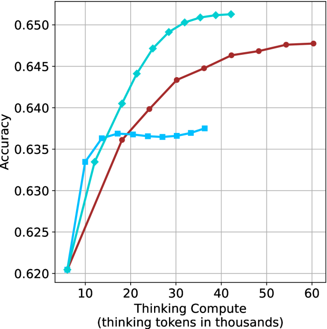
## Line Chart: Accuracy vs. Thinking Compute
### Overview
The image is a line chart that plots accuracy against thinking compute (measured in thousands of thinking tokens). There are three distinct data series represented by lines of different colors (light blue, brown, and a darker blue). The chart illustrates how accuracy changes with increasing thinking compute for each series.
### Components/Axes
* **X-axis:** "Thinking Compute (thinking tokens in thousands)". The scale ranges from approximately 5 to 60, with tick marks at intervals of 10.
* **Y-axis:** "Accuracy". The scale ranges from 0.620 to 0.650, with tick marks at intervals of 0.005.
* **Data Series:**
* Light Blue (with diamond markers): This line represents one data series.
* Brown (with circle markers): This line represents another data series.
* Darker Blue (with square markers): This line represents a third data series.
### Detailed Analysis
* **Light Blue (Diamond Markers):**
* Trend: The line slopes sharply upward initially, then gradually flattens out.
* Data Points:
* (5, 0.620)
* (10, 0.634)
* (15, 0.641)
* (20, 0.647)
* (25, 0.651)
* (30, 0.652)
* (35, 0.652)
* (40, 0.653)
* **Brown (Circle Markers):**
* Trend: The line slopes upward, with a less steep slope than the light blue line.
* Data Points:
* (5, 0.620)
* (20, 0.637)
* (30, 0.644)
* (40, 0.647)
* (50, 0.648)
* (60, 0.648)
* **Darker Blue (Square Markers):**
* Trend: The line slopes upward initially, then flattens out to a nearly horizontal line.
* Data Points:
* (5, 0.633)
* (10, 0.636)
* (15, 0.637)
* (20, 0.637)
* (25, 0.637)
* (30, 0.637)
* (35, 0.638)
* (40, 0.638)
### Key Observations
* The light blue line (diamond markers) achieves the highest accuracy among the three series.
* The darker blue line (square markers) plateaus at a lower accuracy level compared to the other two.
* All three lines show an increase in accuracy with increasing thinking compute, but the rate of increase varies.
### Interpretation
The chart suggests that increasing thinking compute generally leads to higher accuracy, but the extent of improvement depends on the specific data series (likely representing different models or configurations). The light blue series demonstrates the most significant improvement in accuracy with increasing compute, while the darker blue series plateaus quickly, indicating diminishing returns beyond a certain compute level. The brown series shows a steady, moderate increase in accuracy. The data implies that the light blue configuration is the most effective in leveraging increased thinking compute to achieve higher accuracy.