## Line Chart: Accuracy vs. Thinking Compute
### Overview
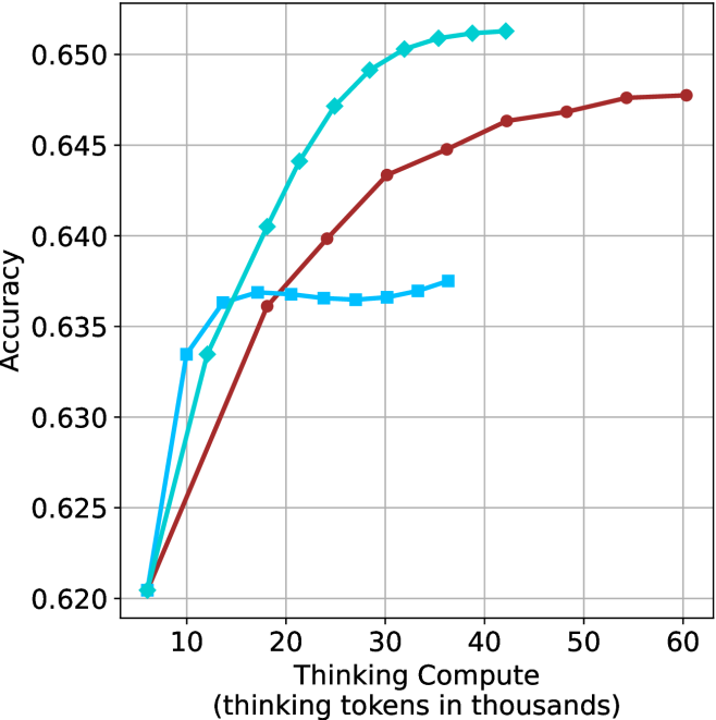
This chart illustrates the relationship between "Thinking Compute" (measured in thousands of thinking tokens) and model "Accuracy." It compares three distinct data series, each represented by a unique color and marker shape. All three series originate from a common baseline point and diverge as compute increases, demonstrating different performance scaling behaviors.
### Components/Axes
* **Y-Axis:** Labeled "Accuracy." The scale ranges from 0.620 to 0.650, with major grid lines at 0.005 intervals.
* **X-Axis:** Labeled "Thinking Compute (thinking tokens in thousands)." The scale ranges from 10 to 60, with major grid lines at 10-unit intervals. The data series begin at an implicit value of approximately 6.
* **Data Series (No explicit legend provided):**
* **Cyan Line (Diamond Markers):** Represents the highest-performing series.
* **Dark Red Line (Circle Markers):** Represents the longest-running series in terms of compute.
* **Medium Blue Line (Square Markers):** Represents the series that exhibits early saturation.
### Detailed Analysis
All three series begin at approximately **(6, 0.620)**.
**1. Cyan Line (Diamond Markers)**
* **Trend:** This series shows the steepest upward trajectory, indicating the highest efficiency in gaining accuracy per unit of compute. It rises sharply until approximately 30k tokens, after which the rate of improvement slows, plateauing near 42k tokens.
* **Key Data Points (Approximate):**
* Start: (6, 0.620)
* (12, 0.633)
* (18, 0.640)
* (24, 0.647)
* (30, 0.650)
* End: (42, 0.651)
**2. Dark Red Line (Circle Markers)**
* **Trend:** This series shows a steady, monotonic increase in accuracy. It does not rise as steeply as the Cyan line initially, but it continues to improve consistently across the entire X-axis range provided.
* **Key Data Points (Approximate):**
* Start: (6, 0.620)
* (18, 0.636)
* (30, 0.643)
* (42, 0.646)
* (54, 0.648)
* End: (60, 0.648)
**3. Medium Blue Line (Square Markers)**
* **Trend:** This series shows a rapid initial increase in accuracy, similar to the Cyan line, but hits a performance ceiling (plateau) very early, around 15k tokens. It remains relatively flat for the remainder of the chart.
* **Key Data Points (Approximate):**
* Start: (6, 0.620)
* (10, 0.633)
* (14, 0.636)
* (18, 0.637)
* (36, 0.637)
### Key Observations
* **Performance Ceiling:** The Medium Blue series (Squares) demonstrates clear diminishing returns, effectively capping its accuracy at ~0.637 regardless of additional compute beyond 15k tokens.
* **Efficiency Leader:** The Cyan series (Diamonds) is the most efficient, achieving the highest accuracy (0.651) with significantly less compute than the Dark Red series.
* **Scaling Potential:** The Dark Red series (Circles) is the only one that does not show a clear plateau within the visible range, suggesting it might continue to improve if more compute were allocated, though it currently trails the Cyan series in absolute accuracy.
### Interpretation
This chart likely represents a comparison of different inference-time compute strategies or model architectures.
* **The Medium Blue strategy** appears to be a baseline or a constrained approach that is insufficient for complex tasks requiring deeper reasoning, as it saturates quickly.
* **The Cyan strategy** represents an optimized approach, likely utilizing a more effective search or reasoning algorithm, as it achieves superior accuracy with lower compute requirements.
* **The Dark Red strategy** represents a "slow and steady" approach. While it is less efficient than the Cyan strategy, its lack of a plateau suggests it may be more robust or scalable for tasks where additional compute can be traded for marginal gains in accuracy.
The data demonstrates that simply increasing "thinking tokens" is not universally beneficial; the *method* of utilizing that compute (represented by the different series) is the primary determinant of the accuracy ceiling.