\n
## Scatter Plots: Work Effect vs. Work Index & Temperature Effect vs. Temperature
### Overview
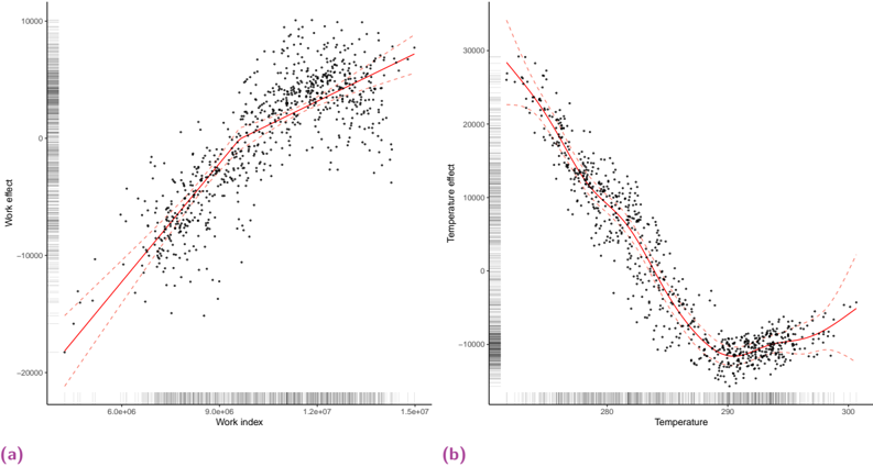
The image presents two scatter plots, labeled (a) and (b). Plot (a) displays the relationship between "Work effect" and "Work index". Plot (b) shows the relationship between "Temperature effect" and "Temperature". Both plots include a fitted red curve attempting to model the data. The data points are represented as black dots.
### Components/Axes
**Plot (a):**
* **X-axis:** "Work index" ranging from approximately 5.0e+06 to 1.5e+07.
* **Y-axis:** "Work effect" ranging from approximately -20000 to 10000.
* No legend is present. The red line represents a fitted curve.
**Plot (b):**
* **X-axis:** "Temperature" ranging from approximately 270 to 300.
* **Y-axis:** "Temperature effect" ranging from approximately -20000 to 30000.
* No legend is present. The red line represents a fitted curve.
### Detailed Analysis or Content Details
**Plot (a): Work Effect vs. Work Index**
The data points show a generally upward trend, but with significant scatter. The red fitted curve appears to be a polynomial function.
* At Work Index ≈ 5.0e+06, Work Effect ≈ -15000.
* At Work Index ≈ 7.0e+06, Work Effect ≈ -5000.
* At Work Index ≈ 9.0e+06, Work Effect ≈ 5000.
* At Work Index ≈ 1.1e+07, Work Effect ≈ 15000.
* At Work Index ≈ 1.3e+07, Work Effect ≈ 25000.
* At Work Index ≈ 1.5e+07, Work Effect ≈ 30000.
**Plot (b): Temperature Effect vs. Temperature**
The data points exhibit a curved relationship, initially increasing and then decreasing. The red fitted curve appears to be a polynomial function.
* At Temperature ≈ 270, Temperature Effect ≈ 25000.
* At Temperature ≈ 275, Temperature Effect ≈ 20000.
* At Temperature ≈ 280, Temperature Effect ≈ 15000.
* At Temperature ≈ 285, Temperature Effect ≈ 10000.
* At Temperature ≈ 290, Temperature Effect ≈ 5000.
* At Temperature ≈ 295, Temperature Effect ≈ 0.
* At Temperature ≈ 300, Temperature Effect ≈ -5000.
### Key Observations
* Both plots show non-linear relationships between the variables.
* The scatter in both plots is substantial, indicating a weak to moderate correlation.
* The fitted curves attempt to capture the general trend but do not perfectly represent all data points.
* Plot (b) shows a clear peak in "Temperature effect" around a temperature of 290.
### Interpretation
The plots suggest that both "Work effect" and "Temperature effect" are influenced by their respective index/temperature values, but the relationships are complex and not strictly linear. The fitted curves represent attempts to model these relationships, but the significant scatter indicates that other factors likely contribute to the observed effects.
In Plot (a), the increasing "Work effect" with increasing "Work index" could indicate a positive correlation between the two variables, but the scatter suggests that this relationship is not deterministic.
In Plot (b), the bell-shaped curve suggests an optimal temperature around 290 where the "Temperature effect" is maximized. Beyond this temperature, the effect decreases. This could represent a process that is most efficient within a specific temperature range. The data suggests a parabolic relationship.
The absence of error bars or statistical measures makes it difficult to assess the significance of these observations. Further analysis would be needed to determine the underlying mechanisms driving these relationships and to quantify the uncertainty associated with the fitted curves.