\n
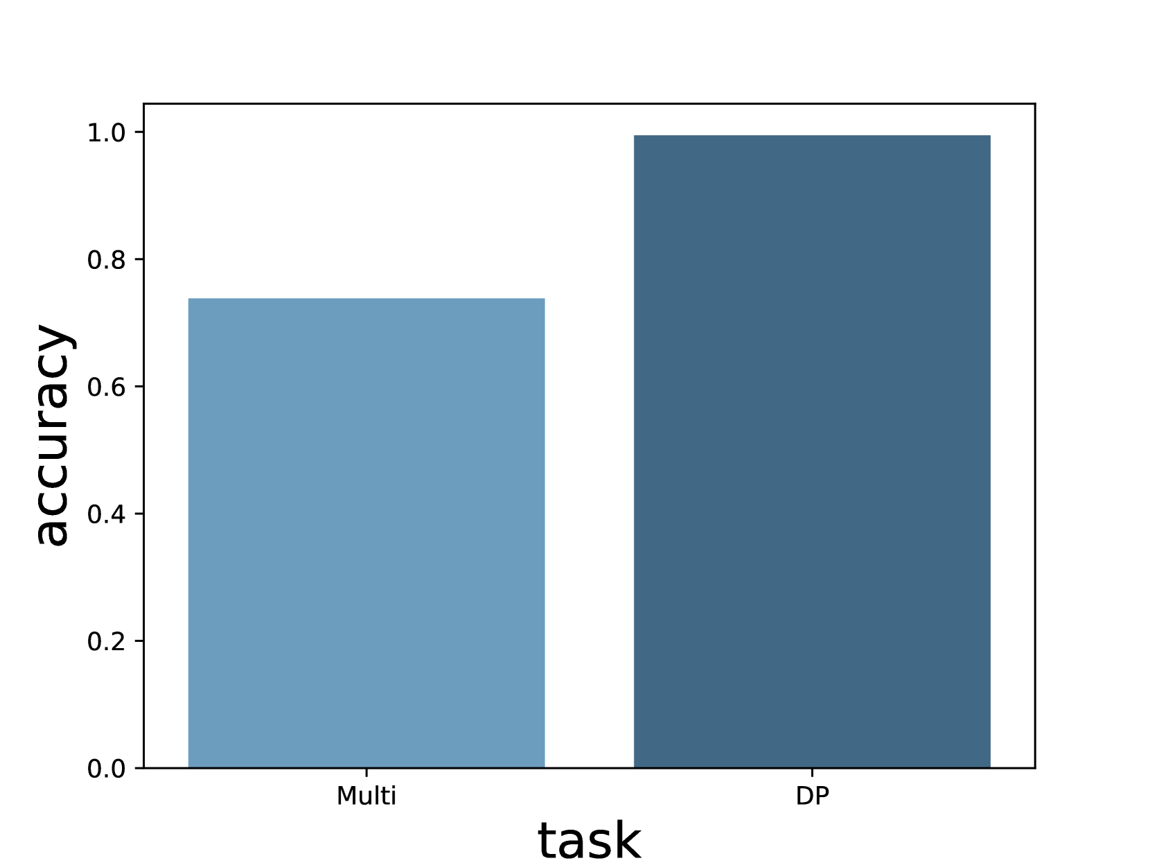
## Bar Chart: Accuracy vs. Task
### Overview
This image presents a bar chart comparing the accuracy achieved on two different tasks: "Multi" and "DP". The y-axis represents accuracy, ranging from 0.0 to 1.0, while the x-axis represents the task type.
### Components/Axes
* **X-axis Label:** "task"
* **Y-axis Label:** "accuracy"
* **X-axis Categories:** "Multi", "DP"
* **Y-axis Scale:** Linear, from approximately 0.0 to 1.0, with increments of 0.2.
* **Bars:** Two bars, one for each task. The bars are a uniform blue color.
### Detailed Analysis
The bar chart displays the accuracy for each task.
* **Multi Task:** The bar for the "Multi" task reaches approximately 0.73 on the accuracy scale.
* **DP Task:** The bar for the "DP" task reaches approximately 1.0 on the accuracy scale.
The "DP" task bar is significantly taller than the "Multi" task bar, indicating a higher accuracy.
### Key Observations
The accuracy for the "DP" task is substantially higher than the accuracy for the "Multi" task. The "DP" task appears to have near-perfect accuracy.
### Interpretation
The data suggests that the model or system being evaluated performs significantly better on the "DP" task compared to the "Multi" task. This could be due to several factors:
* **Task Complexity:** The "DP" task might be inherently simpler than the "Multi" task.
* **Data Quality:** The data used for training or evaluation might be of higher quality for the "DP" task.
* **Model Suitability:** The model might be better suited for the "DP" task than the "Multi" task.
Further investigation would be needed to determine the underlying reasons for this performance difference. The near-perfect accuracy on the "DP" task is notable and could indicate a well-optimized solution for that specific problem. The relatively lower accuracy on the "Multi" task suggests potential areas for improvement.