## Scatter Plot with Confidence Intervals: EFER Analysis
### Overview
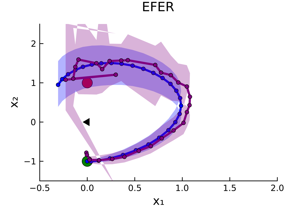
The image depicts a 2D scatter plot with two overlaid data series (blue and purple) and shaded confidence intervals. The plot is titled "EFER" and includes axis labels (X₁, X₂), a legend, and annotations. The data points form curved trajectories, with one series showing greater variability than the other.
### Components/Axes
- **Axes**:
- X-axis (X₁): Ranges from -0.5 to 2.0 in increments of 0.5.
- Y-axis (X₂): Ranges from -1 to 2 in increments of 1.
- **Legend**:
- **Series 1**: Blue line with light blue shading (confidence interval).
- **Series 2**: Purple line with light purple shading (confidence interval).
- **Annotations**:
- Black triangle pointing to a data point on Series 1 near (X₁=0.2, X₂=1.2).
- Green circle highlighting the origin (X₁=0, X₂=0).
### Detailed Analysis
1. **Series 1 (Blue)**:
- Starts at the origin (X₁=0, X₂=0).
- Curves upward, peaking near (X₁=0.5, X₂=1.5).
- Declines slightly after X₁=0.5, ending near (X₁=1.5, X₂=0.5).
- Confidence interval (shaded area) is narrowest near the origin and widens slightly toward the peak.
2. **Series 2 (Purple)**:
- Begins below Series 1 at (X₁=0, X₂=-1).
- Rises steeply, surpassing Series 1 near (X₁=0.3, X₂=0.5).
- Peaks at (X₁=1.0, X₂=1.8), then declines sharply.
- Confidence interval is consistently wider than Series 1, indicating higher variability.
3. **Data Points**:
- Both series include marked data points (circles) along their trajectories.
- Series 1 has a larger circle at (X₁=0.2, X₂=1.2), annotated by the black triangle.
- Series 2 has a larger circle at its peak (X₁=1.0, X₂=1.8).
### Key Observations
- **Divergence**: Series 2 overtakes Series 1 after X₁=0.3, suggesting a shift in behavior or interaction between the two variables.
- **Annotation Significance**: The black triangle highlights a local maximum for Series 1, potentially indicating a critical threshold or inflection point.
- **Variability**: Series 2’s wider confidence intervals suggest greater uncertainty or noise in its measurements compared to Series 1.
### Interpretation
The plot likely represents two competing or complementary processes (e.g., biological pathways, economic models) over a variable X₁. The divergence between Series 1 and 2 after X₁=0.3 implies a qualitative change in their relationship, such as one process dominating the other. The annotated point on Series 1 may represent a key observation (e.g., maximum efficiency, critical failure). The wider confidence intervals for Series 2 could reflect measurement challenges or inherent system complexity. The green circle at the origin might denote a baseline or reference state for both series.