\n
## Line Charts: Time Series Data - Available, Charging, Other
### Overview
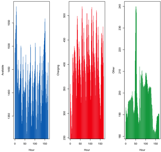
The image presents three separate line charts, each depicting a time series. The charts share a common x-axis representing "Hour" (ranging from 0 to approximately 150), but each has a unique y-axis representing a different metric: "Available" (in blue), "Charging" (in red), and "Other" (in green). All three charts appear to represent data collected over the same time period.
### Components/Axes
* **X-axis (all charts):** "Hour", ranging from 0 to approximately 150. The scale is linear.
* **Y-axis (Chart 1):** "Available", ranging from approximately 1450 to 1550. The scale is linear.
* **Y-axis (Chart 2):** "Charging", ranging from approximately 250 to 500. The scale is linear.
* **Y-axis (Chart 3):** "Other", ranging from approximately 180 to 240. The scale is linear.
* **Line Color 1:** Blue, representing "Available".
* **Line Color 2:** Red, representing "Charging".
* **Line Color 3:** Green, representing "Other".
### Detailed Analysis or Content Details
**Chart 1: Available**
The blue line representing "Available" exhibits a highly oscillatory pattern. The line fluctuates rapidly between approximately 1460 and 1540.
* At Hour 0, the value is approximately 1530.
* Around Hour 20, the value dips to approximately 1460.
* Around Hour 40, the value peaks at approximately 1540.
* The pattern continues with similar amplitude fluctuations throughout the 150-hour period.
**Chart 2: Charging**
The red line representing "Charging" also shows a fluctuating pattern, but with a different frequency and amplitude than the "Available" chart. The line fluctuates between approximately 270 and 480.
* At Hour 0, the value is approximately 320.
* Around Hour 20, the value rises to approximately 400.
* Around Hour 40, the value dips to approximately 280.
* The fluctuations become more pronounced around Hour 100, reaching a peak of approximately 480.
**Chart 3: Other**
The green line representing "Other" shows a generally increasing trend with fluctuations. The line fluctuates between approximately 185 and 235.
* At Hour 0, the value is approximately 190.
* Around Hour 20, the value rises to approximately 200.
* Around Hour 40, the value dips to approximately 185.
* The line gradually increases, reaching a peak of approximately 235 around Hour 140.
### Key Observations
* The "Available" and "Charging" charts exhibit high-frequency oscillations, suggesting rapid changes in these metrics over time.
* The "Other" chart shows a more gradual increase, indicating a longer-term trend.
* There appears to be no obvious direct correlation between the fluctuations in "Available" and "Charging".
* The "Other" metric remains relatively stable compared to the other two.
### Interpretation
The data suggests a dynamic system where "Available" resources and "Charging" activity fluctuate significantly over time. The "Other" metric represents a background process or resource that is increasing over the observed period. The lack of correlation between "Available" and "Charging" could indicate that these are independent processes, or that their relationship is complex and not immediately apparent. The oscillatory behavior of "Available" and "Charging" might be related to cyclical usage patterns or external events. The increasing trend in "Other" could represent a gradual accumulation of resources or a growing demand for a particular service. Further investigation would be needed to understand the underlying causes of these trends and fluctuations. The data could represent, for example, the availability of computing resources, the charging status of devices, and other system metrics in a data center or a cloud computing environment.