## Line Chart: Convergence Analysis
### Overview
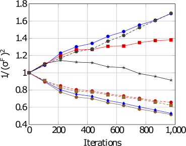
The image is a line chart comparing the convergence of different algorithms or methods, likely in an optimization or machine learning context. The y-axis represents the inverse of the squared Frobenius norm (1/(σ^F)^2), and the x-axis represents the number of iterations. Several lines, each with a distinct color and marker, show how this metric changes over iterations.
### Components/Axes
* **X-axis:** Iterations, ranging from 0 to 1,000 in increments of 200.
* **Y-axis:** 1/(σ^F)^2, ranging from 0.4 to 1.8 in increments of 0.2.
* **Legend:** The legend is not explicitly present, but the different lines are distinguished by color and marker type.
### Detailed Analysis
The chart contains several data series, each represented by a line with distinct markers and colors.
* **Blue line with circle markers:** This line shows an upward trend, starting at approximately 1.0 and increasing to approximately 1.65 at 1,000 iterations.
* (0, 1.0)
* (200, 1.25)
* (400, 1.32)
* (600, 1.45)
* (800, 1.55)
* (1000, 1.65)
* **Red line with square markers:** This line also shows an upward trend, but less steep than the blue line. It starts at approximately 1.0 and increases to approximately 1.4 at 1,000 iterations.
* (0, 1.0)
* (200, 1.15)
* (400, 1.25)
* (600, 1.3)
* (800, 1.35)
* (1000, 1.4)
* **Black line with star markers:** This line shows a downward trend initially, then stabilizes. It starts at approximately 1.0 and decreases to approximately 0.9 at 1,000 iterations.
* (0, 1.0)
* (200, 1.1)
* (400, 1.1)
* (600, 1.05)
* (800, 0.95)
* (1000, 0.9)
* **Brown line with triangle markers:** This line shows a downward trend, starting at approximately 1.0 and decreasing to approximately 0.5 at 1,000 iterations.
* (0, 1.0)
* (200, 0.85)
* (400, 0.75)
* (600, 0.65)
* (800, 0.55)
* (1000, 0.5)
* **Dashed Black line with X markers:** This line shows an upward trend, starting at approximately 1.0 and increasing to approximately 1.7 at 1,000 iterations.
* (0, 1.0)
* (200, 1.15)
* (400, 1.25)
* (600, 1.4)
* (800, 1.55)
* (1000, 1.7)
* **Dashed Red line with circle markers:** This line shows a downward trend, starting at approximately 1.0 and decreasing to approximately 0.65 at 1,000 iterations.
* (0, 1.0)
* (200, 0.9)
* (400, 0.8)
* (600, 0.75)
* (800, 0.7)
* (1000, 0.65)
* **Dashed Blue line with diamond markers:** This line shows a downward trend, starting at approximately 1.0 and decreasing to approximately 0.55 at 1,000 iterations.
* (0, 1.0)
* (200, 0.85)
* (400, 0.75)
* (600, 0.65)
* (800, 0.6)
* (1000, 0.55)
### Key Observations
* Some algorithms (blue and red lines) cause the metric to increase with iterations, while others (brown and black lines) cause it to decrease.
* The dashed black line increases the most rapidly.
* The brown line decreases the most rapidly.
* The black line stabilizes after an initial decrease.
### Interpretation
The chart visualizes the convergence behavior of different algorithms or methods. The y-axis metric, 1/(σ^F)^2, likely represents some measure of error or residual, where a lower value indicates better convergence. Algorithms with downward-sloping lines are converging towards a better solution as the number of iterations increases. Conversely, algorithms with upward-sloping lines are diverging or not converging effectively. The specific meaning of σ^F would depend on the context of the problem being solved. The different markers and colors likely represent different parameter settings or variations of the algorithms being compared. The dashed lines may represent a different set of algorithms or a variation of the solid lines.