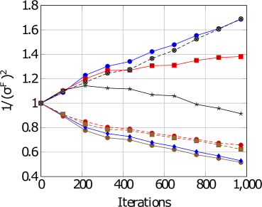
## Line Chart: Inverse Squared Force Variance vs. Iterations
### Overview
The image displays a line chart plotting the quantity `1/(σ^F)^2` (inverse squared force variance) against the number of `Iterations`. The chart compares the performance or behavior of multiple distinct methods or parameter settings over a training or simulation process. All series begin at approximately the same value (1.0) at iteration 0 and diverge significantly as iterations increase.
### Components/Axes
* **Y-Axis:** Labeled `1/(σ^F)^2`. The scale is linear, ranging from 0.4 to 1.8, with major tick marks at intervals of 0.2 (0.4, 0.6, 0.8, 1.0, 1.2, 1.4, 1.6, 1.8).
* **X-Axis:** Labeled `Iterations`. The scale is linear, ranging from 0 to 1,000, with major tick marks at intervals of 200 (0, 200, 400, 600, 800, 1000).
* **Legend:** Positioned in the top-left corner of the plot area. The legend contains entries for each data series, but the specific text labels are not legible in the provided image. The series are distinguished by a combination of line color, line style (solid or dashed), and marker shape.
* **Data Series (Identified by Visual Attributes):**
1. **Blue Solid Line with Circle Markers:** Shows a strong, steady upward trend.
2. **Red Solid Line with Square Markers:** Shows an upward trend that begins to plateau after ~600 iterations.
3. **Black Solid Line with Star Markers:** Shows a slight downward trend.
4. **Brown Dashed Line with Circle Markers:** Shows a moderate downward trend.
5. **Blue Dashed Line with Circle Markers:** Shows the steepest downward trend.
6. **Grey/Black Solid Line with Diamond Markers:** Follows a path very close to, but slightly below, the Blue Solid Line with Circle Markers for most of the chart, ending at a similar high value.
### Detailed Analysis
* **Trend Verification & Data Points (Approximate):**
* **Blue Solid (Circles):** Slopes upward consistently. Starts at ~1.0 (0 iters). Reaches ~1.25 (200 iters), ~1.35 (400 iters), ~1.45 (600 iters), ~1.55 (800 iters), and ends at ~1.7 (1000 iters).
* **Grey/Black Solid (Diamonds):** Slopes upward, closely tracking the Blue Solid line. Starts at ~1.0. Reaches ~1.2 (200 iters), ~1.3 (400 iters), ~1.4 (600 iters), ~1.5 (800 iters), and ends at ~1.65 (1000 iters).
* **Red Solid (Squares):** Slopes upward initially, then plateaus. Starts at ~1.0. Reaches ~1.2 (200 iters), ~1.3 (400 iters), ~1.35 (600 iters), and remains near ~1.35-1.4 from 600 to 1000 iters.
* **Black Solid (Stars):** Slopes gently downward. Starts at ~1.0. Peaks slightly at ~1.1 (200 iters), then declines to ~1.05 (400 iters), ~1.0 (600 iters), ~0.95 (800 iters), and ends at ~0.9 (1000 iters).
* **Brown Dashed (Circles):** Slopes downward. Starts at ~1.0. Drops to ~0.8 (200 iters), ~0.75 (400 iters), ~0.7 (600 iters), ~0.65 (800 iters), and ends at ~0.6 (1000 iters).
* **Blue Dashed (Circles):** Slopes downward most steeply. Starts at ~1.0. Drops to ~0.75 (200 iters), ~0.65 (400 iters), ~0.6 (600 iters), ~0.55 (800 iters), and ends at ~0.5 (1000 iters).
### Key Observations
1. **Clear Divergence:** The primary observation is a stark bifurcation in outcomes. Three series (Blue Solid, Grey/Black Solid, Red Solid) show an *increase* in `1/(σ^F)^2`, while three others (Black Solid, Brown Dashed, Blue Dashed) show a *decrease*.
2. **Performance Hierarchy:** By the final iteration (1000), the series are clearly ordered from highest to lowest value: Blue Solid ≈ Grey/Black Solid > Red Solid > Black Solid > Brown Dashed > Blue Dashed.
3. **Plateau Effect:** The Red Solid line is the only one showing a clear plateau, suggesting its performance metric stabilizes after a certain point.
4. **Starting Point Convergence:** All methods begin at an identical state (value = 1.0), indicating a controlled comparison from a common initialization.
### Interpretation
The chart likely illustrates the results of an experiment comparing different algorithms, hyperparameters, or models on a task where the metric `1/(σ^F)^2` is relevant. This metric is often associated with the precision or stability of force estimates in physics simulations or machine learning models (e.g., in molecular dynamics or reinforcement learning).
* **What the data suggests:** The increasing lines (Blue Solid, Grey/Black Solid, Red Solid) represent methods that successfully *reduce* the variance of the force estimate (`σ^F`) over time, leading to a higher inverse squared value. This is typically desirable, indicating improved precision and stability. The decreasing lines represent methods where the force variance *increases* over iterations, leading to less precise and potentially unstable estimates.
* **Relationship between elements:** The chart directly compares the efficacy of these methods. The steep, continuous rise of the Blue Solid line suggests it is the most effective at variance reduction. The plateau of the Red Solid line indicates it reaches a performance limit. The downward trends of the dashed lines and the Black Solid line indicate those methods are counterproductive for this specific metric under the tested conditions.
* **Notable Anomalies:** The Black Solid line with stars is unique among the "decreasing" group as it is a solid line and shows a much more gradual decline than the dashed lines. This might represent a baseline or a different class of method. The close tracking of the Grey/Black Solid line to the top-performing Blue Solid line suggests two very similar, high-performing approaches.
**Language Note:** All text in the image is in English. No other languages are present.