## Scatter Plot Comparison: G₁ and G₂
### Overview
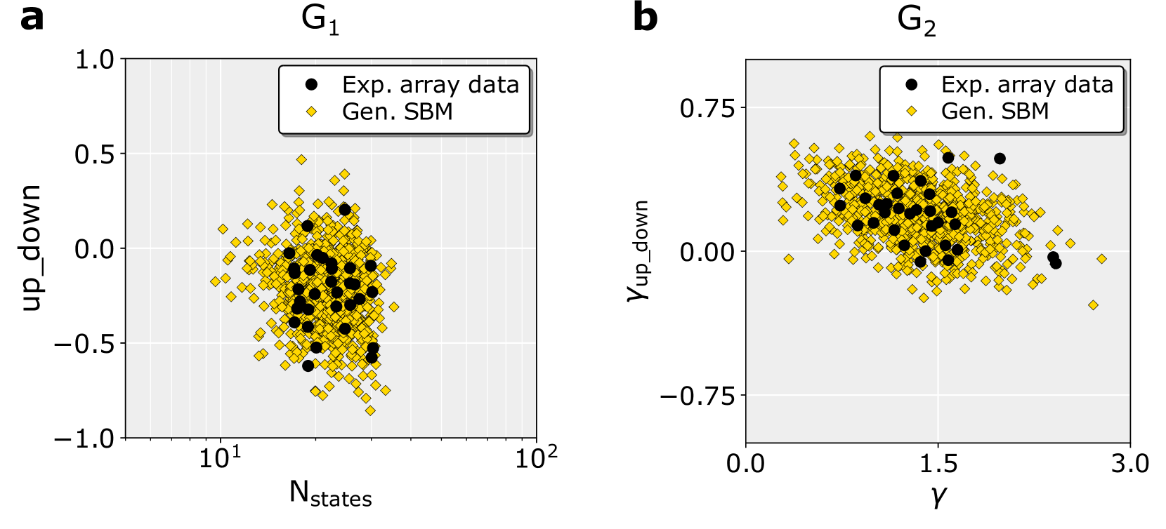
The image contains two side-by-side scatter plots, labeled **a** and **b**, comparing experimental data ("Exp. array data") with data generated from a Stochastic Block Model ("Gen. SBM"). Both plots visualize the relationship between a system parameter (x-axis) and a metric named `up_down` or a variant (y-axis). The plots are designed to assess how well the generated SBM data matches the experimental array data across different conditions.
### Components/Axes
**Panel a (Left):**
* **Title:** `G₁` (centered above the plot area).
* **X-axis:** Label is `N_states`. The scale is **logarithmic**, with major tick marks at `10¹` (10) and `10²` (100).
* **Y-axis:** Label is `up_down`. The scale is linear, ranging from `-1.0` to `1.0` with major ticks at intervals of 0.5.
* **Legend:** Located in the top-right corner of the plot area.
* Black circle (●): `Exp. array data`
* Yellow diamond (♦): `Gen. SBM`
* **Data Series:** Two distinct point clouds are plotted.
**Panel b (Right):**
* **Title:** `G₂` (centered above the plot area).
* **X-axis:** Label is the Greek letter `γ` (gamma). The scale is linear, ranging from `0.0` to `3.0` with major ticks at 0.0, 1.5, and 3.0.
* **Y-axis:** Label is `γ_up_down`. The scale is linear, ranging from `-0.75` to `0.75` with major ticks at -0.75, 0.00, and 0.75.
* **Legend:** Located in the top-right corner of the plot area, identical in format to panel a.
* Black circle (●): `Exp. array data`
* Yellow diamond (♦): `Gen. SBM`
* **Data Series:** Two distinct point clouds are plotted.
### Detailed Analysis
**Panel a (G₁): `up_down` vs. `N_states` (log scale)**
* **Exp. array data (Black Circles):** This series forms a relatively tight, vertically oriented cluster. The points are concentrated in a narrow range of `N_states`, approximately between 20 and 50 (on the log scale). The `up_down` values for these points range roughly from -0.6 to +0.2, with the densest region centered near `up_down` = -0.2.
* **Gen. SBM (Yellow Diamonds):** This series shows a much broader distribution. It spans a wider range of `N_states`, from below 10 to nearly 100. The `up_down` values also have a greater spread, from approximately -0.9 to +0.5. The cloud of yellow diamonds envelops the cluster of black circles, indicating the generated data covers a superset of the experimental parameter space but with higher variance.
**Panel b (G₂): `γ_up_down` vs. `γ`**
* **Exp. array data (Black Circles):** These points form a dense, roughly elliptical cluster centered around `γ` ≈ 1.5 and `γ_up_down` ≈ 0.1. The spread in `γ` is approximately from 0.8 to 2.2, and in `γ_up_down` from -0.3 to +0.5.
* **Gen. SBM (Yellow Diamonds):** This series is again more dispersed than the experimental data. It covers a broader range of `γ` (from ~0.2 to ~2.8) and a significantly wider range of `γ_up_down` (from ~-0.6 to ~+0.7). The yellow diamond cloud is centered near the black circle cluster but extends much further, particularly in the vertical (`γ_up_down`) direction.
### Key Observations
1. **Consistent Pattern:** In both panels, the "Gen. SBM" data (yellow diamonds) exhibits significantly higher variance and covers a broader parameter space than the "Exp. array data" (black circles).
2. **Experimental Data Clustering:** The experimental data points are not randomly scattered; they form distinct, relatively tight clusters in both plots, suggesting the real-world system operates within a specific, constrained regime of parameters (`N_states` and `γ`).
3. **Model Envelope:** The SBM-generated data forms a "cloud" that envelops the experimental data cluster. This suggests the model is capable of generating states that include the experimentally observed ones, but also produces many other possible states not seen in the experiment.
4. **Axis Scaling:** The use of a logarithmic scale for `N_states` in panel **a** indicates that this parameter likely varies over orders of magnitude in the system being studied.
### Interpretation
These plots serve as a validation or comparison tool for a Stochastic Block Model (SBM). The core finding is that while the SBM can generate data that overlaps with and encompasses the experimentally observed data (the black circles lie within the yellow cloud), the model's output is far more diverse.
This discrepancy has several potential implications:
* **Model Overestimation of Variance:** The SBM may be parameterized in a way that allows for too much randomness or too many possible configurations, leading to a broader distribution than what is physically realized in the experiment.
* **Experimental Constraints:** The experimental setup might have inherent limitations or selection pressures that restrict the system to a narrow subset of all theoretically possible states (the tight black cluster). The model, lacking these constraints, explores the full theoretical space.
* **Predictive vs. Generative Use:** The model appears better suited for *generating* a wide range of plausible system behaviors rather than *predicting* the exact, specific state of the experimental array. It captures the general region of operation but not the precise, constrained locus.
In summary, the SBM successfully captures the qualitative region where the experimental system operates but quantitatively overestimates the system's variability. The experimental data suggests a more deterministic or constrained process than the purely stochastic model implies.