## Scatter Plots: Experimental vs. Generated SBM Data
### Overview
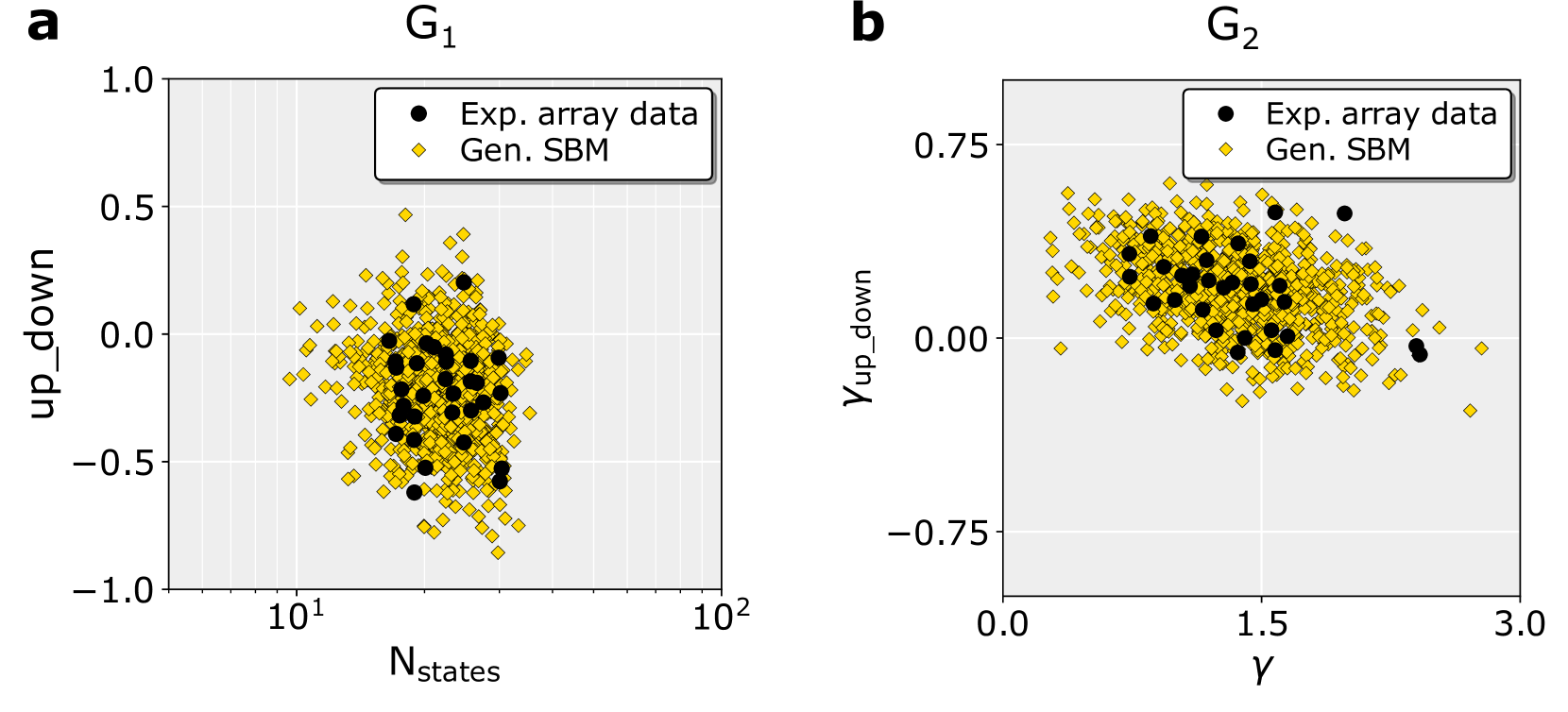
Two scatter plots (G1 and G2) compare experimental array data (black dots) and generated stochastic block model (SBM) data (yellow diamonds). Both plots use the y-axis for "up_down" values, but differ in x-axis variables: G1 uses log-scaled "N_states" (10¹–10²), while G2 uses "γ" (0–3). Data points are spatially clustered, with experimental data showing tighter groupings than generated SBM.
---
### Components/Axes
#### G1 (Left Plot)
- **X-axis**: `N_states` (log scale, 10¹ to 10²)
- **Y-axis**: `up_down` (-1.0 to 1.0)
- **Legend**:
- Black dots: "Exp. array data"
- Yellow diamonds: "Gen. SBM"
- **Spatial Grounding**:
- Legend: Top-left corner
- Data points: Scattered across the plot, with experimental data concentrated in the mid-range of `N_states` and `up_down`.
#### G2 (Right Plot)
- **X-axis**: `γ` (linear scale, 0.0 to 3.0)
- **Y-axis**: `up_down` (-0.75 to 0.75)
- **Legend**:
- Black dots: "Exp. array data"
- Yellow diamonds: "Gen. SBM"
- **Spatial Grounding**:
- Legend: Top-left corner
- Data points: Experimental data clustered near `γ=1.5` and `up_down=0`, while generated SBM are more dispersed.
---
### Detailed Analysis
#### G1 Trends
- **Experimental Data (Black Dots)**:
- Clustered between `N_states=10` and `N_states=50`, with `up_down` values ranging from -0.3 to 0.3.
- No clear upward/downward trend; density decreases at extreme `N_states` values.
- **Generated SBM (Yellow Diamonds)**:
- Spread across the full `N_states` range (10¹–10²), with `up_down` values from -0.8 to 0.8.
- Higher variability in both axes compared to experimental data.
#### G2 Trends
- **Experimental Data (Black Dots)**:
- Concentrated near `γ=1.5` and `up_down=0`, forming a dense cluster.
- Outliers extend to `γ=2.5` and `up_down=0.5`.
- **Generated SBM (Yellow Diamonds)**:
- Distributed across `γ=0.5–2.5` and `up_down=-0.7 to 0.7`.
- Lower density near `γ=0` and `γ=3`, suggesting model limitations at extremes.
---
### Key Observations
1. **Experimental Data Clustering**:
- In G1, experimental data are confined to mid-range `N_states` and moderate `up_down` values.
- In G2, experimental data peak at `γ=1.5` with minimal `up_down` variation.
2. **Generated SBM Variability**:
- Yellow diamonds in both plots show broader distributions, indicating higher stochasticity in modeled data.
3. **Axis Scale Impact**:
- G1’s log-scaled `N_states` compresses high-value data, potentially obscuring trends at `N_states>50`.
---
### Interpretation
- **Experimental vs. Model Behavior**:
- Experimental data (black dots) exhibit tighter clustering, suggesting real-world constraints or stability in measured states.
- Generated SBM (yellow diamonds) display greater variability, reflecting theoretical model flexibility or noise.
- **γ Parameter Influence (G2)**:
- The concentration of experimental data at `γ=1.5` may indicate an optimal or critical parameter value for the system under study.
- **Outliers**:
- Experimental data in G2 extend to `γ=2.5` and `up_down=0.5`, possibly representing edge cases or measurement artifacts.
- **Log Scale Implications**:
- G1’s log axis may underrepresent differences at high `N_states`, warranting caution in interpreting extreme values.
This analysis highlights discrepancies between empirical measurements and theoretical models, emphasizing the need for validation across parameter spaces.