## Bar Chart Comparison: Task 08ed6ac7
### Overview
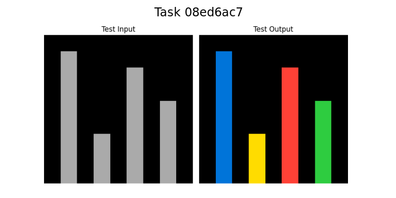
The image displays a side-by-side comparison of two bar charts against a solid black background. The overall title, "Task 08ed6ac7," is centered at the top in white text. The left chart is labeled "Test Input" and contains four vertical bars in shades of gray. The right chart is labeled "Test Output" and contains four vertical bars in distinct, solid colors (blue, yellow, red, green). The charts appear to represent a transformation or classification process where an input sequence is mapped to a categorized output.
### Components/Axes
* **Main Title:** "Task 08ed6ac7" (Top center, white text).
* **Subplot Titles:**
* Left Chart: "Test Input" (Centered above the left chart).
* Right Chart: "Test Output" (Centered above the right chart).
* **Axes:** No numerical axes, tick marks, or grid lines are visible. The charts are presented as pure visual comparisons of bar height and color.
* **Legend:** No explicit legend is present. The color coding in the "Test Output" chart serves as an implicit categorical legend.
* **Spatial Layout:** The two charts are positioned horizontally adjacent, with the "Test Input" on the left and the "Test Output" on the right. Each chart occupies approximately half of the image width.
### Detailed Analysis
**Test Input (Left Chart):**
* Contains four vertical bars, all in a uniform medium gray color.
* **Bar 1 (Leftmost):** The tallest bar in the set.
* **Bar 2:** The shortest bar, significantly lower than Bar 1.
* **Bar 3:** The second tallest bar, slightly shorter than Bar 1.
* **Bar 4 (Rightmost):** The third tallest bar, shorter than Bar 3 but taller than Bar 2.
* **Trend/Pattern:** The heights follow a pattern of High, Low, Medium-High, Medium.
**Test Output (Right Chart):**
* Contains four vertical bars, each a different solid color.
* **Bar 1 (Leftmost):** Blue. Its height appears visually identical to the height of the first gray bar in the "Test Input" chart.
* **Bar 2:** Yellow. Its height appears visually identical to the height of the second (shortest) gray bar in the "Test Input" chart.
* **Bar 3:** Red. Its height appears visually identical to the height of the third gray bar in the "Test Input" chart.
* **Bar 4 (Rightmost):** Green. Its height appears visually identical to the height of the fourth gray bar in the "Test Input" chart.
* **Trend/Pattern:** The sequence of heights (High, Low, Medium-High, Medium) is preserved exactly from the input. The only change is the application of distinct colors to each bar.
### Key Observations
1. **Perfect Height Correspondence:** There is a one-to-one mapping in height between each bar in the "Test Input" and its counterpart in the "Test Output." The output does not alter the magnitude (height) of the data.
2. **Categorical Color Assignment:** The transformation from input to output assigns a unique, vibrant color (Blue, Yellow, Red, Green) to each data point, replacing the uniform gray. This strongly suggests a classification or labeling task.
3. **Order Preservation:** The left-to-right order of the bars is maintained between the two charts.
4. **Visual Clarity:** The use of a black background and high-contrast colors (gray for input, primary/secondary colors for output) makes the comparison stark and unambiguous.
### Interpretation
This visualization demonstrates the result of a **classification or labeling algorithm** applied to a sequence of four data points.
* **What the data suggests:** The "Test Input" represents a sequence of raw, unlabeled numerical values (visualized as gray bars of varying height). The "Test Output" represents the same sequence after each value has been assigned to a discrete category. The height (original value) is preserved, but each item is now identified by a color-coded class label (Blue, Yellow, Red, Green).
* **How elements relate:** The direct, side-by-side layout and identical bar heights create an explicit visual link between each input element and its classified output. The color is the only new information added, serving as the category identifier.
* **Notable patterns/anomalies:** The most notable pattern is the perfect preservation of the input sequence's structure. There is no anomaly; the output is a direct, categorized映射 of the input. The choice of four distinct colors implies the model or process has identified four separate classes within this test sample. The specific mapping (e.g., the tallest bar becomes Blue, the shortest becomes Yellow) would be defined by the underlying model's logic, which is not detailed in the chart itself. This chart effectively answers "What were the input values?" and "What category was each one assigned to?" without providing the numerical scale or class names.