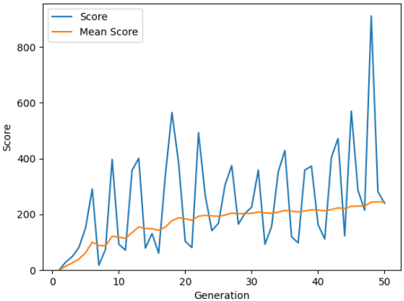
## Line Chart: Score vs. Generation
### Overview
The image is a line chart displaying the "Score" and "Mean Score" over 50 generations. The x-axis represents the generation number, and the y-axis represents the score. The chart shows the fluctuation of the score and the trend of the mean score over the generations.
### Components/Axes
* **Title:** There is no explicit title on the chart.
* **X-axis:**
* Label: "Generation"
* Scale: 0 to 50, with tick marks every 10 units (0, 10, 20, 30, 40, 50).
* **Y-axis:**
* Label: "Score"
* Scale: 0 to 800, with tick marks every 200 units (0, 200, 400, 600, 800).
* **Legend:** Located in the top-left corner.
* "Score" - represented by a blue line.
* "Mean Score" - represented by an orange line.
### Detailed Analysis
* **Score (Blue Line):**
* Trend: Highly volatile, with peaks and troughs throughout the generations. Generally increasing over time, with a large spike at generation 50.
* Data Points:
* Generation 0: Score is approximately 0.
* Generation 5: Score is approximately 100.
* Generation 10: Score fluctuates between approximately 50 and 400.
* Generation 20: Score fluctuates between approximately 75 and 600.
* Generation 30: Score fluctuates between approximately 100 and 400.
* Generation 40: Score fluctuates between approximately 100 and 500.
* Generation 50: Score reaches a peak of approximately 875.
* **Mean Score (Orange Line):**
* Trend: Generally increasing over time, with less volatility than the "Score" line.
* Data Points:
* Generation 0: Mean Score is approximately 0.
* Generation 5: Mean Score is approximately 50.
* Generation 10: Mean Score is approximately 150.
* Generation 20: Mean Score is approximately 175.
* Generation 30: Mean Score is approximately 200.
* Generation 40: Mean Score is approximately 225.
* Generation 50: Mean Score is approximately 250.
### Key Observations
* The "Score" fluctuates significantly, indicating variability in performance across generations.
* The "Mean Score" shows a gradual increase, suggesting an overall improvement in performance as the generations progress.
* The large spike in "Score" at generation 50 is a notable outlier.
### Interpretation
The chart likely represents the performance of a genetic algorithm or similar optimization process. The "Score" represents the performance of the best individual in each generation, while the "Mean Score" represents the average performance of the population. The increasing "Mean Score" suggests that the algorithm is successfully evolving better solutions over time. The volatility of the "Score" indicates that there is still significant variation in the population, and the spike at generation 50 suggests that a particularly good solution was found in that generation. The difference between the score and the mean score indicates the diversity of the population.