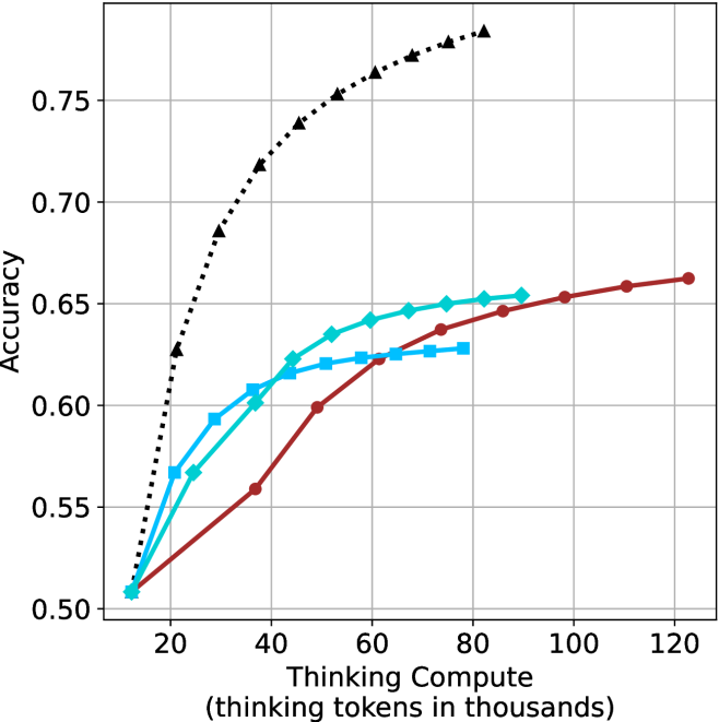
## Chart: Accuracy vs. Thinking Compute
### Overview
The image is a line chart comparing the accuracy of different models as a function of "Thinking Compute" (measured in thousands of thinking tokens). There are four data series represented by different colored lines with distinct markers. The chart shows how accuracy improves with increased compute for each model.
### Components/Axes
* **X-axis:** "Thinking Compute (thinking tokens in thousands)". The scale ranges from approximately 10 to 120 in increments of 20.
* **Y-axis:** "Accuracy". The scale ranges from 0.50 to 0.75 in increments of 0.05.
* **Data Series:**
* Black dotted line with triangle markers.
* Teal line with diamond markers.
* Blue line with square markers.
* Brown line with circle markers.
* **Grid:** The chart has a grid with vertical and horizontal lines.
### Detailed Analysis
* **Black dotted line (triangle markers):** This line shows the highest accuracy for a given compute level. The line increases rapidly from approximately (12, 0.51) to (80, 0.78).
* **Teal line (diamond markers):** This line shows a moderate increase in accuracy. The line starts at approximately (12, 0.51) and increases to approximately (80, 0.65).
* **Blue line (square markers):** This line shows a similar trend to the teal line, but with slightly lower accuracy. The line starts at approximately (12, 0.51) and increases to approximately (80, 0.63).
* **Brown line (circle markers):** This line shows the lowest accuracy for a given compute level. The line starts at approximately (12, 0.51) and increases to approximately (120, 0.66).
**Specific Data Points (Approximate):**
* **Black (Triangle):**
* (12, 0.51)
* (20, 0.60)
* (30, 0.70)
* (40, 0.73)
* (50, 0.75)
* (60, 0.76)
* (70, 0.77)
* (80, 0.78)
* **Teal (Diamond):**
* (12, 0.51)
* (20, 0.57)
* (30, 0.60)
* (40, 0.62)
* (50, 0.63)
* (60, 0.64)
* (70, 0.65)
* (80, 0.65)
* **Blue (Square):**
* (12, 0.51)
* (20, 0.55)
* (30, 0.59)
* (40, 0.61)
* (50, 0.62)
* (60, 0.62)
* (70, 0.63)
* (80, 0.63)
* **Brown (Circle):**
* (12, 0.51)
* (20, 0.53)
* (30, 0.56)
* (40, 0.60)
* (50, 0.61)
* (60, 0.62)
* (70, 0.63)
* (80, 0.64)
* (90, 0.65)
* (100, 0.65)
* (110, 0.66)
* (120, 0.66)
### Key Observations
* The black dotted line (triangle markers) shows the most significant improvement in accuracy with increasing compute.
* The teal and blue lines show similar trends, with the teal line consistently performing slightly better.
* The brown line shows the slowest improvement in accuracy with increasing compute, but it continues to improve even at higher compute levels where the other lines plateau.
* All lines start at approximately the same accuracy level (0.51) with minimal compute (12k tokens).
### Interpretation
The chart demonstrates the relationship between "Thinking Compute" and accuracy for different models. The black dotted line represents a model that benefits significantly from increased compute, achieving the highest accuracy. The other lines represent models that show diminishing returns with increased compute, plateauing at lower accuracy levels. The brown line suggests a model that may continue to improve with even higher compute levels, as it does not plateau within the range shown. The data suggests that the choice of model and the amount of compute allocated are critical factors in achieving high accuracy.