\n
## Line Chart: Distribution Comparison
### Overview
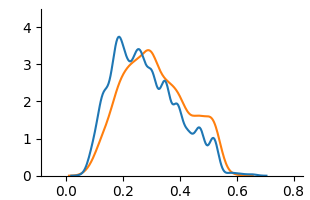
The image presents a line chart comparing two distributions. The chart displays the frequency or density of values along the x-axis, ranging from approximately 0.0 to 0.8. The y-axis represents the frequency/density, ranging from 0.0 to approximately 4.0. Two lines, one blue and one orange, depict the distributions.
### Components/Axes
* **X-axis:** Ranges from 0.0 to 0.8, with tick marks at 0.0, 0.2, 0.4, 0.6, and 0.8. The axis is not explicitly labeled, but represents a variable's value.
* **Y-axis:** Ranges from 0.0 to 4.0, with tick marks at 0.0, 1.0, 2.0, 3.0, and 4.0. The axis is not explicitly labeled, but represents frequency or density.
* **Line 1 (Blue):** Represents the first distribution.
* **Line 2 (Orange):** Represents the second distribution.
* **Legend:** There is no explicit legend, but the colors of the lines are used to differentiate the distributions.
### Detailed Analysis
* **Blue Line:** The blue line starts at approximately 0.0 at x=0.0, rises rapidly to a peak of approximately 3.8 at x=0.2, then gradually declines, crossing the x-axis at approximately x=0.65.
* **Orange Line:** The orange line starts at approximately 0.0 at x=0.0, rises to a peak of approximately 3.3 at x=0.2, then declines more rapidly than the blue line, crossing the x-axis at approximately x=0.55.
* **Trend Comparison:** Both lines exhibit a similar shape, with a peak around x=0.2. However, the blue line has a slightly higher peak and a longer tail, indicating a greater spread of values. The orange line declines more quickly after its peak.
### Key Observations
* Both distributions are unimodal (have a single peak).
* The blue distribution has a slightly larger spread and a higher maximum value than the orange distribution.
* The orange distribution appears to be more concentrated around the peak.
### Interpretation
The chart suggests a comparison of two related distributions. The similarity in shape indicates that both variables likely follow a similar underlying process, but with differences in their spread and magnitude. The blue line might represent a variable with more variability or a higher overall frequency, while the orange line represents a more concentrated variable. Without knowing what the x-axis represents, it's difficult to draw more specific conclusions. The difference in the rate of decline after the peak could indicate different decay rates or different underlying mechanisms governing the distributions. The chart is useful for visually comparing the characteristics of the two distributions and identifying potential differences in their behavior.