## Line Chart: Pass@k Performance Comparison
### Overview
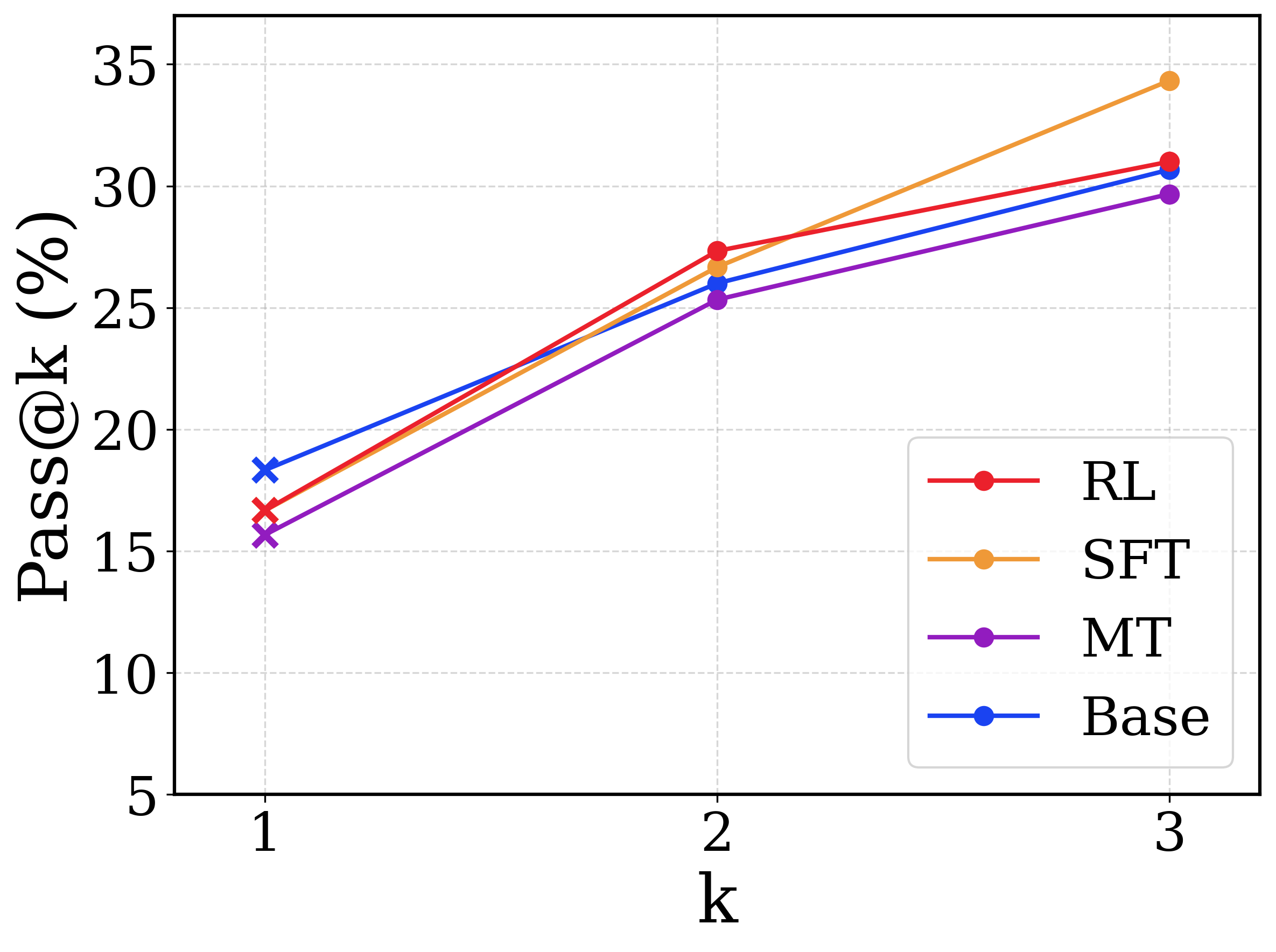
This image is a line chart comparing the performance of four different models or methodologies across three discrete evaluation steps. The metric being measured is "Pass@k (%)" on the y-axis against the variable "k" on the x-axis. All text in the image is in English.
### Components/Axes
**Spatial Layout & Regions:**
* **Main Chart Area:** Occupies the majority of the image, featuring a white background with a light gray, dashed grid.
* **Y-axis (Left):** Vertical axis labeled **"Pass@k (%)"**. The text is oriented vertically, reading from bottom to top. The scale ranges from 5 to 35, with major tick marks and horizontal grid lines at intervals of 5 (5, 10, 15, 20, 25, 30, 35).
* **X-axis (Bottom):** Horizontal axis labeled **"k"**. The scale consists of three discrete, evenly spaced points marked as 1, 2, and 3. Vertical grid lines align with these points.
* **Legend (Bottom-Right):** Located inside the chart area in the lower right quadrant. It is enclosed in a white box with a thin, light gray border. It defines four data series using line color and a circular marker:
* Red line with circle: **RL**
* Orange line with circle: **SFT**
* Purple line with circle: **MT**
* Blue line with circle: **Base**
*Note on Markers:* While the legend displays circular markers for all series, the actual plotted data points on the chart use an 'x' marker at k=1, and circular markers at k=2 and k=3.
### Detailed Analysis
**Trend Verification & Data Extraction:**
All four data series exhibit a positive, upward trend, indicating that the Pass@k percentage increases as 'k' increases from 1 to 3.
*Values below are visually interpolated and approximate (±0.5%).*
1. **Base (Blue Line)**
* *Trend:* Slopes upward moderately from k=1 to k=2, and continues upward at a slightly shallower angle from k=2 to k=3.
* **k=1:** ~18.5% (Highest starting value)
* **k=2:** ~26.0%
* **k=3:** ~30.8%
2. **RL (Red Line)**
* *Trend:* Slopes upward steeply from k=1 to k=2 (crossing above the Base line), then the slope flattens slightly from k=2 to k=3.
* **k=1:** ~16.8%
* **k=2:** ~27.5% (Highest value at k=2)
* **k=3:** ~31.0%
3. **SFT (Orange Line)**
* *Trend:* Slopes upward from k=1 to k=2, and then exhibits the steepest upward slope of any line from k=2 to k=3, crossing above both Base and RL.
* **k=1:** ~16.5%
* **k=2:** ~26.8%
* **k=3:** ~34.5% (Highest ending value)
4. **MT (Purple Line)**
* *Trend:* Slopes upward consistently from k=1 to k=3. It remains the lowest performing series across all values of k.
* **k=1:** ~15.8% (Lowest starting value)
* **k=2:** ~25.5%
* **k=3:** ~29.8% (Lowest ending value)
**Reconstructed Data Table:**
| k | Base (Blue) | RL (Red) | SFT (Orange) | MT (Purple) |
|---|---|---|---|---|
| **1** | ~18.5% | ~16.8% | ~16.5% | ~15.8% |
| **2** | ~26.0% | ~27.5% | ~26.8% | ~25.5% |
| **3** | ~30.8% | ~31.0% | ~34.5% | ~29.8% |
### Key Observations
* **Crossovers:** The "Base" model starts with the highest performance at k=1 but is overtaken by "RL" and "SFT" at k=2, and remains below them at k=3.
* **Late Surge:** The "SFT" model shows a significant acceleration in performance between k=2 and k=3, separating itself from the cluster to achieve the highest overall score.
* **Consistent Underperformer:** The "MT" model consistently scores the lowest across all three measured points, though its rate of improvement (slope) is roughly parallel to the "Base" model.
* **Marker Anomaly:** The use of 'x' markers exclusively at k=1 suggests a potential difference in how the k=1 metric was calculated or represents a baseline state compared to k=2 and k=3 (which use circles).
### Interpretation
In the context of machine learning (specifically generative AI or code generation), "Pass@k" measures the probability that at least one out of 'k' generated samples passes a specific test or criteria.
* **Baseline vs. Fine-tuning:** The data suggests that the "Base" model is relatively strong at generating a correct answer on the very first try (k=1). However, the fine-tuned models (RL - Reinforcement Learning, and SFT - Supervised Fine-Tuning) benefit much more from being allowed multiple attempts (k=2, k=3).
* **Diversity of Output:** The steep rise of the SFT and RL curves implies these methods produce a higher diversity of plausible answers. If the first answer is wrong, subsequent generated answers are highly likely to be different and correct, pushing their Pass@2 and Pass@3 scores higher than the Base model. The Base model might be generating similar (incorrect) variations of its first attempt, leading to a flatter curve.
* **SFT Efficacy at Scale:** The SFT method scales the best with multiple attempts, suggesting it has learned a wide distribution of correct patterns that are revealed when given a larger budget of generations (k=3).