\n
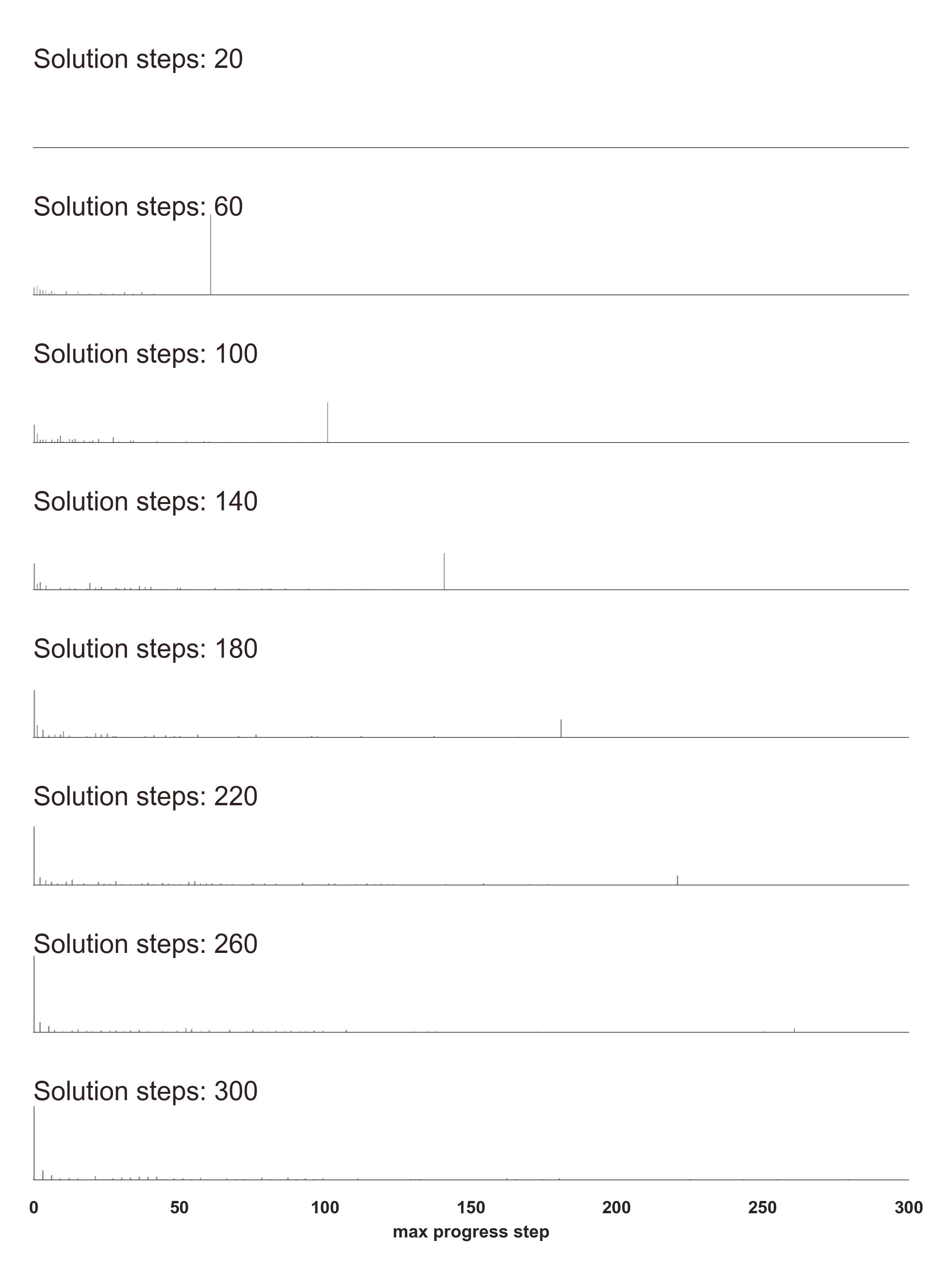
## [Series of Step Plots]: Solution Steps vs. Max Progress Step
### Overview
The image displays a vertical series of eight individual horizontal line plots. Each plot is labeled with a specific "Solution steps" count and contains a single vertical line marker. The plots share a common x-axis at the bottom, labeled "max progress step," which ranges from 0 to 300. The visualization demonstrates a direct, one-to-one correspondence between the labeled solution step count and the position of the vertical marker on the shared progress axis.
### Components/Axes
* **Plot Labels (Top-Left of each subplot):** Each of the eight subplots has a text label in the format "Solution steps: [Number]". The numbers are, from top to bottom: 20, 60, 100, 140, 180, 220, 260, 300.
* **X-Axis (Bottom of the entire figure):**
* **Label:** "max progress step"
* **Scale:** Linear, from 0 to 300.
* **Major Tick Marks & Numerical Labels:** 0, 50, 100, 150, 200, 250, 300.
* **Plot Content:** Each subplot consists of a horizontal baseline and a single, thin vertical line extending upward from it. There are no other data series, legends, or color codes.
### Detailed Analysis
Each subplot contains one data point, represented by a vertical line. The x-position of this line corresponds precisely to the number given in the subplot's label.
1. **Solution steps: 20:** Vertical line is positioned at approximately x = 20 on the shared axis.
2. **Solution steps: 60:** Vertical line is positioned at approximately x = 60.
3. **Solution steps: 100:** Vertical line is positioned at approximately x = 100.
4. **Solution steps: 140:** Vertical line is positioned at approximately x = 140.
5. **Solution steps: 180:** Vertical line is positioned at approximately x = 180.
6. **Solution steps: 220:** Vertical line is positioned at approximately x = 220.
7. **Solution steps: 260:** Vertical line is positioned at approximately x = 260.
8. **Solution steps: 300:** Vertical line is positioned at approximately x = 300.
**Trend Verification:** For every data series (each subplot), the visual trend is a single, static vertical line. The position of this line shifts rightward along the x-axis in direct proportion to the increasing "Solution steps" value in the label.
### Key Observations
* **Perfect Correlation:** The "max progress step" value is identical to the "Solution steps" count for every plotted instance.
* **Visual Simplicity:** The chart uses a minimal design with no extraneous elements, focusing solely on the relationship between the two named variables.
* **Consistent Scaling:** All subplots are aligned to the same x-axis scale, allowing for direct visual comparison of the marker positions.
* **No Variance:** Each plot shows only a single outcome; there is no distribution, error, or multiple trials depicted.
### Interpretation
This visualization is a direct graphical proof or demonstration of a linear, identity relationship. It suggests that in the context of the system or process being measured, the "max progress step" achieved is exactly equal to the number of "Solution steps" allocated or executed.
The chart likely serves to validate a model, algorithm, or process where progress is measured in discrete steps. The perfect alignment indicates no overhead, delay, or regression—the system utilizes every allocated step to make exactly one unit of progress. The absence of any deviation from this pattern across a wide range of step counts (from 20 to 300) strongly reinforces the reliability and predictability of this relationship. It answers the question: "If I run for N solution steps, what is the maximum progress I can expect?" The answer, as shown, is precisely N.