\n
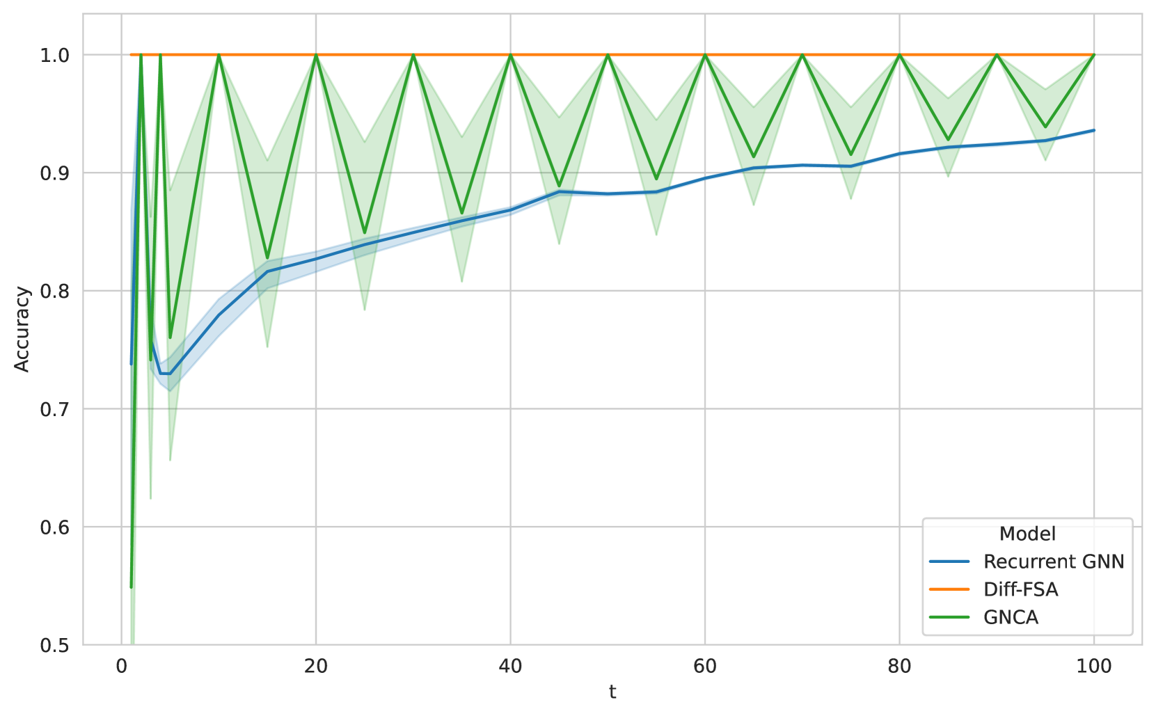
## Line Chart: Model Accuracy Over Time
### Overview
This line chart depicts the accuracy of three different models (Recurrent GNN, Diff-FSA, and GNCA) over time, represented by the variable 't'. The chart shows how the accuracy of each model changes as 't' increases from 0 to 100. A shaded region around each line indicates the variance or confidence interval of the accuracy measurements.
### Components/Axes
* **X-axis:** Labeled "t", representing time or iterations. The scale ranges from approximately 0 to 100.
* **Y-axis:** Labeled "Accuracy", representing the accuracy score. The scale ranges from approximately 0.5 to 1.0.
* **Legend:** Located in the top-right corner, identifying the three models:
* "Recurrent GNN" (Blue line)
* "Diff-FSA" (Orange line)
* "GNCA" (Green line)
* **Data Series:** Three lines representing the accuracy of each model over time. Each line has a shaded region around it, indicating the variance.
### Detailed Analysis
* **GNCA (Green Line):** Starts at approximately 0.5 at t=0, rapidly increases to 1.0 by t=5, and then oscillates between approximately 0.95 and 1.0 for the remainder of the chart. The shaded region around the line is relatively small, indicating low variance.
* **Diff-FSA (Orange Line):** Starts at approximately 0.75 at t=0, increases steadily to approximately 0.85 by t=20, and then oscillates between approximately 0.8 and 0.95 for the remainder of the chart. The shaded region is larger than GNCA's, indicating higher variance.
* **Recurrent GNN (Blue Line):** Starts at approximately 0.7 at t=0, increases steadily to approximately 0.88 by t=60, and then plateaus around 0.9. The shaded region is the largest of the three, indicating the highest variance.
Here's a more detailed breakdown of approximate data points:
| t | Recurrent GNN (Accuracy) | Diff-FSA (Accuracy) | GNCA (Accuracy) |
| :---- | :----------------------- | :------------------ | :-------------- |
| 0 | 0.7 | 0.75 | 0.5 |
| 10 | 0.78 | 0.85 | 1.0 |
| 20 | 0.83 | 0.85 | 1.0 |
| 30 | 0.85 | 0.90 | 0.95 |
| 40 | 0.86 | 0.90 | 1.0 |
| 50 | 0.87 | 0.92 | 0.95 |
| 60 | 0.88 | 0.92 | 1.0 |
| 70 | 0.88 | 0.93 | 0.98 |
| 80 | 0.89 | 0.94 | 1.0 |
| 90 | 0.89 | 0.95 | 0.97 |
| 100 | 0.9 | 0.95 | 0.95 |
### Key Observations
* GNCA consistently exhibits the highest accuracy, remaining close to 1.0 for most of the time period.
* Diff-FSA shows a moderate increase in accuracy, but with more variance than GNCA.
* Recurrent GNN has the slowest increase in accuracy and the highest variance.
* All three models demonstrate some level of oscillation in accuracy, particularly after the initial learning phase.
### Interpretation
The chart suggests that GNCA is the most effective model for this task, achieving and maintaining high accuracy over time. Diff-FSA performs reasonably well, but with more fluctuations in accuracy. Recurrent GNN, while improving over time, lags behind the other two models in terms of both accuracy and stability. The oscillations observed in all models could indicate sensitivity to the data or the presence of noise. The shaded regions around each line highlight the uncertainty associated with each model's performance. The initial dip in accuracy for Recurrent GNN and the rapid increase for GNCA could represent the learning phase of each model, where they are adapting to the data. The consistent high accuracy of GNCA suggests it has effectively learned the underlying patterns in the data.