## Scatter Plot: Association and Hallucination Types
### Overview
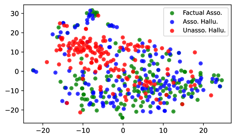
The image is a scatter plot visualizing the distribution of three categories: "Factual Asso.", "Asso. Hallu.", and "Unasso. Hallu." The plot displays data points in a two-dimensional space, with the x and y axes ranging from approximately -25 to 30. Each category is represented by a different color: green for "Factual Asso.", blue for "Asso. Hallu.", and red for "Unasso. Hallu.". The data points appear to cluster in certain regions, suggesting potential relationships or distinctions between the categories.
### Components/Axes
* **X-axis:** Ranges from approximately -25 to 25, with tick marks at -20, -10, 0, 10, and 20. The x-axis label is not explicitly provided in the image.
* **Y-axis:** Ranges from approximately -20 to 30, with tick marks at -20, -10, 0, 10, 20, and 30. The y-axis label is not explicitly provided in the image.
* **Legend:** Located in the top-right corner of the plot.
* Green: "Factual Asso."
* Blue: "Asso. Hallu."
* Red: "Unasso. Hallu."
### Detailed Analysis
* **Factual Asso. (Green):** The green data points are distributed across the plot, with a higher concentration in the bottom-right quadrant and a cluster in the top-left quadrant.
* **Asso. Hallu. (Blue):** The blue data points are also distributed across the plot, with a higher concentration in the central region.
* **Unasso. Hallu. (Red):** The red data points are primarily concentrated in the top-center region of the plot.
**Specific Data Point Analysis (Approximate):**
* **Factual Asso. (Green):**
* Cluster in top-left: X values range from -15 to -5, Y values range from 20 to 30.
* Bottom-right quadrant: X values range from 5 to 25, Y values range from -20 to 0.
* **Asso. Hallu. (Blue):**
* Central region: X values range from -10 to 10, Y values range from -10 to 10.
* Top-left: X values range from -20 to -10, Y values range from 0 to 10.
* **Unasso. Hallu. (Red):**
* Top-center: X values range from -15 to 0, Y values range from 10 to 25.
### Key Observations
* The "Unasso. Hallu." category (red) appears to be more clustered than the other two categories.
* The "Factual Asso." category (green) has a wider distribution, with concentrations in the bottom-right and top-left quadrants.
* The "Asso. Hallu." category (blue) is more centrally located, with some overlap with the other two categories.
### Interpretation
The scatter plot suggests that there are distinct patterns in how "Factual Asso.", "Asso. Hallu.", and "Unasso. Hallu." are distributed in the two-dimensional space. The clustering of "Unasso. Hallu." in the top-center region may indicate that this category has unique characteristics compared to the other two. The wider distribution of "Factual Asso." suggests that it may be more diverse or influenced by different factors. The central location of "Asso. Hallu." may indicate that it shares characteristics with both "Factual Asso." and "Unasso. Hallu.".
The plot could represent a dimensionality reduction technique (e.g., t-SNE or PCA) applied to a dataset, where each point represents a data sample, and the colors indicate the category it belongs to. The proximity of points suggests similarity in the original high-dimensional space. Further analysis would be needed to understand the specific features that contribute to these patterns.