\n
## Chart: Coherence Factor vs. Correction Factor
### Overview
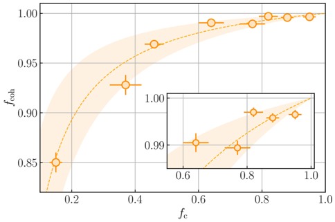
The image presents a scatter plot with a fitted curve, illustrating the relationship between a coherence factor (`f_coh`) and a correction factor (`f_c`). The plot includes a shaded region representing uncertainty or variance around the fitted curve. A zoomed-in inset plot provides a more detailed view of the data in the upper-right quadrant of the main plot.
### Components/Axes
* **X-axis:** Labeled `f_c` (Correction Factor). Scale ranges from approximately 0.0 to 1.0, with tick marks at 0.2, 0.4, 0.6, 0.8, and 1.0.
* **Y-axis:** Labeled `f_coh` (Coherence Factor). Scale ranges from approximately 0.8 to 1.0, with tick marks at 0.85, 0.90, 0.95, and 1.00.
* **Data Points:** Represented by orange circles with error bars.
* **Fitted Curve:** A dashed orange line that approximates the trend of the data points.
* **Uncertainty Region:** A light orange shaded area surrounding the fitted curve, indicating the range of possible values.
* **Inset Plot:** A smaller plot positioned in the top-right corner, providing a zoomed-in view of the data between `f_c` values of 0.6 and 1.0. The inset plot has the same axes labels and visual elements as the main plot.
### Detailed Analysis
The main plot shows a generally increasing trend between `f_c` and `f_coh`. As `f_c` increases, `f_coh` also tends to increase, but the rate of increase diminishes as `f_c` approaches 1.0.
Here's a breakdown of approximate data points extracted from the main plot:
* `f_c` ≈ 0.05, `f_coh` ≈ 0.85 (with error bar extending to approximately 0.80)
* `f_c` ≈ 0.2, `f_coh` ≈ 0.90 (with error bar extending to approximately 0.85)
* `f_c` ≈ 0.4, `f_coh` ≈ 0.95 (with error bar extending to approximately 0.90)
* `f_c` ≈ 0.6, `f_coh` ≈ 0.97 (with error bar extending to approximately 0.92)
* `f_c` ≈ 0.8, `f_coh` ≈ 0.99 (with error bar extending to approximately 0.97)
* `f_c` ≈ 1.0, `f_coh` ≈ 1.00 (with error bar extending to approximately 0.98)
The inset plot shows a similar trend, but with more detail in the region where `f_c` is close to 1.0.
* `f_c` ≈ 0.65, `f_coh` ≈ 0.992 (with error bar extending to approximately 0.985)
* `f_c` ≈ 0.8, `f_coh` ≈ 0.996 (with error bar extending to approximately 0.990)
* `f_c` ≈ 0.9, `f_coh` ≈ 0.998 (with error bar extending to approximately 0.993)
* `f_c` ≈ 1.0, `f_coh` ≈ 1.00 (with error bar extending to approximately 0.995)
### Key Observations
* The relationship between `f_c` and `f_coh` appears to be non-linear, exhibiting diminishing returns as `f_c` increases.
* The error bars indicate a degree of uncertainty in the data, particularly at lower values of `f_c`.
* The inset plot suggests that the increase in `f_coh` slows down significantly as `f_c` approaches 1.0.
* The fitted curve provides a smoothed representation of the underlying trend, but it's important to consider the uncertainty represented by the shaded region.
### Interpretation
The chart likely represents a model or empirical observation where a correction factor (`f_c`) is applied to improve the coherence (`f_coh`) of a system or process. The diminishing returns observed as `f_c` approaches 1.0 suggest that there's a limit to the improvement that can be achieved through this correction. The error bars indicate that the relationship is not perfectly deterministic, and there's inherent variability in the system.
The inset plot is included to highlight the behavior of the system when the correction factor is already relatively high. This could be important for understanding the practical limitations of the correction method. The data suggests that further increases in `f_c` beyond a certain point yield only marginal improvements in `f_coh`.
The chart could be used to optimize the value of `f_c` to achieve a desired level of coherence, balancing the benefits of correction with the potential costs or limitations. The shaded region around the fitted curve is crucial for risk assessment and decision-making, as it provides a range of plausible outcomes.