## Line Chart: Accuracy vs. Sample Size
### Overview
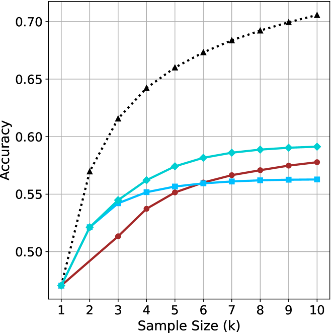
The image is a line chart comparing the accuracy of different models as a function of sample size. The x-axis represents the sample size (k), ranging from 1 to 10. The y-axis represents the accuracy, ranging from 0.50 to 0.70. There are four distinct data series represented by different colored lines with different markers.
### Components/Axes
* **X-axis:** Sample Size (k), with tick marks at each integer value from 1 to 10.
* **Y-axis:** Accuracy, with tick marks at 0.50, 0.55, 0.60, 0.65, and 0.70.
* **Data Series:**
* Black dotted line with triangle markers.
* Turquoise line with diamond markers.
* Brown line with circle markers.
* Light Blue line with square markers.
### Detailed Analysis
* **Black dotted line with triangle markers:** This line shows the highest accuracy overall. It increases rapidly from approximately 0.47 at sample size 1 to approximately 0.63 at sample size 2. It continues to increase, but at a decreasing rate, reaching approximately 0.71 at sample size 10.
* (1, 0.47)
* (2, 0.57)
* (3, 0.62)
* (4, 0.64)
* (5, 0.66)
* (6, 0.67)
* (7, 0.68)
* (8, 0.69)
* (9, 0.70)
* (10, 0.71)
* **Turquoise line with diamond markers:** This line starts at approximately 0.47 at sample size 1, increases to approximately 0.54 at sample size 3, and then gradually increases to approximately 0.59 at sample size 10.
* (1, 0.47)
* (2, 0.52)
* (3, 0.54)
* (4, 0.56)
* (5, 0.575)
* (6, 0.58)
* (7, 0.585)
* (8, 0.59)
* (9, 0.59)
* (10, 0.59)
* **Brown line with circle markers:** This line starts at approximately 0.47 at sample size 1, increases to approximately 0.54 at sample size 4, and then gradually increases to approximately 0.57 at sample size 10.
* (1, 0.47)
* (2, 0.50)
* (3, 0.52)
* (4, 0.54)
* (5, 0.55)
* (6, 0.56)
* (7, 0.565)
* (8, 0.57)
* (9, 0.57)
* (10, 0.575)
* **Light Blue line with square markers:** This line starts at approximately 0.47 at sample size 1, increases to approximately 0.54 at sample size 3, and then gradually increases to approximately 0.56 at sample size 10.
* (1, 0.47)
* (2, 0.51)
* (3, 0.54)
* (4, 0.55)
* (5, 0.56)
* (6, 0.56)
* (7, 0.56)
* (8, 0.56)
* (9, 0.56)
* (10, 0.565)
### Key Observations
* The black dotted line (triangle markers) consistently outperforms the other models in terms of accuracy across all sample sizes.
* All models show diminishing returns in accuracy as the sample size increases beyond a certain point (around 6-7).
* The turquoise line (diamond markers) performs better than the brown line (circle markers) and the light blue line (square markers).
* The brown line (circle markers) and the light blue line (square markers) perform similarly.
### Interpretation
The chart suggests that increasing the sample size generally improves the accuracy of the models, but the extent of improvement varies between the models. The model represented by the black dotted line is significantly more effective than the others. The diminishing returns observed for all models indicate that there is a point beyond which increasing the sample size provides only marginal gains in accuracy. This information could be used to optimize the sample size for each model, balancing the cost of data collection with the desired level of accuracy.