## Line Chart: Accuracy vs. Sample Size
### Overview
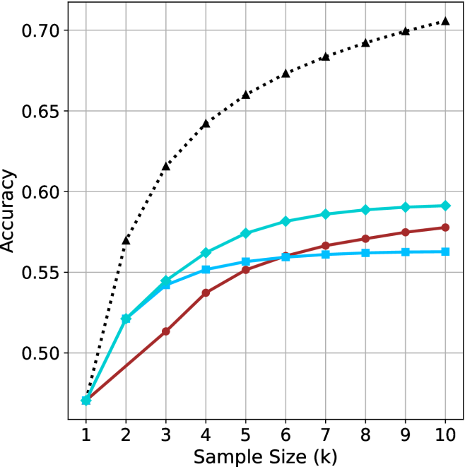
The image is a line chart displaying the relationship between "Accuracy" (y-axis) and "Sample Size (k)" (x-axis). The chart contains four distinct data series, all originating from a common starting point at Sample Size 1. The background features a grid to assist in reading values. **Note:** There is no legend provided in the image, making it impossible to identify the specific variables or models represented by each line color/marker style.
### Components/Axes
* **X-Axis:** Labeled "Sample Size (k)". The scale is linear, ranging from 1 to 10 in integer increments.
* **Y-Axis:** Labeled "Accuracy". The scale ranges from 0.50 to 0.70, with grid lines at 0.05 intervals.
* **Data Series (Legend Missing):**
* **Series 1 (Black, dotted line, triangle markers):** Positioned at the top of the chart.
* **Series 2 (Cyan/Light Blue, solid line, diamond markers):** Positioned second from the top.
* **Series 3 (Dark Red/Maroon, solid line, circle markers):** Positioned third from the top.
* **Series 4 (Medium Blue, solid line, square markers):** Positioned at the bottom of the chart.
### Detailed Analysis
All four series converge at approximately (1, 0.47).
| Sample Size (k) | Series 1 (Black/Tri) | Series 2 (Cyan/Dia) | Series 3 (Red/Circ) | Series 4 (Blue/Sq) |
| :--- | :--- | :--- | :--- | :--- |
| **1** | ~0.47 | ~0.47 | ~0.47 | ~0.47 |
| **2** | ~0.57 | ~0.52 | ~0.49 | ~0.52 |
| **3** | ~0.615 | ~0.545 | ~0.515 | ~0.545 |
| **4** | ~0.64 | ~0.56 | ~0.54 | ~0.55 |
| **5** | ~0.66 | ~0.575 | ~0.55 | ~0.555 |
| **6** | ~0.675 | ~0.58 | ~0.56 | ~0.56 |
| **7** | ~0.685 | ~0.585 | ~0.565 | ~0.56 |
| **8** | ~0.69 | ~0.59 | ~0.57 | ~0.56 |
| **9** | ~0.70 | ~0.59 | ~0.575 | ~0.56 |
| **10** | ~0.705 | ~0.59 | ~0.58 | ~0.56 |
**Trend Verification:**
* **Series 1 (Black/Tri):** Slopes upward consistently with a concave-down shape. It maintains the highest accuracy throughout the entire range.
* **Series 2 (Cyan/Dia):** Slopes upward, showing rapid growth between k=1 and k=4, then begins to plateau after k=6.
* **Series 3 (Red/Circ):** Shows the most consistent, linear-like upward slope. It starts as the lowest performer but overtakes Series 4 around k=6.
* **Series 4 (Blue/Sq):** Shows rapid initial growth (matching Series 2 until k=3), but experiences severe diminishing returns, flattening out almost completely after k=4.
### Key Observations
* **Convergence:** All models perform identically at the smallest sample size (k=1).
* **Performance Gap:** The Black/Triangle series is significantly more accurate than the other three, ending at ~0.705 compared to the others which cluster between 0.56 and 0.59.
* **Crossover:** The Dark Red/Circle series and the Medium Blue/Square series intersect at approximately k=6.
* **Saturation:** Series 4 (Medium Blue/Square) reaches a saturation point very early (k=4), suggesting that increasing the sample size beyond this point provides no additional accuracy benefit for this specific method.
### Interpretation
This chart is characteristic of a machine learning model performance evaluation, likely comparing different algorithms or hyperparameter configurations (e.g., k-Nearest Neighbors, where 'k' is the number of neighbors).
* **The "Black/Triangle" method** is clearly superior, suggesting it is either a more robust algorithm or a better-tuned model.
* **The "Medium Blue/Square" method** exhibits early saturation, indicating that it is highly sensitive to small sample sizes but fails to generalize or improve with more data.
* **The "Dark Red/Circle" method** shows the most stable, predictable improvement, which might be preferable in scenarios where consistent, incremental gains are desired over rapid, early-stage performance.
* **Missing Context:** Without the legend, we cannot determine the specific algorithms. However, the data demonstrates a classic "diminishing returns" pattern common in data science, where the marginal utility of increasing sample size decreases as the sample size grows.