\n
## Chart: Probability Distribution for Different 'l' Values
### Overview
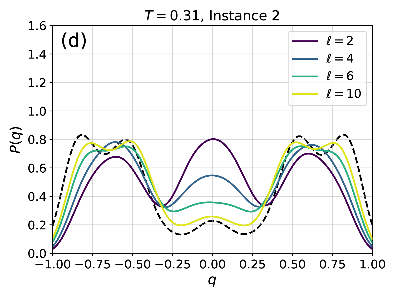
The image presents a line chart illustrating the probability distribution, P(q), as a function of 'q' for different values of 'l'. The chart is labeled with "T = 0.31, Instance 2" indicating specific parameters for the data. The chart appears to show how the shape of the probability distribution changes with varying 'l' values.
### Components/Axes
* **X-axis:** Labeled 'q', ranging from -1.00 to 1.00 with increments of 0.25.
* **Y-axis:** Labeled 'P(q)', ranging from 0.0 to 1.6 with increments of 0.2.
* **Title:** "T = 0.31, Instance 2" positioned at the top-center of the chart.
* **Legend:** Located in the top-right corner, listing the 'l' values and their corresponding line colors:
* l = 2 (Purple)
* l = 4 (Blue)
* l = 6 (Teal)
* l = 10 (Yellow)
* **Label (d):** Located in the top-left corner.
### Detailed Analysis
The chart displays four distinct lines, each representing a different 'l' value.
* **l = 2 (Purple):** The line exhibits a roughly symmetrical, bell-shaped curve. It peaks around q = -0.75 and q = 0.75, reaching a maximum P(q) of approximately 0.85. The curve dips to a minimum of approximately 0.15 around q = 0.
* **l = 4 (Blue):** This line also shows a bell-shaped curve, but it is broader and flatter than the l=2 line. It peaks around q = -0.5 and q = 0.5, reaching a maximum P(q) of approximately 0.8. The minimum value is around 0.2 at q = 0.
* **l = 6 (Teal):** The teal line continues the trend of broadening and flattening. It peaks around q = -0.25 and q = 0.25, reaching a maximum P(q) of approximately 0.7. The minimum value is around 0.3 at q = 0.
* **l = 10 (Yellow):** This line is the broadest and flattest of the four. It peaks around q = 0, reaching a maximum P(q) of approximately 0.6. The minimum value is around 0.4 at q = -0.75 and q = 0.75.
All lines exhibit a roughly symmetrical shape around q = 0. As 'l' increases, the peak of the distribution becomes less pronounced and the curve flattens.
### Key Observations
* The probability distributions become wider and flatter as 'l' increases.
* The peak probability decreases as 'l' increases.
* The minimum probability increases as 'l' increases.
* The distributions appear to be centered around q = 0, although there is a slight shift towards negative values for lower 'l' values.
### Interpretation
The data suggests that the parameter 'l' controls the spread or variance of the probability distribution. Higher values of 'l' lead to a more uniform distribution, indicating greater uncertainty or a wider range of possible values for 'q'. Lower values of 'l' result in a more peaked distribution, indicating a higher probability of observing values of 'q' closer to the peak. The parameter 'T = 0.31' and 'Instance 2' likely define the specific conditions under which these distributions are observed. The distributions could represent the probability of a certain state or outcome given a specific value of 'q', and 'l' might be related to the number of degrees of freedom or the amount of information available. The 'd' label could indicate a specific experimental setup or condition. The consistent trend across all 'l' values suggests a systematic relationship between 'l' and the shape of the probability distribution.