## Line Chart: Accuracy vs. Sample Size (k)
### Overview
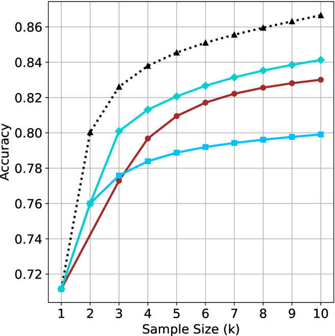
This image displays a line chart illustrating the relationship between "Sample Size (k)" and "Accuracy." The chart features four distinct data series, each represented by a unique color and marker shape. All four series exhibit a positive correlation, where accuracy increases as the sample size increases. Notably, the chart lacks a legend, making it impossible to identify the specific models or datasets associated with each line.
### Components/Axes
* **X-Axis:** Labeled "Sample Size (k)". The scale is linear, ranging from 1 to 10, with integer markers at each unit.
* **Y-Axis:** Labeled "Accuracy". The scale ranges from 0.72 to 0.86, with grid lines at intervals of 0.02.
* **Data Series:**
* **Black Dotted Line (Triangle markers):** The highest-performing series.
* **Teal/Cyan Line (Diamond markers):** The second-highest-performing series.
* **Dark Red/Maroon Line (Circle markers):** The third-highest-performing series.
* **Light Blue/Sky Blue Line (Square markers):** The lowest-performing series at higher sample sizes.
* **Grid:** A standard Cartesian grid is overlaid, with vertical lines at each integer of the x-axis and horizontal lines at each 0.02 increment of the y-axis.
### Detailed Analysis
All four data series originate from a single point at **k=1**, with an accuracy of approximately **0.71**.
#### 1. Black Dotted Line (Triangles)
* **Trend:** This line shows the steepest initial growth and maintains the highest accuracy throughout the range.
* **Values:**
* k=1: ~0.71
* k=2: 0.80
* k=3: ~0.825
* k=4: ~0.838
* k=5: ~0.845
* k=6: ~0.85
* k=7: ~0.855
* k=8: ~0.86
* k=9: ~0.863
* k=10: ~0.865
#### 2. Teal/Cyan Line (Diamonds)
* **Trend:** This line shows strong growth, particularly between k=1 and k=3, then continues to rise steadily but at a slower rate than the black line.
* **Values:**
* k=1: ~0.71
* k=2: 0.76
* k=3: 0.80
* k=4: ~0.813
* k=5: 0.82
* k=6: ~0.827
* k=7: ~0.832
* k=8: ~0.835
* k=9: ~0.838
* k=10: ~0.841
#### 3. Dark Red/Maroon Line (Circles)
* **Trend:** This line shows a more gradual, consistent upward slope compared to the others. It starts as the lowest performer (tied with the light blue line) but overtakes the light blue line between k=2 and k=3.
* **Values:**
* k=1: ~0.71
* k=2: ~0.735
* k=3: ~0.773
* k=4: ~0.797
* k=5: ~0.81
* k=6: ~0.817
* k=7: ~0.822
* k=8: ~0.825
* k=9: ~0.828
* k=10: ~0.83
#### 4. Light Blue/Sky Blue Line (Squares)
* **Trend:** This line shows rapid initial growth (matching the teal line at k=2) but experiences significant diminishing returns, flattening out considerably after k=3.
* **Values:**
* k=1: ~0.71
* k=2: 0.76
* k=3: ~0.776
* k=4: ~0.784
* k=5: ~0.789
* k=6: ~0.792
* k=7: ~0.794
* k=8: ~0.796
* k=9: ~0.798
* k=10: ~0.799
### Key Observations
* **Convergence:** All models perform identically at the smallest sample size (k=1).
* **Divergence:** The models diverge significantly as the sample size increases.
* **Diminishing Returns:** The Light Blue (Square) line exhibits the most severe diminishing returns, effectively plateauing near 0.80 after k=5.
* **Cross-over:** The Teal (Diamond) and Light Blue (Square) lines share the same accuracy at k=2 (0.76), after which the Teal line continues to climb while the Light Blue line flattens.
### Interpretation
This chart is characteristic of a machine learning performance evaluation, likely comparing different algorithms or model architectures in a "few-shot" or "data-scaling" context.
* **The Black Dotted Model** is the most robust, as it benefits the most from additional data, suggesting it has the highest capacity to learn from larger samples.
* **The Light Blue Model** appears to be "data-starved" or limited by its architecture; it gains initial performance quickly but fails to leverage additional data beyond k=3 effectively.
* **The Maroon Model** represents a balanced approach, showing steady, predictable improvement without the sharp plateauing seen in the light blue model, though it lacks the high-end performance of the black or teal models.
* **The Teal Model** represents a middle ground, performing well but ultimately falling short of the black model's ceiling.