TECHNICAL ASSET FINGERPRINT
636890db0fb4e998e8ce26f9
Click to view fullscreen
Press ESC or click to close
FOUND IN PAPERS
EXPERT: healer-alpha-free VERSION 1
RUNTIME: free/openrouter/healer-alpha
INTEL_VERIFIED
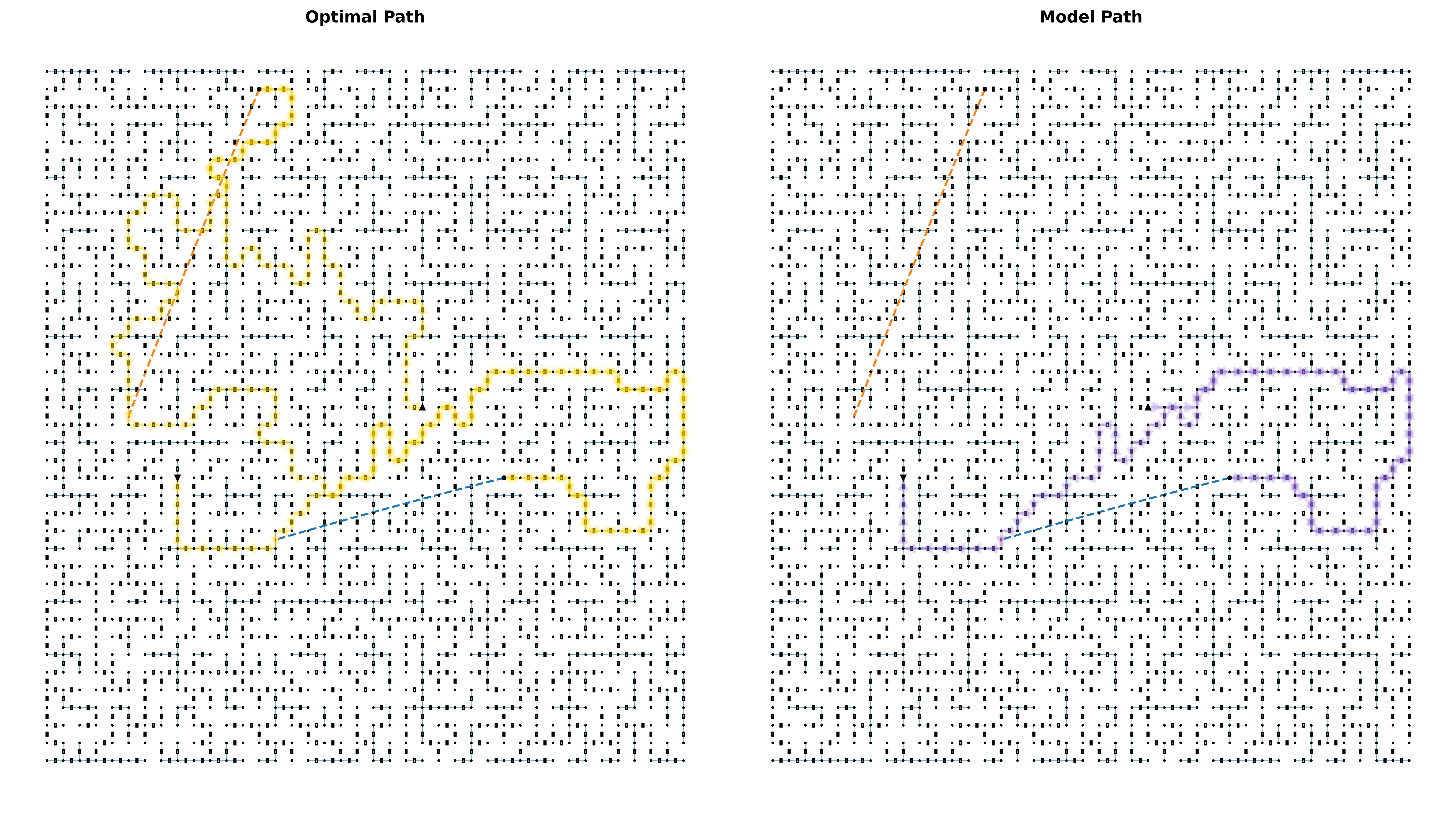
## Diagram Comparison: Optimal Path vs. Model Path
### Overview
The image displays two side-by-side diagrams on a white background, each titled and depicting a pathfinding or navigation scenario on an identical underlying grid. The left diagram is titled "Optimal Path," and the right is titled "Model Path." Both diagrams show a complex lattice of black dots connected by short black lines, forming a grid or network. Overlaid on this grid are colored paths and dashed reference lines. The primary purpose is to visually compare a theoretically optimal route with a route generated by a model.
### Components/Axes
* **Titles:** Centered at the top of each respective diagram.
* Left: "Optimal Path"
* Right: "Model Path"
* **Base Grid:** A uniform lattice of small black dots (nodes) connected by short, thin black lines (edges), forming a dense, maze-like network across the entire area of each diagram.
* **Paths (Primary Data Series):**
* **Optimal Path (Left Diagram):** A thick, continuous **yellow** line tracing a complex, winding route through the grid.
* **Model Path (Right Diagram):** a thick, continuous **purple** line tracing a different, somewhat more direct but still irregular route through the identical grid.
* **Reference Lines (Secondary Elements):**
* An **orange dashed line** runs diagonally from the upper-left quadrant towards the center in both diagrams. Its position and angle appear identical in both.
* A **blue dashed line** runs diagonally from the lower-left quadrant towards the center-right in both diagrams. Its position and angle also appear identical in both.
* **Markers:**
* A small, solid **black triangle** is present in both diagrams. In the "Optimal Path" diagram, it is located near the center-left. In the "Model Path" diagram, it is located near the center-right. This likely marks a start point, end point, or key waypoint.
* A small, solid **black circle** is present at the terminus of the blue dashed line in both diagrams.
### Detailed Analysis
**Spatial Grounding & Path Description:**
1. **Optimal Path (Yellow):**
* **Trend:** The path is highly non-linear and exploratory. It begins (or passes through) the area near the black triangle in the center-left. It initially moves upward and right, then executes a large, looping detour to the far left side of the grid. It then winds back towards the center, makes another significant excursion to the lower-right quadrant, and finally terminates near the black circle at the end of the blue dashed line. The path frequently doubles back and makes sharp turns, suggesting it is navigating around obstacles or following a cost-minimizing algorithm that values path quality over directness.
* **Key Segments:** Notable features include a long vertical segment on the far left, a dense cluster of turns in the upper-middle area, and a final approach to the endpoint from the south.
2. **Model Path (Purple):**
* **Trend:** The path is more direct than the yellow path but still contains significant deviations. It appears to start (or pass through) the black triangle, now located in the center-right. It moves generally leftward and downward, then curves upward to approach the same black circle endpoint. While it avoids the extreme detours of the optimal path, it is not a straight line; it has several bends and a notable "S" curve in its middle section.
* **Key Segments:** The path has a smoother overall trajectory but clearly does not follow the shortest geometric line between its apparent start and end points.
**Cross-Reference of Reference Lines:**
The orange and blue dashed lines are static reference elements, identical in placement across both diagrams. They do not interact with the paths directly but provide fixed spatial anchors for comparison. The yellow optimal path crosses the orange dashed line twice and the blue dashed line once. The purple model path crosses the orange dashed line once and terminates at the blue dashed line's endpoint.
### Key Observations
1. **Path Divergence:** The most striking observation is the significant difference in route choice between the "Optimal" and "Model" paths, despite operating in the same environment (grid). The optimal path is far more circuitous.
2. **Grid Complexity:** The underlying black dot-and-line grid is highly complex and irregular, resembling a road network or a state-space graph with many possible connections. This complexity explains why even the "optimal" path is not simple.
3. **Shared Landmarks:** The black triangle and circle serve as common reference points, but their relative positions to the paths differ. The triangle is near the start of the yellow path but near the middle of the purple path's trajectory. Both paths share the same final endpoint (black circle).
4. **Visual Efficiency:** The model path (purple) appears to cover less total distance and has fewer sharp turns than the optimal path (yellow), suggesting the model may be optimizing for a different metric (e.g., smoothness, predictability) or has learned an approximate policy.
### Interpretation
This image is a classic visualization used in fields like robotics, reinforcement learning, or algorithmic path planning. It demonstrates the difference between a ground-truth, computationally derived optimal solution and the solution produced by a trained model (e.g., a neural network).
* **What the Data Suggests:** The "Optimal Path" likely represents the result of an exhaustive search algorithm (like A* or Dijkstra's) that guarantees the shortest or least-cost path through the complex grid, albeit at high computational cost. Its winding nature indicates the grid contains many high-cost areas or obstacles that must be circumvented. The "Model Path" represents a learned policy's attempt to navigate the same space. Its more direct but imperfect route suggests the model has generalized a "good enough" strategy that balances efficiency with computational speed, but it has not fully replicated the optimal solution's nuanced navigation of the cost landscape.
* **Relationship Between Elements:** The static dashed lines and markers provide a fixed frame of reference, allowing the viewer to easily see how each path relates to the same spatial landmarks. The identical grid confirms the comparison is fair.
* **Notable Anomalies/Insights:** The fact that the model's path is *less* tortuous than the optimal path is counterintuitive and highly significant. It implies that the model's objective function or training data may not perfectly align with the true optimality criteria used to generate the yellow path. Alternatively, the model might be avoiding areas that are technically optimal but risky or unstable in a way not captured by the grid's cost structure. This visualization effectively highlights the "sim-to-real" or "theory-to-practice" gap in learned navigation systems.
DECODING INTELLIGENCE...