\n
## Charts: Logarithmic Error and Probability Analysis
### Overview
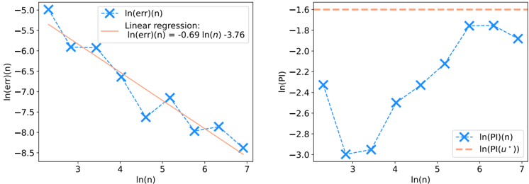
The image presents two separate scatter plots with regression lines. The left plot displays the natural logarithm of the error, ln(err)(n), against the natural logarithm of n, ln(n). The right plot shows the natural logarithm of probability, ln(P)(n), also against ln(n). Both plots include linear regression lines for comparison.
### Components/Axes
**Left Plot:**
* **X-axis:** ln(n) - Scale ranges from approximately 2.8 to 7.2 with markers at 3, 4, 5, 6, and 7.
* **Y-axis:** ln(err)(n) - Scale ranges from approximately -9.0 to -5.0 with markers at -6, -7, -8, and -9.
* **Data Series:** ln(err)(n) - Represented by blue 'x' markers.
* **Regression Line:** Linear regression: ln(err)(n) = -0.69 ln(n) - 3.76 - Represented by a dashed orange line.
* **Legend:** Located in the top-right corner.
* Blue 'x': ln(err)(n)
* Orange dashed line: Linear regression: ln(err)(n) = -0.69 ln(n) - 3.76
**Right Plot:**
* **X-axis:** ln(n) - Scale ranges from approximately 2.8 to 7.2 with markers at 3, 4, 5, 6, and 7.
* **Y-axis:** ln(P)(n) - Scale ranges from approximately -3.1 to -1.6 with markers at -2.4, -2.6, -2.8, and -3.0.
* **Data Series:** ln(P)(n) - Represented by blue 'x' markers.
* **Regression Line:** ln(P)(u'') - Represented by a dashed orange horizontal line.
* **Legend:** Located in the top-right corner.
* Blue 'x': ln(P)(n)
* Orange dashed line: ln(P)(u'')
### Detailed Analysis or Content Details
**Left Plot:**
The data series ln(err)(n) exhibits a clear downward trend. The line slopes downward from left to right.
* (ln(n) ≈ 3.0, ln(err)(n) ≈ -6.1)
* (ln(n) ≈ 3.5, ln(err)(n) ≈ -6.7)
* (ln(n) ≈ 4.0, ln(err)(n) ≈ -7.3)
* (ln(n) ≈ 4.5, ln(err)(n) ≈ -7.6)
* (ln(n) ≈ 5.0, ln(err)(n) ≈ -7.9)
* (ln(n) ≈ 6.0, ln(err)(n) ≈ -8.3)
* (ln(n) ≈ 7.0, ln(err)(n) ≈ -8.7)
The regression line closely follows the downward trend of the data, with a slope of approximately -0.69.
**Right Plot:**
The data series ln(P)(n) initially increases, then plateaus and slightly decreases.
* (ln(n) ≈ 3.0, ln(P)(n) ≈ -3.0)
* (ln(n) ≈ 3.5, ln(P)(n) ≈ -2.6)
* (ln(n) ≈ 4.0, ln(P)(n) ≈ -2.4)
* (ln(n) ≈ 4.5, ln(P)(n) ≈ -2.1)
* (ln(n) ≈ 5.0, ln(P)(n) ≈ -1.8)
* (ln(n) ≈ 6.0, ln(P)(n) ≈ -1.9)
* (ln(n) ≈ 7.0, ln(P)(n) ≈ -1.7)
The regression line is a horizontal line at approximately ln(P)(u'') = -1.65.
### Key Observations
* The left plot shows a strong negative correlation between ln(n) and ln(err)(n), indicating that as n increases, the error decreases exponentially.
* The right plot shows a more complex relationship between ln(n) and ln(P)(n), with an initial increase in probability followed by a leveling off.
* The regression line on the right plot suggests a limit to the probability as n increases.
### Interpretation
The data suggests an analysis of error and probability as a function of a variable 'n'. The left plot indicates that the error decreases as 'n' increases, which could represent improved accuracy or convergence with increasing sample size or iterations. The logarithmic scale implies an exponential decay of error.
The right plot shows that the probability initially increases with 'n', but then reaches a plateau. This could indicate a saturation point where further increases in 'n' do not significantly improve the probability. The horizontal regression line suggests an upper bound on the probability.
The use of natural logarithms suggests that the underlying relationships may be exponential. The difference between the two plots could be related to the interplay between error reduction and probability maximization. The 'u'' in the right plot's legend may represent a specific condition or parameter under which the probability is evaluated. The plots together could be used to optimize a process or model by balancing error and probability.