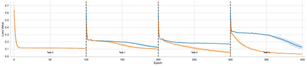
## Line Chart: Loss Value vs. Epoch for Multiple Tasks
### Overview
The image is a line chart displaying the loss value of a model over epochs for four different tasks (Task 0, Task 1, Task 2, and Task 3). There are two lines plotted on the chart: one in orange and one in blue, representing different aspects of the model's performance. The chart is divided into sections by vertical dashed lines, each section corresponding to a different task.
### Components/Axes
* **X-axis:** Epoch, ranging from 0 to 400 in increments of 50.
* **Y-axis:** Loss Value, ranging from 0.0 to 0.7 in increments of 0.1.
* **Lines:**
* Orange line: Represents one aspect of the model's performance.
* Blue line: Represents another aspect of the model's performance.
* **Task Labels:** "Task 0", "Task 1", "Task 2", "Task 3" are placed near the bottom of the chart, indicating the task associated with each section.
* **Vertical Dashed Lines:** Separate the tasks, located approximately at Epoch = 100, 200, and 300.
### Detailed Analysis
**Task 0 (Epoch 0-100):**
* **Orange Line:** Starts at approximately 0.65 and rapidly decreases to approximately 0.1 between Epoch 0 and Epoch 20. It then remains relatively constant at approximately 0.1 until Epoch 100.
* **Blue Line:** Not present in this section.
**Task 1 (Epoch 100-200):**
* **Orange Line:** Starts at approximately 0.23 and gradually decreases to approximately 0.15 by Epoch 200.
* **Blue Line:** Starts at approximately 0.7 and rapidly decreases to approximately 0.23 between Epoch 100 and Epoch 110. It then gradually decreases to approximately 0.2 by Epoch 200.
**Task 2 (Epoch 200-300):**
* **Orange Line:** Starts at approximately 0.25 and gradually decreases to approximately 0.1 by Epoch 300.
* **Blue Line:** Starts at approximately 0.7 and rapidly decreases to approximately 0.25 between Epoch 200 and Epoch 210. It then remains relatively constant at approximately 0.18 until Epoch 300.
**Task 3 (Epoch 300-400):**
* **Orange Line:** Starts at approximately 0.35 and gradually decreases to approximately 0.05 by Epoch 400.
* **Blue Line:** Starts at approximately 0.7 and rapidly decreases to approximately 0.35 between Epoch 300 and Epoch 310. It then gradually decreases to approximately 0.15 by Epoch 400.
### Key Observations
* The orange line consistently shows a decreasing loss value across all tasks.
* The blue line shows a rapid initial decrease in loss value at the beginning of each task, followed by a more gradual decrease or stabilization.
* The initial loss value for the blue line at the start of each task is consistently high (approximately 0.7).
* The orange line's initial loss value at the start of tasks 1, 2, and 3 is significantly lower than the blue line's.
### Interpretation
The chart illustrates the learning process of a model across multiple tasks. The orange line likely represents the loss on the current task, while the blue line may represent the loss on a previous task or a combined loss. The rapid initial decrease in the blue line's loss value at the beginning of each task suggests that the model is quickly adapting to the new task. The lower and decreasing loss value of the orange line indicates that the model is effectively learning and improving its performance on the current task. The consistent high initial loss of the blue line at the start of each task could indicate that the model is experiencing some forgetting of previous tasks or that the combined loss is heavily influenced by the new task.