## Line Graphs: Correlation Length vs. Temperature
### Overview
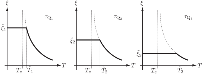
The image presents three line graphs illustrating the relationship between correlation length (ξ) and temperature (T) for different scenarios denoted as τQ1, τQ2, and τQ3. Each graph shows a distinct behavior of the correlation length as temperature changes, particularly around a critical temperature (Tc).
### Components/Axes
* **Vertical Axis (y-axis):** Represents the correlation length, labeled as "ξ" (xi). The y-axis markers are labeled as ξ̃1, ξ̃2, and ξ̃3 for the three graphs respectively.
* **Horizontal Axis (x-axis):** Represents the temperature, labeled as "T".
* **Curves:** Each graph contains a solid line representing the correlation length as a function of temperature. Additionally, each graph contains a dashed line.
* **Vertical Lines:** Each graph has two vertical dotted lines, one at Tc (critical temperature) and another at a temperature denoted as T̃1, T̃2, and T̃3 for the three graphs respectively.
* **Titles:** The graphs are titled as τQ1, τQ2, and τQ3.
### Detailed Analysis
**Graph 1: τQ1**
* **Trend:** The solid line starts at ξ̃1 and remains constant until T̃c. After T̃c, the line decreases sharply until T̃1, then continues to decrease at a slower rate as temperature increases. The dashed line increases sharply as it approaches T̃c from the right.
* **Key Points:**
* Correlation length is constant at ξ̃1 for T < T̃c.
* Correlation length decreases rapidly for T > T̃c.
**Graph 2: τQ2**
* **Trend:** The solid line starts at ξ̃2 and remains constant until T̃c. After T̃c, the line decreases sharply until T̃2, then continues to decrease at a slower rate as temperature increases. The dashed line increases sharply as it approaches T̃c from the right.
* **Key Points:**
* Correlation length is constant at ξ̃2 for T < T̃c.
* Correlation length decreases rapidly for T > T̃c.
**Graph 3: τQ3**
* **Trend:** The solid line starts at ξ̃3 and remains constant until T̃c. After T̃c, the line decreases sharply until T̃3, then continues to decrease at a slower rate as temperature increases. The dashed line increases sharply as it approaches T̃c from the right.
* **Key Points:**
* Correlation length is constant at ξ̃3 for T < T̃c.
* Correlation length decreases rapidly for T > T̃c.
### Key Observations
* All three graphs exhibit a similar pattern: a constant correlation length below a critical temperature (Tc) followed by a decrease in correlation length as temperature increases beyond Tc.
* The dashed lines in each graph approach infinity as T approaches Tc from the right.
* The temperatures T̃1, T̃2, and T̃3 are greater than Tc in each respective graph.
### Interpretation
The graphs illustrate how the correlation length (ξ) of a system changes with temperature (T) near a critical point (Tc). The constant correlation length below Tc suggests a state of order or coherence. Above Tc, the rapid decrease in correlation length indicates a transition to a disordered state. The dashed lines likely represent a theoretical or limiting behavior of the correlation length, diverging at Tc, which is characteristic of second-order phase transitions. The different values of ξ̃1, ξ̃2, and ξ̃3 and the different temperatures T̃1, T̃2, and T̃3 suggest that the specific details of this transition depend on the parameter τQ, which could represent different physical conditions or system properties.