TECHNICAL ASSET FINGERPRINT
64bd7c87af7dc78fac12ab7e
Click to view fullscreen
Press ESC or click to close
FOUND IN PAPERS
EXPERT: gemini-2.0-flash VERSION 1
RUNTIME: nugit/gemini/gemini-2.0-flash
INTEL_VERIFIED
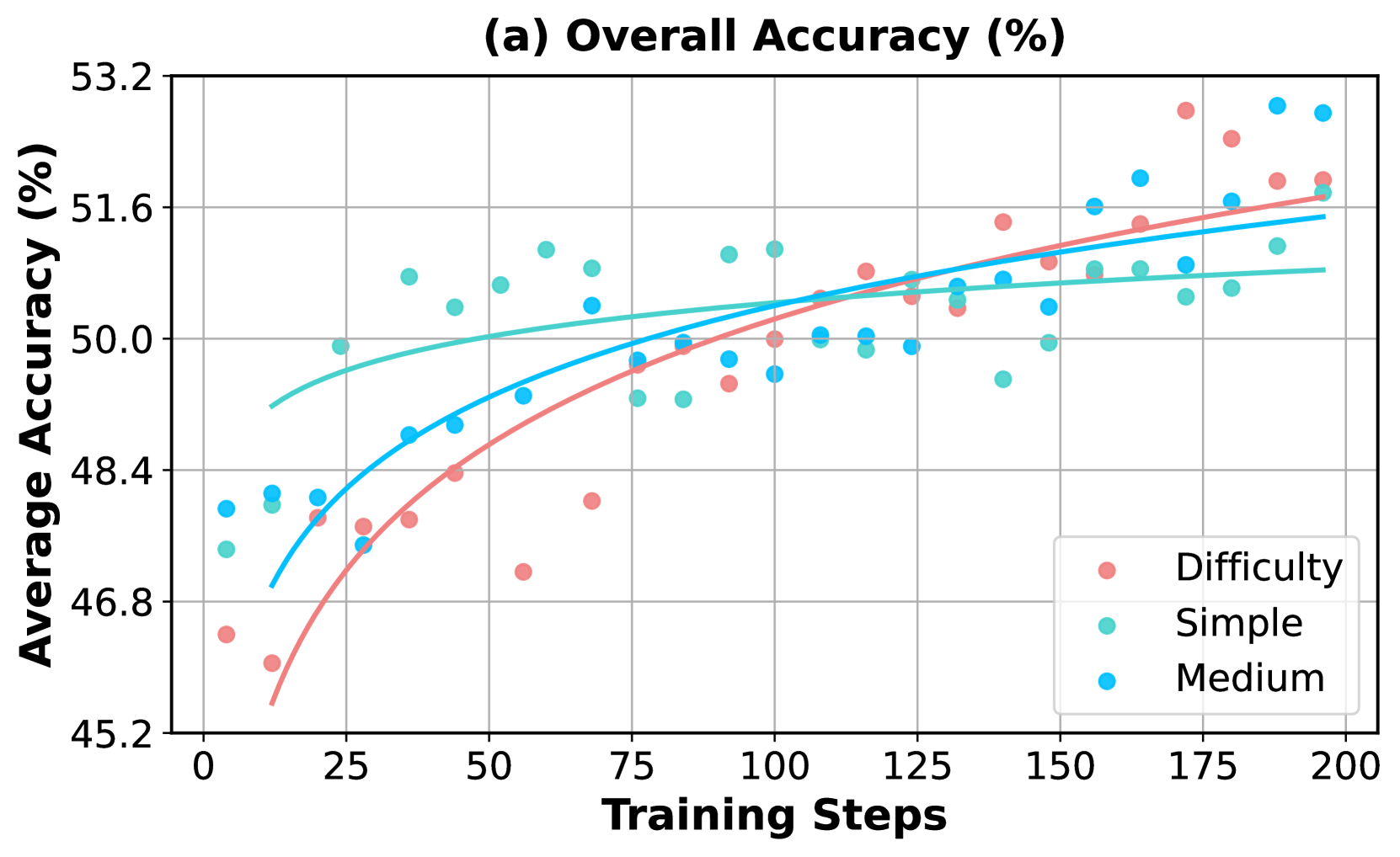
## Chart: Overall Accuracy vs. Training Steps
### Overview
The image is a scatter plot showing the relationship between "Training Steps" and "Average Accuracy (%)" for three categories: "Difficulty", "Simple", and "Medium". Trend lines are fitted to each category's data points. The plot includes a title, axis labels, gridlines, and a legend.
### Components/Axes
* **Title:** (a) Overall Accuracy (%)
* **X-axis:** Training Steps
* Scale: 0 to 200, with major ticks at intervals of 25 (0, 25, 50, 75, 100, 125, 150, 175, 200)
* **Y-axis:** Average Accuracy (%)
* Scale: 45.2 to 53.2, with major ticks at intervals of 1.6 (45.2, 46.8, 48.4, 50.0, 51.6, 53.2)
* **Legend:** Located in the bottom-right corner.
* Difficulty (Reddish-Pink)
* Simple (Light Green/Cyan)
* Medium (Light Blue/Cyan)
### Detailed Analysis
* **Difficulty (Reddish-Pink):**
* Trend: The accuracy increases with training steps, showing a positive correlation. The rate of increase appears to slow down as training steps increase.
* Data Points:
* At 0 Training Steps: ~46.8% accuracy
* At 25 Training Steps: ~47.5% accuracy
* At 50 Training Steps: ~48.4% accuracy
* At 75 Training Steps: ~47.3% accuracy
* At 100 Training Steps: ~49.5% accuracy
* At 125 Training Steps: ~50.0% accuracy
* At 150 Training Steps: ~51.0% accuracy
* At 175 Training Steps: ~52.0% accuracy
* At 200 Training Steps: ~51.5% accuracy
* **Simple (Light Green/Cyan):**
* Trend: The accuracy remains relatively stable with increasing training steps, showing a slight positive correlation.
* Data Points:
* At 0 Training Steps: ~47.3% accuracy
* At 25 Training Steps: ~48.4% accuracy
* At 50 Training Steps: ~50.5% accuracy
* At 75 Training Steps: ~50.0% accuracy
* At 100 Training Steps: ~50.5% accuracy
* At 125 Training Steps: ~50.0% accuracy
* At 150 Training Steps: ~50.5% accuracy
* At 175 Training Steps: ~50.5% accuracy
* At 200 Training Steps: ~51.5% accuracy
* **Medium (Light Blue/Cyan):**
* Trend: The accuracy increases with training steps, showing a positive correlation.
* Data Points:
* At 0 Training Steps: ~48.4% accuracy
* At 25 Training Steps: ~48.4% accuracy
* At 50 Training Steps: ~49.0% accuracy
* At 75 Training Steps: ~48.0% accuracy
* At 100 Training Steps: ~50.0% accuracy
* At 125 Training Steps: ~50.0% accuracy
* At 150 Training Steps: ~51.0% accuracy
* At 175 Training Steps: ~51.5% accuracy
* At 200 Training Steps: ~52.0% accuracy
### Key Observations
* The "Difficulty" category shows the most significant improvement in accuracy with increasing training steps, starting from the lowest initial accuracy.
* The "Simple" category has the most stable accuracy across the training steps.
* The "Medium" category shows a moderate improvement in accuracy with increasing training steps.
* The accuracy values for all three categories appear to converge as the number of training steps increases.
### Interpretation
The data suggests that the model's performance on "Difficulty" benefits the most from increased training, while "Simple" is already well-learned. "Medium" shows a moderate learning curve. The convergence of accuracy values implies that with sufficient training, the model can achieve comparable performance across all three categories. The plot demonstrates the impact of training steps on the overall accuracy of the model for different levels of difficulty. The "Difficulty" category starts with the lowest accuracy but shows the most significant improvement, indicating that the model learns more effectively from harder examples with more training.
DECODING INTELLIGENCE...
EXPERT: gemini-2.5-flash-lite-free VERSION 1
RUNTIME: google-free/gemini-2.5-flash-lite
INTEL_VERIFIED
## Line Chart: Overall Accuracy (%) vs. Training Steps
### Overview
This image displays a line chart titled "(a) Overall Accuracy (%)". The chart plots the "Average Accuracy (%)" on the y-axis against "Training Steps" on the x-axis. Three data series, representing different difficulty levels ("Difficulty", "Simple", and "Medium"), are visualized with scattered data points and corresponding trend lines.
### Components/Axes
* **Title:** (a) Overall Accuracy (%)
* **Y-axis Label:** Average Accuracy (%)
* **Scale:** Ranges from 45.2 to 53.2, with major tick marks at 45.2, 46.8, 48.4, 50.0, 51.6, and 53.2.
* **X-axis Label:** Training Steps
* **Scale:** Ranges from 0 to 200, with major tick marks at 0, 25, 50, 75, 100, 125, 150, 175, and 200.
* **Legend:** Located in the bottom-right quadrant of the chart.
* **Difficulty:** Represented by red dots and a red trend line.
* **Simple:** Represented by teal/cyan dots and a teal/cyan trend line.
* **Medium:** Represented by blue dots and a blue trend line.
### Detailed Analysis
**Data Series: Difficulty (Red)**
* **Trend:** The red data points and trend line show an upward, accelerating curve, indicating that accuracy increases significantly with training steps, especially in the initial stages.
* **Approximate Data Points (Training Steps, Accuracy (%)):**
* (0, 45.5)
* (10, 46.5)
* (20, 47.5)
* (25, 48.0)
* (35, 48.5)
* (45, 49.0)
* (55, 49.5)
* (65, 49.8)
* (75, 50.0)
* (85, 50.2)
* (95, 50.5)
* (105, 50.7)
* (115, 50.9)
* (125, 51.0)
* (135, 51.2)
* (145, 51.3)
* (155, 51.4)
* (165, 51.5)
* (175, 51.6)
* (185, 51.7)
* (195, 51.8)
**Data Series: Simple (Teal/Cyan)**
* **Trend:** The teal/cyan data points and trend line show a generally upward, but more linear, trend compared to "Difficulty". The accuracy increases steadily with training steps.
* **Approximate Data Points (Training Steps, Accuracy (%)):**
* (0, 46.7)
* (10, 47.0)
* (20, 47.5)
* (30, 48.0)
* (40, 48.5)
* (50, 49.0)
* (60, 49.5)
* (70, 49.8)
* (80, 50.0)
* (90, 50.2)
* (100, 50.4)
* (110, 50.5)
* (120, 50.6)
* (130, 50.7)
* (140, 50.8)
* (150, 50.9)
* (160, 51.0)
* (170, 51.1)
* (180, 51.2)
* (190, 51.3)
* (200, 51.4)
**Data Series: Medium (Blue)**
* **Trend:** The blue data points and trend line show an upward trend that starts with a steeper slope and then flattens out, becoming more linear and similar to the "Simple" trend in later stages.
* **Approximate Data Points (Training Steps, Accuracy (%)):**
* (0, 47.2)
* (5, 47.5)
* (15, 48.2)
* (25, 48.6)
* (35, 49.0)
* (45, 49.4)
* (55, 49.8)
* (65, 50.0)
* (75, 50.2)
* (85, 50.3)
* (95, 50.4)
* (105, 50.5)
* (115, 50.6)
* (125, 50.7)
* (135, 50.8)
* (145, 50.9)
* (155, 51.0)
* (165, 51.1)
* (175, 51.2)
* (185, 51.3)
* (195, 51.4)
### Key Observations
* **Initial Performance:** At the beginning of training (Training Steps = 0), the "Medium" difficulty level shows the highest initial accuracy (approx. 47.2%), followed by "Simple" (approx. 46.7%), and then "Difficulty" (approx. 45.5%).
* **Convergence:** Over time, the accuracy for all three difficulty levels converges. The "Difficulty" series shows the most significant improvement, catching up to and eventually surpassing the other two in terms of the rate of increase.
* **Late Stage Performance:** By the end of the training steps shown (around 200), the accuracy levels are very close, with "Difficulty" and "Medium" slightly higher than "Simple". The "Difficulty" trend line appears to be the highest at the very end of the plotted range, around 51.8%.
* **Variability:** The scattered data points indicate some variability in accuracy at each training step for all difficulty levels.
### Interpretation
This chart demonstrates the learning progress of a model across different difficulty levels over training steps.
* **Learning Dynamics:** The "Difficulty" series' accelerating curve suggests that the model learns more effectively from "Difficulty" examples as training progresses, or that these examples are more informative for improving overall accuracy. The initial lower accuracy might be due to the inherent complexity of these examples.
* **Model Robustness:** The convergence of all three lines by the end of training indicates that the model eventually achieves similar performance levels regardless of the initial difficulty setting, suggesting a degree of robustness. However, the different learning trajectories highlight how the model adapts to different types of data.
* **Training Efficiency:** The "Difficulty" series shows the most dramatic improvement, implying that focusing on more challenging examples might lead to faster overall accuracy gains after an initial learning phase. The "Simple" and "Medium" series show more consistent, linear growth, which might be considered more predictable or stable learning.
* **Peircean Investigative Reading:** The chart can be seen as a representation of the model's inferential process. The initial data points represent the model's first hypotheses about the data. The trend lines show the evolution of these hypotheses as new evidence (training steps) is processed. The convergence suggests that the model is approaching a stable, well-formed belief (high accuracy) about the underlying patterns, even if the path to that belief differs based on the nature of the data it's learning from. The variability in the points could represent moments of doubt or revision in the model's inferential process.
* **Reading Between the Lines:** The title "(a) Overall Accuracy (%)" implies that this is one part of a larger study, likely with other sub-plots (b), (c), etc., exploring different metrics or aspects of the model's performance. The choice of plotting "Difficulty" with an accelerating curve suggests a deliberate design choice in the training data or methodology, aiming to show how the model handles progressively harder tasks or how harder tasks contribute more to overall learning.
DECODING INTELLIGENCE...
EXPERT: gemma-3-27b-it-free VERSION 1
RUNTIME: google-free/gemma-3-27b-it
INTEL_VERIFIED
## Line Chart: Overall Accuracy (%)
### Overview
This chart displays the average accuracy (%) over training steps for different difficulty levels. It uses line plots to represent the trend for each difficulty level, overlaid with scatter plots showing individual data points.
### Components/Axes
* **Title:** (a) Overall Accuracy (%) - positioned at the top-center.
* **X-axis:** Training Steps - ranging from approximately 0 to 200.
* **Y-axis:** Average Accuracy (%) - ranging from approximately 45.2 to 53.2.
* **Legend:** Located in the bottom-right corner.
* Difficulty (represented by light red circles)
* Simple (represented by teal circles)
* Medium (represented by blue circles)
* **Gridlines:** Present throughout the chart for easier readability.
### Detailed Analysis
The chart contains three data series, each represented by a line and corresponding scatter points.
**1. Difficulty (Light Red):**
* **Trend:** The line slopes upward, indicating increasing accuracy with more training steps. The initial slope is steep, then gradually flattens.
* **Data Points (approximate):**
* (0, 46.4)
* (25, 47.8)
* (50, 49.2)
* (75, 50.2)
* (100, 50.8)
* (125, 51.2)
* (150, 51.4)
* (175, 51.6)
* (200, 51.8)
**2. Simple (Teal):**
* **Trend:** The line also slopes upward, but is more erratic than the "Difficulty" line. It starts lower than the "Difficulty" line but eventually surpasses it.
* **Data Points (approximate):**
* (0, 47.2)
* (25, 48.6)
* (50, 49.8)
* (75, 50.6)
* (100, 51.0)
* (125, 51.2)
* (150, 51.4)
* (175, 51.8)
* (200, 52.2)
**3. Medium (Blue):**
* **Trend:** The line slopes upward, and is the most stable of the three lines. It starts higher than the "Difficulty" line and remains consistently above it.
* **Data Points (approximate):**
* (0, 48.0)
* (25, 49.0)
* (50, 50.0)
* (75, 50.8)
* (100, 51.2)
* (125, 51.4)
* (150, 51.6)
* (175, 52.0)
* (200, 52.4)
### Key Observations
* All three difficulty levels show an increase in average accuracy with increasing training steps.
* The "Medium" difficulty consistently achieves the highest accuracy.
* The "Simple" difficulty shows the most variability in its data points.
* The "Difficulty" line starts with the lowest accuracy but shows a consistent upward trend.
* The lines converge as the training steps increase, suggesting diminishing returns in accuracy improvement.
### Interpretation
The chart demonstrates that increasing training steps generally leads to improved accuracy for all difficulty levels. The "Medium" difficulty consistently outperforms the others, suggesting it provides an optimal level of challenge for the model. The variability in the "Simple" difficulty might indicate that the model quickly learns the simple task, leading to fluctuations in accuracy as it overfits or encounters minor variations. The convergence of the lines at higher training steps suggests that further training may not yield significant improvements in accuracy. This data could be used to determine the optimal training duration and difficulty level for maximizing model performance. The chart suggests a positive correlation between training steps and accuracy, but also highlights the importance of selecting an appropriate difficulty level.
DECODING INTELLIGENCE...
EXPERT: healer-alpha-free VERSION 1
RUNTIME: free/openrouter/healer-alpha
INTEL_VERIFIED
## Scatter Plot with Trend Lines: Overall Accuracy (%) vs. Training Steps
### Overview
The image is a scatter plot chart titled "(a) Overall Accuracy (%)". It displays the relationship between the number of training steps (x-axis) and the average accuracy percentage (y-axis) for three different task difficulty categories: "Difficulty", "Simple", and "Medium". Each category is represented by colored data points and a corresponding fitted trend line.
### Components/Axes
* **Chart Title:** "(a) Overall Accuracy (%)" (Top center)
* **Y-Axis:**
* **Label:** "Average Accuracy (%)" (Left side, rotated vertically)
* **Scale:** Linear scale ranging from 45.2 to 53.2.
* **Major Tick Marks:** 45.2, 46.8, 48.4, 50.0, 51.6, 53.2.
* **X-Axis:**
* **Label:** "Training Steps" (Bottom center)
* **Scale:** Linear scale ranging from 0 to 200.
* **Major Tick Marks:** 0, 25, 50, 75, 100, 125, 150, 175, 200.
* **Legend:** Located in the bottom-right quadrant of the chart area.
* **"Difficulty":** Represented by red/salmon-colored circular points and a matching red/salmon trend line.
* **"Simple":** Represented by teal/turquoise-colored circular points and a matching teal/turquoise trend line.
* **"Medium":** Represented by bright blue/cyan-colored circular points and a matching bright blue/cyan trend line.
* **Grid:** A light gray grid is present, aligning with the major tick marks on both axes.
### Detailed Analysis
**Trend Verification & Data Point Approximation:**
* **"Difficulty" (Red/Salmon Series):**
* **Trend:** The trend line shows a steep, concave-down increase from low accuracy at the start, which gradually flattens as training steps increase. It starts as the lowest-performing category but shows the most significant improvement.
* **Approximate Data Points (Trend Line):**
* Step ~10: ~45.5%
* Step 50: ~48.8%
* Step 100: ~50.2%
* Step 150: ~51.0%
* Step 200: ~51.8%
* **Notable Scatter:** There is significant variance in the individual data points. For example, a point near step 60 is notably lower (~47.2%) than the trend line, while points after step 150 show high variance, with some reaching near 53.0%.
* **"Simple" (Teal/Turquoise Series):**
* **Trend:** The trend line starts at the highest accuracy level but has the shallowest slope, indicating the slowest rate of improvement. It is nearly linear with a very slight curve.
* **Approximate Data Points (Trend Line):**
* Step ~10: ~49.2%
* Step 50: ~50.0%
* Step 100: ~50.5%
* Step 150: ~50.8%
* Step 200: ~51.0%
* **Notable Scatter:** The data points are relatively tightly clustered around the trend line compared to the other series, suggesting more consistent performance on simple tasks.
* **"Medium" (Bright Blue/Cyan Series):**
* **Trend:** The trend line shows a moderate, concave-down increase, positioned between the "Difficulty" and "Simple" lines in both starting point and slope.
* **Approximate Data Points (Trend Line):**
* Step ~10: ~47.0%
* Step 50: ~49.2%
* Step 100: ~50.4%
* Step 150: ~51.2%
* Step 200: ~51.5%
* **Notable Scatter:** The scatter is moderate. A cluster of points around step 100-125 sits slightly below the trend line.
**Spatial Grounding:** The legend is positioned in the bottom-right, overlapping the lower portion of the data field. The "Difficulty" (red) trend line begins lowest on the left (y ~45.5 at x~10) and ends highest on the right (y ~51.8 at x=200). The "Simple" (teal) line begins highest on the left (y ~49.2 at x~10) and ends lowest on the right (y ~51.0 at x=200). The "Medium" (blue) line is intermediate at both ends.
### Key Observations
1. **Convergence and Crossover:** All three trend lines converge in the region of 100-125 training steps, where their accuracy values are very close (~50.2-50.5%). After this point, the "Difficulty" line surpasses the others.
2. **Diminishing Returns:** All three curves show signs of diminishing returns (concave-down shape), where the gain in accuracy per additional training step decreases as training progresses.
3. **Performance Hierarchy Inversion:** The initial performance hierarchy ("Simple" > "Medium" > "Difficulty") inverts by the end of the plotted training steps ("Difficulty" > "Medium" > "Simple").
4. **Variance:** The "Difficulty" category exhibits the highest variance in data points, especially at higher step counts, suggesting less predictable outcomes when training on hard tasks.
### Interpretation
This chart demonstrates the learning dynamics of a model across tasks of varying difficulty. The data suggests that:
* **Model Learning is Non-Linear:** Accuracy does not improve at a constant rate; the most significant gains happen early in training.
* **Task Difficulty Impacts Learning Trajectory:** The model starts with a better baseline on simple tasks but learns more from complex ("Difficulty") tasks over time. The steeper slope for "Difficulty" indicates that the model's capacity to handle complex problems improves more dramatically with extended training.
* **Potential for Further Training:** Since the curves, especially for "Difficulty" and "Medium," have not fully plateaued by 200 steps, it is plausible that accuracy could continue to increase with further training, though at a slower rate.
* **Training Stability:** The higher variance in the "Difficulty" series might indicate that training on hard tasks is less stable or more sensitive to specific data batches or training conditions.
The inversion of performance hierarchy is a key insight. It implies that while simple tasks are easier to learn initially, sustained training disproportionately benefits the model's ability to solve more challenging problems, ultimately leading to higher overall accuracy on those hard tasks. This is a common and desirable pattern in machine learning, indicating the model is developing robust, generalizable features rather than just memorizing simple patterns.
DECODING INTELLIGENCE...
EXPERT: nemotron-free VERSION 1
RUNTIME: free/nvidia/nemotron-nano-12b-v2-vl:free
INTEL_VERIFIED
## Line Graph: (a) Overall Accuracy (%)
### Overview
The image depicts a line graph titled "(a) Overall Accuracy (%)" that visualizes the relationship between training steps and average accuracy across three difficulty categories: Difficulty (red), Simple (teal), and Medium (blue). The graph includes data points, trend lines, and a legend for categorical differentiation.
### Components/Axes
- **X-axis (Training Steps)**: Ranges from 0 to 200 in increments of 25.
- **Y-axis (Average Accuracy %)**: Ranges from 45.2% to 53.2% in increments of 1%.
- **Legend**: Located in the bottom-right corner, with three categories:
- **Red**: Difficulty
- **Teal**: Simple
- **Blue**: Medium
### Detailed Analysis
1. **Difficulty (Red)**:
- **Trend**: Steep upward slope from ~46.5% (at 0 steps) to ~51.8% (at 200 steps).
- **Data Points**: Scattered but align closely with the trend line. Notable values include ~47.5% at 50 steps and ~51.2% at 150 steps.
- **Uncertainty**: Values approximate ±0.3% due to data point dispersion.
2. **Simple (Teal)**:
- **Trend**: Gradual upward slope from ~47.5% (at 0 steps) to ~51.2% (at 200 steps).
- **Data Points**: More dispersed than Difficulty, with values like ~49.0% at 100 steps and ~50.8% at 175 steps.
- **Uncertainty**: Values approximate ±0.4%.
3. **Medium (Blue)**:
- **Trend**: Moderate upward slope from ~47.2% (at 0 steps) to ~51.6% (at 200 steps).
- **Data Points**: Consistent alignment with the trend line, e.g., ~49.5% at 100 steps and ~51.0% at 175 steps.
- **Uncertainty**: Values approximate ±0.2%.
### Key Observations
- **Trend Verification**: All three categories show positive correlation between training steps and accuracy. The Difficulty series exhibits the steepest improvement, followed by Medium and Simple.
- **Outliers**: No significant outliers; data points generally cluster around trend lines.
- **Spatial Grounding**: The legend is positioned in the bottom-right, ensuring clear association with line colors. Data points match legend colors exactly (e.g., red points for Difficulty).
### Interpretation
The graph demonstrates that increased training steps improve model performance across all difficulty levels. The Difficulty category shows the most pronounced improvement, suggesting that complex tasks benefit disproportionately from extended training. The trend lines indicate a logarithmic-like growth pattern, where early training steps yield larger accuracy gains, which plateau as steps increase. This implies diminishing returns in later training phases. The Medium category’s consistent performance highlights its stability compared to the more variable Simple and Difficulty categories.
DECODING INTELLIGENCE...