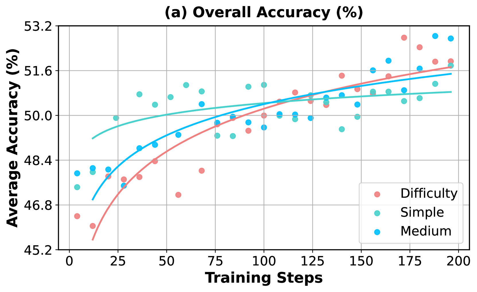
## Line Chart: Overall Accuracy (%)
### Overview
This chart displays the average accuracy (%) over training steps for different difficulty levels. It uses line plots to represent the trend for each difficulty level, overlaid with scatter plots showing individual data points.
### Components/Axes
* **Title:** (a) Overall Accuracy (%) - positioned at the top-center.
* **X-axis:** Training Steps - ranging from approximately 0 to 200.
* **Y-axis:** Average Accuracy (%) - ranging from approximately 45.2 to 53.2.
* **Legend:** Located in the bottom-right corner.
* Difficulty (represented by light red circles)
* Simple (represented by teal circles)
* Medium (represented by blue circles)
* **Gridlines:** Present throughout the chart for easier readability.
### Detailed Analysis
The chart contains three data series, each represented by a line and corresponding scatter points.
**1. Difficulty (Light Red):**
* **Trend:** The line slopes upward, indicating increasing accuracy with more training steps. The initial slope is steep, then gradually flattens.
* **Data Points (approximate):**
* (0, 46.4)
* (25, 47.8)
* (50, 49.2)
* (75, 50.2)
* (100, 50.8)
* (125, 51.2)
* (150, 51.4)
* (175, 51.6)
* (200, 51.8)
**2. Simple (Teal):**
* **Trend:** The line also slopes upward, but is more erratic than the "Difficulty" line. It starts lower than the "Difficulty" line but eventually surpasses it.
* **Data Points (approximate):**
* (0, 47.2)
* (25, 48.6)
* (50, 49.8)
* (75, 50.6)
* (100, 51.0)
* (125, 51.2)
* (150, 51.4)
* (175, 51.8)
* (200, 52.2)
**3. Medium (Blue):**
* **Trend:** The line slopes upward, and is the most stable of the three lines. It starts higher than the "Difficulty" line and remains consistently above it.
* **Data Points (approximate):**
* (0, 48.0)
* (25, 49.0)
* (50, 50.0)
* (75, 50.8)
* (100, 51.2)
* (125, 51.4)
* (150, 51.6)
* (175, 52.0)
* (200, 52.4)
### Key Observations
* All three difficulty levels show an increase in average accuracy with increasing training steps.
* The "Medium" difficulty consistently achieves the highest accuracy.
* The "Simple" difficulty shows the most variability in its data points.
* The "Difficulty" line starts with the lowest accuracy but shows a consistent upward trend.
* The lines converge as the training steps increase, suggesting diminishing returns in accuracy improvement.
### Interpretation
The chart demonstrates that increasing training steps generally leads to improved accuracy for all difficulty levels. The "Medium" difficulty consistently outperforms the others, suggesting it provides an optimal level of challenge for the model. The variability in the "Simple" difficulty might indicate that the model quickly learns the simple task, leading to fluctuations in accuracy as it overfits or encounters minor variations. The convergence of the lines at higher training steps suggests that further training may not yield significant improvements in accuracy. This data could be used to determine the optimal training duration and difficulty level for maximizing model performance. The chart suggests a positive correlation between training steps and accuracy, but also highlights the importance of selecting an appropriate difficulty level.