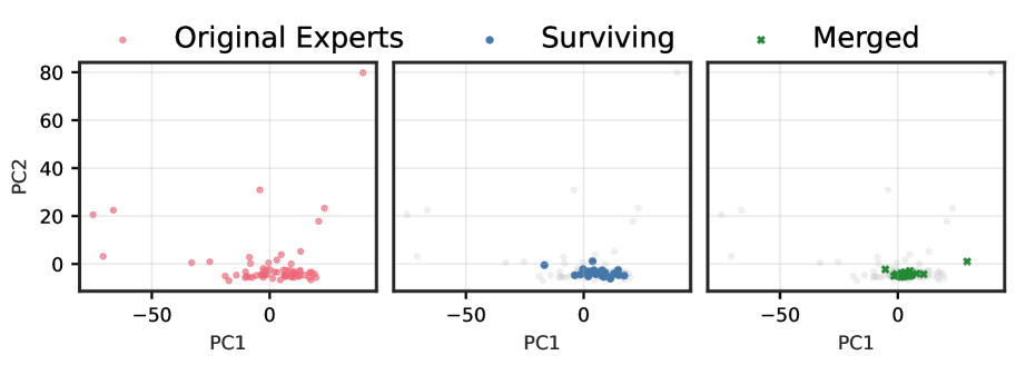
# Technical Data Extraction: Principal Component Analysis (PCA) of Experts
This image consists of three side-by-side scatter plots representing a Principal Component Analysis (PCA) of "Experts." The plots visualize the distribution and selection of data points across two principal components.
## 1. Global Chart Metadata
* **Y-Axis Label:** PC2 (Applies to all three plots)
* **Y-Axis Scale:** 0 to 80, with major tick marks at 0, 20, 40, 60, and 80.
* **X-Axis Label:** PC1 (Repeated for each individual plot)
* **X-Axis Scale:** Approximately -80 to +40, with major tick marks at -50 and 0.
* **Grid:** Light gray grid lines are present in the background of all plots.
## 2. Legend and Categories
The legend is positioned at the top of the image, spanning across the three panels:
* **Original Experts:** Represented by light red/pink circles ($\circ$).
* **Surviving:** Represented by blue solid circles ($\bullet$).
* **Merged:** Represented by green crosses ($\times$).
## 3. Panel Analysis
### Panel 1: Original Experts
* **Focus:** Displays the full distribution of the original dataset.
* **Data Distribution:**
* The majority of points are clustered tightly around the origin (PC1: -10 to +20, PC2: -5 to +5).
* There are several outliers:
* One extreme outlier at approximately (PC1: 40, PC2: 80).
* A small group of outliers on the far left at approximately (PC1: -75, PC2: 5 to 25).
* A few scattered points between PC1 -40 and 0 with PC2 values near 0.
* A few points with PC2 values between 20 and 40 near PC1 0 and PC1 25.
### Panel 2: Surviving
* **Focus:** Highlights a subset of the original data points that "survived."
* **Visual Encoding:** The "Surviving" points are highlighted in blue. The "Original Experts" from the first panel are shown in the background as faint, light-gray circles.
* **Data Distribution:**
* The surviving points are almost exclusively located within the central cluster (PC1: -15 to +20, PC2: -5 to +2).
* Notably, the extreme outlier at (40, 80) and the far-left outliers (PC1: -75) did **not** survive (they are grayed out).
### Panel 3: Merged
* **Focus:** Highlights a subset of data points that have been "merged."
* **Visual Encoding:** The "Merged" points are highlighted as green crosses. The "Original Experts" are shown in the background as faint, light-gray circles.
* **Data Distribution:**
* The merged points are concentrated in the central cluster, very similar to the "Surviving" group.
* There is one distinct green cross outlier at approximately (PC1: 30, PC2: 2), which corresponds to one of the original points that was not part of the "Surviving" blue set in the middle panel.
* Like the "Surviving" panel, the extreme top-right and far-left outliers are excluded from the "Merged" set.
## 4. Summary of Trends
The visualization demonstrates a filtering or reduction process. While the **Original Experts** contain several high-variance outliers (particularly in the PC2 dimension and the negative PC1 direction), the **Surviving** and **Merged** processes prioritize the dense central cluster located near the PC1/PC2 origin. The "Merged" set appears to be a specific selection or transformation of the "Surviving" set, maintaining the central density but including at least one different point on the positive PC1 axis.