## Principal Component Analysis (PCA) of Expert Data
### Overview
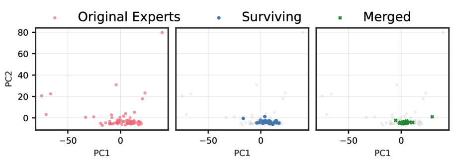
The image displays a Principal Component Analysis (PCA) plot that visualizes the distribution of data points in two principal components (PC1 and PC2). The plot is divided into three sections, each representing a different group of data: Original Experts, Surviving, and Merged. The data points are color-coded to distinguish between these groups.
### Components/Axes
- **X-axis (PC1)**: Represents the first principal component, which captures the most variance in the data.
- **Y-axis (PC2)**: Represents the second principal component, which captures the second most variance in the data.
- **Legend**: The legend on the right side of the plot indicates the color-coding for each group: Original Experts (red), Surviving (blue), and Merged (green).
- **Data Points**: Each data point represents an individual expert, with its position on the plot determined by its values on PC1 and PC2.
### Detailed Analysis or ### Content Details
- **Original Experts**: The data points for Original Experts are scattered across the plot, with no clear clustering. This suggests that the original experts have a wide range of values on both PC1 and PC2.
- **Surviving**: The data points for Surviving experts are more concentrated towards the center of the plot, indicating that these experts have similar values on both PC1 and PC2.
- **Merged**: The data points for Merged experts are also concentrated towards the center, but they are slightly more spread out compared to the Surviving group. This suggests that the merged experts have a similar distribution of values on both PC1 and PC2, but with a slight variation.
### Key Observations
- **No Clear Clustering**: There is no clear clustering of data points within any of the groups, suggesting that the data does not have a strong underlying structure.
- **Similar Distribution**: The Merged and Surviving groups have a similar distribution of data points, indicating that the merging process did not significantly alter the distribution of the data.
- **No Outliers**: There are no data points that stand out significantly from the rest, suggesting that the data is relatively homogeneous.
### Interpretation
The PCA plot suggests that the data does not have a strong underlying structure, as there is no clear clustering of data points within any of the groups. The merging process did not significantly alter the distribution of the data, as indicated by the similar distribution of data points in the Merged and Surviving groups. The lack of outliers suggests that the data is relatively homogeneous.